What Are Kagi Charts NetPicks
Post on: 16 Март, 2015 No Comment

Introduction
Several years ago we started using range and Renko charts with our systems here at NetPicks. This has piqued people’s interest in some of the other more esoteric chart types. In this article we’ll introduce you to Kagi charts.
Kagi (rhymes with touchy) charts were developed in the 1870’s in Japan, and many of us in the US first learned about them from Steve Nison in his book Beyond Candlesticks. Like Renko charts, Kagi charts are independent of time and have the virtue of filtering out much of the market noise, thereby giving a clear indication of price trend.
Basics
Looking at a Kagi charts you might think you’re seeing a very long snake gradually weaving its way to the right. There appear to be no distinct price bars as you’d see in time based, Renko or other charts, but that’s simply due to the presentation method. We do in fact have a series of price bars, the vertical bars, connected by the short horizontal bars. Every horizontal bar represents a high or a low. A bar that moves from a low to a high is an up bar, one that moves from a high to a low, a down bar. Note also that an up bar can be either thick (green on some platforms) or thin (red on some platforms), so color or line thickness does not reflect the direction of price movement inside the bar.
Figure 1 – Kagi Chart
The style or color of the Kagi line tells us what the dominant market trend is. A thick (green) line tells us the market is in a rally and the dominant trend is up; a thin (red) line says that the market is in decline and the dominant trend is down.
Each of the elements of a Kagi chart also has a unique name. The thick line is called the yang line while the thin line is called a yin line, and a high is referred to as a shoulder and a low as a waist. We won’t use these names in this article however, we’ll keep referring to them as thick or thin or high or low.
Reversals
Consider an up bar, one that started drawing from a price low. As long as price continues moving up, the bar grows longer and the high of the bar extends further. Minor price fluctuations will not affect the direction of the bar. However, once price retraces a predetermined amount we have a reversal, and your charting platform will draw a short horizontal line at the bar high and commence drawing a down bar. As long as price continues to move down, the new bar will extend lower. If price however moves back up by the same predetermined amount, we establish a new low, draw a horizontal line at that low and begin drawing an up bar.
Figure 2 Reversals
On most charting platforms, including Tradestation and NinjaTrader, the reversal can be specified as either a fixed amount or a percentage of the price of the instrument. The traditional approach uses 4% of price as the reversal amount. Note that you can have a series of reversal but the line style – thick or thin – will not necessarily change. In effect what you’ll see is essentially a series of swing highs and swing longs.
Dominant Trend Reversals
As stated earlier, a thick line indicates a dominant trend to the upside. As long as price does not move below the previous low on the Kagi chart, that dominant trend will remain in effect and the line will remain thick. Once the previous low is broken, the style immediately changes to a thin line, indicating that the dominant trend is changing to a downtrend. Conversely, when a thin line has price breaking a previous high, it becomes thick again indicating a shift out of the dominant downtrend.
Figure 3 – Dominant Trend Changes

In practice you’d need to see a couple of reversals where the line remains thin before accepting that the dominant trend has changed, since as you know prices usually go through a consolidation period before definitively changing direction. These consolidations show up clearly on a Kagi bar as a succession of short thick and thin lines.
Application
The traditional approach to trading Kagi charts says that you buy whenever the line changes from thin to thick, and you sell when it changes from thick to thin. Because the Kagi charts filter out a lot of the market noise, this can keep you in some very nice trends. Of course it’s not perfect either, as you’ll still be susceptible to chop whenever price consolidates.
You can also use Kagi charts as a directional filter for your current trading system. Open a chart with your trading system and a separate Kagi chart for the same instrument. Only take long setups from your system while the Kagi line is thick, and only take short setups from your trading system while the Kagi chart is thin.
Finally, you can use all of the usual technical analysis techniques with Kagi charts, including support/resistance levels, price formations, and all of the technical indicators available in your charting package. Give it a try: pull up a chart of your favorite trading system and simply change the chart type to Kagi. Your system will continue to work as before, except that now all the signals will be based on the Kagi chart. A word of caution is in order here: if you day trade using a Kagi chart be sure to set the precision on the chart to 1 tic intervals.
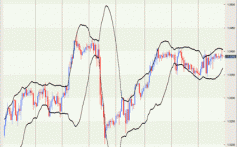
Figure 4 – NetPicks SST with Kagi Chart
Conclusion
Kagi charts are another tool we can use in trading the markets. They do a great job of filtering out noise and indicating major trends and can be used either on their own or in conjunction with other charts and systems. Open up Kagi charts of your favorite instruments, experiment with the reversal size and see how you can incorporate them into your own trading.