Risk vs Reward for Utility ETFs and CEFs
Post on: 31 Июль, 2015 No Comment
A version of this post has been submitted to Seeking Alpha.
Utility Sector
Over the years, utility companies have prospered from increasing residential and commercial demand coupled with a low interest rate environment. However, when interest rates began to rise in May of this year, the stock of utility companies nosedived. To get a better feel for the performance of this sector, I analyzed the risk versus rewards over the past several years.
The utility sector consists of large firms that operate facilities for the generation and transmission of electricity, gas, or water to the general public. These firms usually require substantial infrastructure, like power distribution lines, and have to assume large amounts of debt to finance expansion and improvements. This makes utility companies sensitive to interest rates. However, once the infrastructure is in place, it becomes cost prohibitive for other companies to compete. Therefore, utilities often enjoy a “natural monopoly” in the region they serve. The Government also views utilities as providing essential services for the wellbeing of society. For these reasons, many of the utilities companies are regulated. The regulators set retail rates that are designed to provide each company with a “fair” rate of return. This return varies from region to region but is typically in the 9% to 12% range. This provides a stable income for the regulated companies but decreases their ability to grow profits.
In the 1990s, to foster competition, some States decided they would “unbundle” the generation part of the electric lifecycle from distribution. The rationale was that only the distribution part was a “natural monopoly” and that firms could compete for the right to generate the power. This deregulation led to the emergence of unregulated utilities. Unregulated utilities are also known as merchant power generators. Today, many companies in the industry encompass both regulated and unregulated activities.
Selection Criteria
To obtain a diversified view of this sector, I limited myself to either Exchange Traded Funds (ETFs) or Closed End Funds (CEFs) that specialize in utilities. I also wanted to analyze performance of this sector over a complete market cycle that encompassed both boom and bust times. I therefore restricted my analysis to funds that were launched prior to 12 October, 2007 (the start of the last bear market). This represents a little less than 6 years of market data. In addition, I wanted to view only the funds that had at least a moderate liquidity so I confined by analysis to funds with an average daily trading volume of more than 50,000 shares and a market cap that exceeded $150 million.
Selected ETFs and CEFs
The three ETFs and two CEFs that met by selection criteria were:
- Utilities Select Sector SPDR (XLU). This ETF tracks the Utilities Select Sector Index, which is a cap weighted index that contains all 31 utilities companies in the S&P 500 index. Electric utilities make up 56% of the index and diversified utilities 36%. Gas utilities and independent power producers represent the other 8%. The expense ratio is an ultra-low 0.18%. This ETF is also the most liquid, trading an average of over 10 million shares per day. It yields almost 4%.
- The Vanguard Utilities (VPU ) ETF and the iShares U.S. Utilities (IDU) ETF track slightly more diversified indexes than XLU. However, over the past 6 years, these ETFs have been over 97% correlated with XLU so I only considered XLU in my analysis.
- First Trust Utilities AphaDEX Fund (FXU). This ETF is based on the StrataQuant Utilities Index, which employs a quantitative selection methodology that tries to choose the best utility stocks based on growth and value factors. Higher ranked stocks receive a higher allocation within the index. The fund has 53 holdings consisting of 78% utilities, 18% Telecommunications, and 4% energy. The index is rebalanced quarterly. The fund has an expense ratio of 0.7% and a yield of 3.2%.
- iShares S&P Global Utilities (JXI). This ETF tracks the cap weighted S&P Global Utilities Sector Index, which holds 73 companies including both regulated and unregulated utilities. In terms of country exposure, the USA has by far the largest weighting at 50% followed by United Kingdom at 12% and Germany at 7%. The fund yields 4.2% and has an expense ratio of 0.48%.
- Reeves Utility Income (UTG). This is a closed end fund (CEF) that sells at a discount of 5.8%, which is slightly lower than the average discount of 3.5% that the fund has experienced over the past 52 weeks. The fund holds 70 securities, all from USA-based companies. The distribution rate is 6.3%, which has been achieved without any return of capital. The fund enhances yield by utilizing 25% leverage and has a high expense ratio of 1.9%, including interest expense.
- Gabelli Utility Trust (GUT). This closed end fund sells at a premium of 10%, which is relatively low compared with the average premium of 18%. One reason for the premium is the 9.3% distribution rate. However, care should be exercised because about 30% of this distribution is return of capital. This fund has a large portfolio with 172 holdings, with about 85% in equities (mostly related to utilities) and the rest in treasuries. The holdings are all from USA-based companies. This fund uses a relatively low amount of leverage (18%) and has an expense ratio of 1.7%.
For reference, I also included SPDR S&P 500 (SPY). This ETF tracks the S&P 500 equity index and has a yield of 2%.
Risk vs Reward over Bear-Bull Cycle
To analyze risks and return, I used the Smartfolio 3 program (www.smartfolio.com ) over a complete bear-bull cycle (from 12 October 2007 to the present). The results are shown in Figure 1, which plots the rate of return in excess of the risk free rate of return (called Excess Mu on the charts) against the historical volatility.
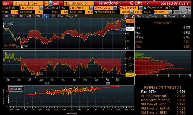
Figure 1. Risk versus Reward over bear-bull cycle (click to expand)
As is evident from the figure, there was a relatively large range of returns and volatilities. For example, GUT had a high rate of return but also had a high volatility. Was the increased return worth the increased volatility? To answer this question, I calculated the Sharpe Ratio.
Sharpe Ratio
The Sharpe Ratio is a metric, developed by Nobel laureate William Sharpe that measures risk-adjusted performance. It is calculated as the ratio of the excess return over the volatility. This reward-to-risk ratio (assuming that risk is measured by volatility) is a good way to compare peers to assess if higher returns are due to superior investment performance or from taking additional risk. In Figure 1, I plotted a red line that represents the Sharpe Ratio associated with SPY. If an asset is above the line, it has a higher Sharpe Ratio than SPY. Conversely, if an asset is below the line, the reward-to-risk is worse than SPY.
Some interesting observations are apparent from Figure 1. JXI had a rough time over the past 6 years, booking an overall negative return during the period. Looking a little deeper into JXI performance showed that it lost over 50% during the 2008 bear market and never recovered. The other ETFs and CEFs fared much better than JXI. As you might expect, the CEFs were more volatile than the ETFs, mainly due to the use of leverage and the fact that selling at premiums or discounts tends to increase price volatility. The CEFs were more volatile than the SPY but provided a return commensurate with the risk. In fact, the best risk-adjusted performer was Reeves Utility Income with a Sharpe Ratio well above the other funds. The ETFs were less volatile than the SPY but also generated lower returns. The First Trust ETF (FXU) provided a higher return with the same volatility as the more popular XLU.
Diversification
I next checked to see how much diversification you obtained from these utility funds. To be diversified, you want to choose assets such that when some assets are down, others are up. In mathematical terms, you want to select assets that are uncorrelated (or at least not highly correlated) with each other. I calculated the pairwise correlations associated with the selected funds. The results are provided as a correlation matrix in Figure 2. Generally speaking, the Utility ETFs provide a moderate level (about 80% correlation) of diversification relative to SPY. The CEFs provide more diversification since their price actions were not in synch with the utility ETFs or the SPY.
Figure 2. Correlation Matrix (12 October, 2007 to present (click to expand)
Risk vs Reward past 3 years
With the exception of JXI, the utility funds provided reasonable performance over the bear-bull cycle. To check how the performance may have changed over a more bullish period, I reduced the look back period to 3 years and re-ran the analysis. The results are shown in Figure 3.
Figure 3. Risk versus Reward over 3 years (click to expand)
During this period, the S&P 500 was in a rip-roaring bull market and left the more staid utility funds in the dust. However, to facilitate analyzing performance among utilities, I plotted the Sharpe Ratio associated with XLU as a blue line on the chart. As with the longer term chart, CEFs exhibited higher volatility than the ETFs but this time, the risk-adjusted return was not as good as those booked by the ETFs (all the CEFs are below the blue line). JXI still brought up the rear but was able to move into positive territory. Among the ETFs, XLU and FXU had about the same risk-adjusted returns.
Risk vs Reward since January 2012
The investment landscape became even murkier in the more recent past. Since early this year, the fear of rising rates has made the utility space more volatile. To obtain a more near term view, I ran the analysis from the beginning of 2012 to the present, a little over 1.5 years. This data is presented in Figure 4.
Figure 4. Risk versus Reward since January 2012 (click to expand)
The last 1.5 years has not been kind to the CEFs, as the prices dropped more than the Net Asset Values (NAVs). This resulted in significant underperformance of the CEFs relative to the ETFs. Among the ETFs, FXU has continued to shine with JXI still lagging in relative performance.
Bottom Line
In summary, over a complete bear-bull cycle, many of the utility focused funds have provided investors with a good risk-adjusted income. However, since the bull market began in 2009, utilities have under-performed the S&P 500 (which is not surprising). As the threat of increasing interest rates continues to shape investor sentiment, I would be wary of utility CEFs, because of the use of leverage and the possibility of widening the gaps between NAVs and prices. The quantitative selection process used by First Trust appears to be working, so my favorite utility fund is FXU. This fund has provided some of the best risk-adjusted returns relative to other utility funds over all the time periods analyzed. You should also note that utility ETFs have been only slightly less volatile than the S&P 500 so investors should consider their risk tolerance before investing in this asset class. No one knows what the future will hold but if interest rates stabilize, then investors looking for income should give utility funds serious consideration.


