What are the Voodoo Lines Simpler Trading Knowledge Base
Post on: 4 Октябрь, 2015 No Comment

The Voodoo Lines uncover regions of potential support and resistance which might not otherwise be visible. Used in the simplest form, one can trade against the lines the same way as any other level such as trend lines, pivot points, moving averages, etc… Many experienced daytraders have told me that they received benefit from Voodoo Lines on the same day they received it. From the following 5 minute chart for the E-Mini S&P 500 you can see why.
Most often, traders who jump in and successfully use Voodoo lines right away are already comfortable trading against support and resistance. This is important because price doesn’t always stop at Voodoo Lines just as price doesn’t always stop at an important moving average. Therefore, it’s important to not blindly buy or sell at a Voodoo Line level and without an already developed sense of whether price is likely to stop at a level or not, one might make some costly trades.
While it may be possible to use the lines right away, there is benefit to learning how to read the more nuanced messages that are delivered as price interacts with the Voodoo Line levels. Whether you are experienced or not, it is best to spend time studying any new tool during live market conditions and Voodoo Lines is no different. This guide is designed to help speed you on your journey. It covers three broad subjects:
1. Descriptions of the various Voodoo Line levels are and the meaning of the different colors;
2. An overview of some of the common ways that price acts at Voodoo Lines
3. Techniques help identify longer-term trends with Voodoo Lines
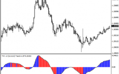
After reading the discussion this guide you should be better positioned to study Voodoo Lines with an eye toward how to incorporate it into your own trading strategies. Combining Voodoo Lines with other tools can add additional insights. For example, the chart below shows the Euro bouncing from its fireline with MACD divergences suggesting that price is running out of steam as it approaches this support level:
This is just one example of how Voodoo Lines can be combined with other technical analysis techniques and it is not meant to suggest that MACD is the best indicator to use. What is best is whatever works well for you.
About the Examples
The 5-minute ES chart which served as the first example in this guide was not “cherry picked” It was the most recent 5-minute chart for this common daytrading instrument on the day when I sat down to craft this document. The importance of the lines on the chart can be immediately seen even though price didnt always stop right at them.
The same thing cannot be said about further examples. In most cases they have been chosen to illustrate a particular concept and, therefore, need to be selected from many possible charts so that the pattern is clear. That doesnt mean that the charts show prices always turning exactly at Voodoo Lines; in fact, it is just the opposite, most of the examples or of common patterns showing behavior when prices go don’t reverse exactly at a line to illustrate the variety of patterns which can occur.
Nevertheless, it is important to recognize that the examples were chosen because they are good examples of how Voodoo Lines can signal the likely direction of prices. Not all signals will be as clear and some seemingly clear signals will lead us to anticipate moves which might not occur.
What Are The Voodoo Lines?
The underlying techniques to create Voodoo Lines are based on Elliott waves – a dark art to some. However, you don’t need to know anything about Elliott waves to make use of the tool. Furthermore, Voodoo Lines overcomes one of the most cited problems with Elliott waves: analysts often disagree about the current waves. Voodoo projects levels from long-term levels, usually based on levels which analysts have long since agreed upon.
Because markets tend to make proportional moves, these projections establish levels which have an uncanny way of becoming support and resistance. By using them you get to harness the predictive power of Elliott waves without needing to do any analysis.
Another benefit of using long-term levels to create Voodoo Lines is that the lines are always at the same levels until a major turning point occurs. They can remain in the same place for many years; sometimes even decades. They appear at the same place on every timeframe from one minute to one month and can be used on time charts, tick charts, volume charts, range bars, renko bars, point and figure charts, market profile charts and more.
Even though one can trade against the various Voodoo Lines without regard to what the many levels represent, one can make more informed trading decisions by understanding the relationships of the levels and their relative importance. The most important Voodoo level is the fireline. These are the levels taken directly from the long-term Elliott wave structure. They are few and far between and prices can often go for months or even years without visiting a fireline. Let’s take a look at an example of the Dow Jones Industrial Average with just firelines shown:
Just as the treelines fill in areas of possible support and resistance between the firelines, more levels are added to fill in other possible areas of interest. They are, in order,
- Red firelines
- Green treelines
- White snowlines
- Violet skylines
- Dashed moguls
You can see how the addition of the third-level snowlines helps to further clarify the important areas on the hourly DJIA chart:
By zooming in on a 15 minute chart of the most recent portion of the 15-minute chart, the value of incorporating the smaller degree lines becomes evident:
On some platforms Voodoo Lines has the ability to display a sixth degree of line which is disabled by default. Turning on this level of line is usually overkill and will make charts impossible to read. However, some symbols have lines very far apart on small timeframes and adding the sixth level can fill in some gaps. Below is an example of 30-Year Treasury futures on a 5-minute chart both with and without the sixth level micro-moguls shown in magenta:
Common Voodoo Patterns
When studying Voodoo Lines you want to develop a feel for whether prices will go through a level or not. In addition to the other analytical tools and experience which you will bring, there are some common patterns which can help reveal the intended direction of price once you have some practice recognizing them.
Below are descriptions of several common behaviors that I’ve seen as prices interact with the various levels. This list is not exhaustive and you may observe your own patterns. Furthermore, you might find that you can see or trade certain reliably, but not others. The goal in presenting the patterns is to start you thinking about the many types of movement you can look for when observing price action with Voodoo Lines as you’re developing your own feel for them.
Testing and Continuation
The first scenario we want to look at is when prices pause at a Voodoo Line level before continuing in the direction of the dominant trend. On an hourly chart you can see that gold futures tested the $1744.80 skyline twice before breaking through. After each of the first two attempts the price of gold remained in the general area of the line indicating it was building strength for a possible attempt to break through.
The two tests of the Skyline let us know that the market respects this level and that makes it an important event if prices do make it through. Once a level that is tested multiple times is broken, It is not uncommon for price to move swiftly as happened with gold. However, this isnt the only possible resolution as we’ll see when we cover patterns which retest from the other side.
Notice that once price finally broke, the next level that was visited was the $1771.80 skyline.
A similar test and continue pattern can be seen as PCLN approaches and tries to break through its fireline.
Test and Reverse
The E-Mini S&P Futures give us an example of a situation where prices stop at an important Voodoo Line level. In this case they don’t wait around too long and start taking out levels in the opposite direction.
Here’s another example of the test and reverse from a daily chart of the DJIA. See how the DJIA found support right at the 12,030.33 Fireline – the most important level there is.
Spike then Fail
It is important to recognize that when prices reverse at Voodoo Lines the turn doesn’t always happen at the exact level. Sometimes they do like the swing low that the DJIA put in at the Snowline in the example below. However, sometimes they will spike beyond the level before failing in the two examples where DJIA tried to climb above two skylines: first at 13,004.75 and then again at 13,274.08.
In each case, after pulling back from the skyline they made a retest of the level before failing. It doesn’t always happen this way, but when it does it can be a real gift. The first failure of the line shows that prices may not go through. The retest often gives an opportunity to take a trade right by the line while confirming which side of the line prices want to be on. There are several patterns that involve retests and we will cover them more.
Retest from Other Side
It is very common for price to test and retest Voodoo Line Levels. This behavior not only is a strong signal of a choice of on side of the line vs. the other, but it also can provide potential trade setups if you become accustomed to identifying the retest behavior.


