Kagi Charts_2
Post on: 16 Март, 2015 No Comment

What are Kagi Charts?
They are stock charts used in charting and study of chart patterns in technical analysis. It differs from traditional stock charts, such as the Bar and Candlestick chart by being independent of time and volume.
It does not even use open, high, low and close prices. It only uses tick data. The chart line changes direction only if there is a specified amount of move in the opposite direction.
This eliminates noise by not reacting to smaller movement in the opposite direction than a fixed reversal amount of movement. It lessens the ambiguity in making trading decision.
History
The Kagi chart was originally developed in Japan during the 1870s when the Japanese stock market started trading. This charting was designed to find entry exit points to trade rice. Later on it was found useful in trading financial instruments also. These charts display a series of connecting vertical lines where the thickness and direction of the lines are dependent on the price action. These charts use only the continuous price data called Tick data. Change of direction of lines occurs only when a change reaches a specific amount. This reduces random noise.
These charts were introduced to the western world by Steve Nison a well-known authority on the Candlestick charting. You can get more detailed information on this subject in his book Beyond Candlesticks.
How are Kagi Charts constructed?
They are constructed by drawing vertical and horizontal lines. The vertical line denote the change in price in one direction. The horizontal lines denote the change in the trend.
The vertical line is moved in the direction of the price movement. The line keeps extending as long as the price moves in the same direction however small it may be. When the price move in the opposite direction by a pre determined ‘reversal’ amount, an horizontal line is drawn and the vertical line is drawn in the opposite direction. Keep extending this line as long as the price moves in this direction.
If the closing price moves in the opposite direction of the current line by less than the reversal amount then no lines are drawn. The change in direction is made only if the price moves in the opposite direction more than the reversal amount although this could take a number of sessions.
If the line drawn in the opposite direction penetrates the prior column’s high or low, the thickness of the Kagi line changes. When the line crosses the previous swing high the line is made thick denoting strong up movement. When the line crosses the previous swing low the line is made thin denoting strong down movement.
Thick lines denotes increased demand and thin lines represents increased supply. It may also be color coded. Thick line can be made green or blue and thin line can be made red or orange.
The ‘reversal’ amount may be measured in terms of pips or percentage. It is usually fixed at 4%. We can change it as per our requirement.
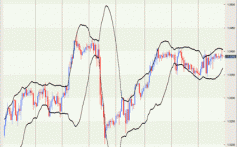
Study the Kagi chart given below and compare it with the bar chart. Click on the charts to see bigger charts.
In this chart the ‘reversal amount’ is set to 1 percent.