How to Read a Candlestick Chart
Post on: 25 Сентябрь, 2015 No Comment
How to Read a Candlestick Chart
By Walker England. Forex Trading Instructor
Technical traders are confronted with many choices when it comes to charting. More often than not Forex charts are defaulted with candlestick charts which differ greatly from the more traditional bar chart often used in other markets. Surprisingly after learning to analyze candlesticks, traders often find they are able to quickly identify different types of price action they could not pinpoint before with traditional charts.
Finding these points can help give a trader an advantage when planning a trading strategy. So let’s get started learning about how to read a candlestick chart!
How to Read Candles
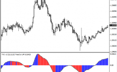
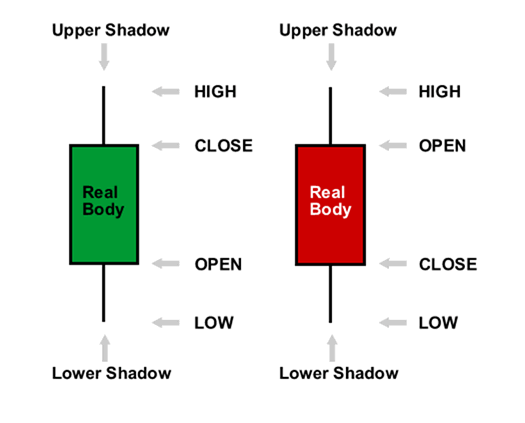
The image below represents the design of a typical candlestick. There are three specific points (open, close, wicks) that are used in the creation of a price candle. The first points we need to consider are the candles open and close prices. These points identify where price began and concluded for a selected period and will construct the body of a candle. It is important to note the color of the body of a candlestick (red for down and blue for up). Knowing this, candlesticks can help us quickly identify if the market is trading higher or lower for a selected period.
Next we have the wicks of our candlesticks, which can also be referred to as a shadow. These points are vital as they show the extremes in price for a specific charting period. The wicks are quickly identifiable as they are visually thinner than the body of the candlestick. This is where the strength of candlesticks becomes apparent. Candlesticks can help us keep our eye on market momentum and away from the static of price extremes.
Uses in Trading
Once you can read the basics of a candlestick chart, they can open up an array of trading opportunities. While a trader may not employ candlestick analysis alone in their strategies, it can help give us clues into market sentiment and direction. Forex professionals are known to look for specific patterns or a series of candlesticks to gauge future price movement and set trading orders . Throughout the month of August, we will continue our discussion on candlestick charts and look at specific candle patterns for market reversals and continuations.
—Written by Walker England, Trading Instructor
To contact Walker, email wengland@fxcm.com. Follow me on Twitter at @WEnglandFX.
Trading the Bullish Hammer Candle
By Walker England. Forex Trading Instructor
Interpreting Japanese candlesticks can give a trader important insight into market momentum. By understanding how to read candles, traders can often include them in their analysis to find areas of price continuations and possible reversals. Today we will focus on one candle that can help validate a charts reversal point. Let’s learn to identify and trade the bullish hammer candle.
What is a bullish hammer?
A bullish hammer differs from other candle patterns as it is a single candle hinting at a turn during an established downtrend. Pictured above the hammer is interpreted by understanding a candles particular open, low high and close levels. To create a hammer price must first significantly sell off to create a new low for a currency pair. However, after this decline, prices must significantly rally causing prices to have a small body and close near its opening price. It should be noted that hammers should have long wicks at least twice the length of the candle body. As well, the candle itself can either be red or blue depending on the strength of the reversal.
Often the bullish hammer is confused with a bearish hanging man candle. The misrepresentation is logical because both candles look identical! The difference between these two candles lies in their placement in a trending market. The hanging man has a small body and lock wick but is found hanging at the conclusion of an uptrend. Bullish hammers have small bodies and long wicks also, but are only seen at the end of a downtrend.
(Created using FXCM’s Marketscope 2.0 charts)
Uses in Trading
Bullish hammer candles can be found on a variety of charts and time frames. Depicted above is an example of the hammer on the AUDUSD daily chart. From February the 29 th through June 1st the AUDUSD rallied as much as 1276 pips. This downtrend was concluded with a bullish hammer candle, and price has subsequently rallied a total of 1033 through today’s price action.
As the strength of a hammer depends on its placement on the graph, normally traders use this candle in conjuncture with other indications of price support. This includes using tools such as fib lines, pivot points and psychological whole numbers. In an ideal scenario, the wick of the hammer will penetrate a support level but the body will close above support on renewed buying sentiment. With a new buying opportunity presented, traders may then choose to place stops under the created wick below support.
—Written by Walker England, Trading Instructor
How to Trade Shooting Star Candle Patterns
By Jeremy Wagner. Head Forex Trading Instructor
Japanese candlesticks are a popular charting technique used by many traders. Today, we are looking at the shooting star reversal pattern which is a popular Japanese candlestick formation and how to apply it towards the FX market.
What Does a Shooting Star Look Like?
(the shooting star is the red candle at the high point above)
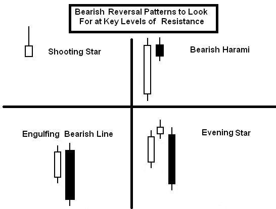
A shooting star formation is a bearish reversal pattern that consists of just one candle. It is formed when the price is pushed higher and immediately rejected lower so that it leaves behind a long wick to the upside. The long wick should take up at least half of the total length of the candle.
Additionally, the closing price should be lower than the opening price creating a red candle. As you can see, this creates an overall bearish structure because prices were unable to sustain their higher trade.
Trading the Shooting Star
Trading this reversal pattern is fairly simple. First, the implication is for lower prices therefore we want to look for entries to short. Since the prices were previously rejected at the high of the shooting star, we will establish our stop loss about 10-20 pips above the high of the said candlestick.
The entry can take place in a couple of manners. First, a trader could simply enter on the open of the next candle. Or, if the trader was more conservative and wanted to capture a better risk-to-reward ratio, we can trade a retest of the wick.
Retests of the wick tend to occur when the wick is longer than normal. Oftentimes, prices will come back and retrace upward a portion of the long wick. A trader recognizing this might wait to enter around the middle of the wick rather than enter immediately after the shooting star candle forms. This means the trader is entering a short trade at a higher price and with a tighter stop loss reducing risk.
Regardless of the entry mechanism, the stop loss will remain the same which is about 10-20 pips above the shooting star candle.
Regarding profit targets, we teach in our courses to take profit at least twice the distance as your stop loss. So if your stop loss is about 90 pips, then look for at least 180 pips of profit potential. This means we are establishing a 1-to-2 risk-to-reward ratio which falls in line with the Traits of Successful Traders research.
Trading the AUDJPY Shooting Star
On Friday, November 2, the AUDJPY produced a shooting star reversal pattern on the daily chart.
(Created using FXCM’s Marketscope Charts)
What makes this set up appealing is that it forms near 2 other levels of horizontal resistance.
- Purple horizontal line which coincides with the previous high on August 20, 2012 and October 25, 2012. This resistance line is near 83.60. The 61.8% retracement level of the March 19, 2012 to June 1, 2012 down trend crosses near 83.23. (blue horizontal line)
Therefore, a strong resistance zone is created. As prices approached this resistance zone, the buyers stopped buying and the sellers started selling which left a shooting star candle pattern in its wake.
(Created using FXCM’s Marketscope Charts)
Since the AUDJPY has been trading in a range between 79.70 and 83.50, consider an entry to short near the top of the range near 83.15 with a stop loss just above the shooting star high near 84.05.
We’ll look to take profits near the bottom of the range at 80.15. This means we are risking 90 pips for a potential reward of 300 pips. This yields a 1-to-3 risk to reward ratio.
—Written by Jeremy Wagner, Head Trading Instructor, DailyFX Education
Trading the Doji Candle
By Walker England. Forex Trading Instructor
Being able to identify and interpret candle charts is an important technical market skill for Forex traders to master. Candle shapes and patterns can give visual insight into what traders are thinking as well as provide critical levels of support and resistance. With this idea in mind we will focus on recognizing and trading one of the markets most prevalent candles, the doji.
What is a doji?
A doji candle is formed when price causes a candle to open and close at nearly the same price. Pictured above, you will see that doji candles visually will appear like a plus sign or a cross on your graph. The body of the candle should be very short, with wicks elongated to either side. These wicks symbolize the market volatility during the specified charting period. However, since price opened and closed at virtually the same price neither the bulls or bears appear to be in control of the market.
Since market momentum has stalled, the doji candle traditionally signifies market indecision. Traders can use this indecision as an opportunity to plan for an increase in momentum. Often traders choose to use support and resistance levels for fresh market breakouts or to identify areas where a broader trend may continue. Let’s take a look at a practical trading example using the GBPUSD daily chart seen below.
(Created using FXCM’s Marketscope 2.0 charts)
Uses in Trading
Once you are familiarized with identifying dojis, they can then actively applied to virtually any trading strategy. Since the candle itself does not give us much information regarding market direction, dojis are often used in conjunction with a trend lines or other support and resistance indicators. Above is an example of a doji, forming near a support line on the GBPUSD daily graph. Since price has been moving lower back to support prior to the creation of a doji, a potential change in direction would indicate a resumption of bullish strength.
An aggressive trader can look to enter into the market in the direction of the trend after the creation of a doji candle. Risk can be managed as well using this candle with stops being placed below the wick low which is now acting support for the pair. From here traders can then extrapolate a positive risk reward level of their choosing.
—Written by Walker England, Trading Instructor
bit.ly/DFXplus2013
Last edited by DailyFX; 05-08-2013 at 11:36 AM.


