Market’s Bill of Health – Momentum Slows Possibly Signaling a Pause Ahead
Post on: 30 Апрель, 2015 No Comment
The S&P 500 hit another milestone this week by closing over 1800 for the first time. The Dow Jones Industrial Average also hit a milestone by closing over 16,000 to end the week at 16,064.80. The NASDAQ also finished the week on a positive note and remains less than 10 points away from hitting the 4,000 mark for the first time since September 2000. While the markets may be hitting new highs, the percent of participating stocks in the S&P 1500 is less now than a month ago when the market was hitting new highs. Declining participation on the rally and weakening market momentum may indicate a potential short-term top on the horizon.
S&P 500 Member Trend Strength
As shown below, the long-term outlook for the S&P 500 is clearly bullish as 83.4% of the 500 stocks in the index have bullish long-term trends. The market’s intermediate-term outlook has also improved, jumping from 50.4% a month ago to 78.0%, pushing it deep into bullish territory. The market’s short-term outlook also remains in bullish territory at a reading of 63.0% this week, though slipping from last week’s 72.8% reading. What is most important is the market’s strong long-term outlook, which still does not suggest a market top is forming.
* Note: Numbers reflect the percentage of members with rising moving averages: 200-day moving average (or 200d MA) is used for long-term outlook, 50d MA is used for intermediate outlook, and 20d MA is used for short-term outlook.
The most important section of the table below is the 200d SMA column, which sheds light on the market’s long-term health. As seen in the far right columns, you have 83.8% of stocks in the S&P 500 with rising 200d SMAs and 83.2% of stocks above their 200d SMA. Also, all ten sectors are in long-term bullish territory with more than 60% of their members having rising 200d SMAs.
Source: Bloomberg
S&P 500 Market Momentum
The Moving Average Convergence/Divergence (MACD) technical indicator is used to gauge the S&P 500’s momentum on a daily, weekly, and monthly basis. The daily MACD for the S&P 500 went on a buy signal last week as now all three time frames show a buy signal.
Source: Bloomberg
Digging into the details for the 500 stocks within the S&P 500 we can see that the daily momentum for the market has slipped to 47%, down from a reading of 77% three weeks ago as it has slipped into neutral-bearish territory.
The intermediate momentum of the market slipped slightly from last week’s 67% reading to this week’s 66% reading, with the market’s intermediate momentum still holding onto bullish territory.
The market’s long-term momentum remains solid at a strong 79% this week, putting it well into bullish territory.
Source: Bloomberg
While it is encouraging to see the market’s long-term momentum remains in bullish territory, the market’s weekly momentum had been diverging with the S&P 500’s advance with a series of lower highs. The weekly numbers have finally broken the string of lower highs on rallies as the current reading breached the highs seen in August. One of the biggest causes for the negative divergence in weekly MACD’s with the S&P 500’s price was the weakness in financials and consumer staples which make up nearly a fourth of the S&P 500 members. The rally that has occurred in these sectors has caused the overall market breadth of the S&P 500 to broaden out and break the string of lower highs and also caused the monthly MACD readings to stabilize. That said, this week’s reading did decline for the first time since August 9th which led to a
5% market pullback into early September.
Source: Bloomberg
52-Week Highs and Lows Data
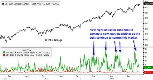
The insightful Lowry Research Corporation conducted a study on market tops recently (click for link ) in which they looked at all major market tops since the Great Depression and found selectivity is a hallmark of all market tops, in which participation in the bull market fades as individual stocks enter their own private bear markets well before the market peaks. They found that, on average, 17.26% of stocks were at or within 2% of their 52-week highs on the day the market peaked while 22.26% were off by 20% or more from their highs, indicating more stocks were experiencing bear markets than were participating in rallying to new highs. For this reason, a look at 52-week breadth of the markets is helpful in detecting an approaching bull market top.
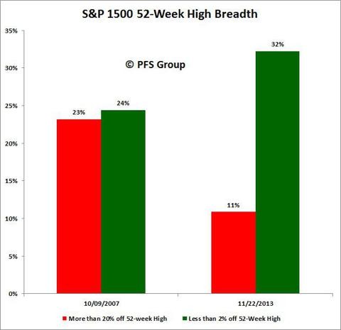
As shown below, currently 32% of the S&P 1500 stocks (which includes the S&P 500, S&P 400, and S&P 600) closed within 2% of their 52-week highs while 11% were in bear markets. This near 3-to-one ratio is far better than the 17.3% to 22.3% that Lowry’s found near market tops and better than the near split tape at the 2007 market top as shown below.
Digging deeper into the data confirms the market continues to display impressive internals and does not suggest a market in danger of rolling over into a bear market. For example, The S&P 500 (large caps) shows the strongest margin between those near new highs (39%) and those in bear markets (6%) with the S&P 600 (small caps) showing the weakest margin between those near new highs (28%) and those in bear markets (15%), but still a healthy margin overall.
Source: Bloomberg
The current market leaders are financials, health care, industrials, and materials as these sectors have the highest percentage of members within their group that are within 2% of a new 52-week high and very few members that are currently experiencing a bear market (20% + decline). This is bullish as four of the top five sectors are cyclical stocks that tend to peak ahead of the market, and the fact that these are the strongest sectors is encouraging.
Source: Bloomberg
Stock Market in a Bubble?
With calls from Carl Icahn to Jeremy Grantham and Doug Kass, and even a Barron’s cover this past weekend, calling for the stock market in a “Bubble,” I thought it worthy of some attention. But before I put my two cents in I wanted to highlight what famed VALUE investor Warren Buffett had to say on the matter in a recent CNBC interview (click for link ):
Warrant Buffett: The stock market compared to most assets, all the big asset classes in my view, is the most attractive place to have your money over the next 20 years. We have our money in businesses. we call those stocks. We think that’s where value lies.
CNBC: We had Mark Hulbert as a guest on the show yesterday, he laid out the argument about just by looking at formulas, playing the averages, that we are due for another correction at some point. You never know when that going to come or what’s going to happen but it was an argument for not getting caught up in the euphoria of the bull market and making sure you were diversified. Do you think we’ve reached the stage in this bull market where people have to worry about bubble levels?
Warrant Buffett: No. We could at some point but, no, stocks are not selling at bubble levels. What do you want to diversify in? Do you diversify into cash? I think it’s a terrible investment compared to equities. Do you want to diversify into long-term bonds? I think it’s a terrible investment compared to equities so you’re going to have your assets in something and I think that good businesses held for a long periods of time are certain to deliver good results.
I couldn’t agree more with Buffett’s comments. Going back nearly a half century, to compare the earnings yield on the S&P 500 (Inverse of the PE ratio) versus the interest rate on the 10-Yr UST shows the spread between the two still clearly favors equities. Going back just two years we were at similar levels as the 2009 market bottom near a 6% spread, which was near the highest levels in a half century. Even with this year’s run in stocks and decline in bonds we are still well above the long-term average and stocks continue to remain a relative bargain versus long-term government bonds.
Source: Bloomberg
And on the subject of bubbles, they typically occur as a result of financial resources over allocated to any one area like bonds, stocks, or even housing. The figure below looks at stock (top panel) and bond values (bottom panel) as a share of household total financial assets. The top panel shows that when stocks make up 28-30% of total household financial assets a secular bear market ensues, as seen by the 1969 and 2000 tops. What is interesting is to note that we are currently only at the half century average of 18.5% for stock ownership while bond ownership still rests well above the average after hitting nearly 11% in 2009-2010, which was the highest level seen in over a half century as too much retail money was allocated to bonds.
Source: Bloomberg
So if one wants to talk about a bubble, historically speaking their attention would be better spent talking about the bond market than the stock market.
The market’s long term trend and momentum remain firmly in bullish territory and 52-week breadth data on the S&P 1500 shows no signs of a major market top. That said, sentiment levels are elevated and intermediate and short-term momentum is slowing for the market so we could certainly be due for a pause, but given the strength of the market’s underlining internals the bull market remains alive, short-term pullback or not.


