Hard Right Edge Trading The 50Day Moving Average
Post on: 16 Март, 2015 No Comment

Seats on the 50-yard line give football fans the ideal place to watch a game unfold. It’s no different when traders focus their attention on the 50-day moving average. This neutral ground between bulls and bears offers a perfect view of the market’s playing field. This column has looked at the 50-day moving average many times. In May, I showed how to use it as a buy signal on pullback trades. Last September, I examined the market mechanics behind this versatile tool. And a year ago, readers discovered how crossovers between the 50-day and 200-day averages signaled new bull or bear market impulses.
Let’s explore how the 50-day fits into a broader trade analysis and why I place the indicator (or its intraday cousin) on every chart I view. Keep in mind that these examples aren’t stock picks yet, so don’t flame me if they don’t act a certain way.
I spend weeks watching a chart until the price sets up perfectly at the 50-day average. If I’ve done my homework, the trade entry will come at the ideal time, rather than at the ideal price. For example, a pullback may hit its low many bars before issuing a decent buy signal.
Traders must choose between an ideal price and ideal time in most of their entries. Ideal price means entering into high volatility when price gets stretched to an extreme. Ideal time means standing aside until a pattern sets up for the move. Trading by price reduces risk but requires more patience. Trading by time takes on higher risk in exchange for the likelihood of an immediate move.
Juniper Networks had a great run off its October low. It hit a high at $15 three weeks ago and started to pull back. Notice how it gapped down through the 50-day moving average on June 24 and then filled the gap. The question is whether there’s a buying opportunity now that it has bounced off support.
Aggressive traders might enter near the June 24 low, assuming the 50-day average would hold and set up a decent rally. That level represents the ideal price at the moment. But the ideal time hasn’t come yet, because there’s no way to tell if the selloff is over.
The pattern shows a three-stage correction with a selloff, bounce and second selloff. Markets like to correct in threes or fives, but the chart doesn’t tell us which type to expect. It makes sense to wait for the pattern to give us a buy signal. This won’t come until lower highs of the correction are broken to the upside. That would signal the ideal time to enter a long position.
The Altera correction started out the same way as Juniper. It did a 1-2-3 selloff to the 50-day moving average and bounced. But then it rolled over and broke support in a third leg down. This gives traders valuable but conflicting information. It completes a wave-set that often precedes a strong reversal. But the last leg broke intermediate support at the 50-day average.
The conflict sets up two interesting trade possibilities. The first is a 50-200 pinball play. Notice how the June 27 bar rallies back to resistance at the 50-day average and sells off. This level provides the ideal price for a short sale down to the 200-day average. The trader would then cover the short position at the average, hence the pinball designation.
The second trade is more potent but requires ideal timing. We know the decline may be over, giving us an ideal price to go long. But we have no buy signal, so it’s risky to enter the market. If we’re lucky, a signal comes when price remounts the broken 50-day average.
This small rally triggers a failure of a failure that traps short-sellers and forces them to cover at a loss. This, in turn, lifts our long position into a substantial profit.
Sometimes the ideal price and ideal time line up perfectly. This means the pattern points to a reversal or breakout at a very narrow price zone. This rare confluence can set up very profitable trade entries. For example, look at the current selloff in Goldman Sachs. It charged out of a long base in late May and rallied up to $92. Then it turned tail with the broad market and headed back down.
The 50-day average is rising up to greet the falling price at the same level as last month’s breakout. This tells traders to look for a high-volatility reversal at this support. The turnaround would fulfill ideal price, because support should hold on the first test. It also fulfills ideal time, because the selloff could transform into a V-type move back to the high.
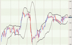
There is endless debate about which calculation to use for the 50-day moving average. The most common math just takes the last 50 bars and divides by the total. Not exactly rocket science. Technicians have tweaked the output in many ways over the years, trying to build a better mousetrap.
The most popular variation is the exponential moving average, or EMA. This version addresses a double-count error in the original calculation and produces a reading that responds more quickly than the original math. Since the early bird tends to get the market worm, the exponential average is now the most popular choice in the professional community. It’s also the way I look at the market. I noted previously that the chart examples represent works in progress, i.e. they’re not stock picks that readers should run out to buy or sell immediately. They’re developing setups that are intended to highlight the mental work flow that traders must go through to find good positions.
Price action at the 50-day average flags many short-sale opportunities. Keep in mind that it’s best to stay with the trend when taking trades off this indicator. This means waiting until price breaks below it on strong volume then rallies back to test it from below. The subsequent reversal should set off sell signals across all kinds of trading platforms.
Whole Food Markets gapped down on heavy volume in early May. Notice how it already tested and failed the average after the initial selloff. The stock then continued to decline, breaking several trendlines and the 200-day EMA. Now that it’s stabilizing at lower prices, there may be another rally back to the 50-day EMA.
This could set up a better short sale than the initial failure. The stock now has less sponsorship because of the significant decline. The chart also shows a confluence of the 50-day and 200-day averages, as well as the last broken trendline. Seeing these elements converge at a narrow price level is just what the short-seller is looking for to enter a new position.

Genzyme’s interaction with the 50-day average is obvious from a quick glance at the chart. Over and over again, it drops just below the average, sits there for a few bars and makes another run at the highs. How does a trader find the ideal time to go long and not miss the next run-up?
The 50-day average works well in combination with relative strength indicators, such as Wilder’s Relative Strength Index. The GENZ chart shows a 14-day RSI, smoothed by seven-day periods. This is the setting I use for all my end-of-day analysis. This popular reading reduces noise and makes indicator reversals less susceptible to whipsaws.
Notice how the RSI turns up ahead of each rally off the 50-day average. This shows the stock healing after each pullback and attracting the interest of fresh buyers. The stock returned to the average about six bars ago, but relative strength is still pointed down. This divergence warns traders to stand aside, because the bounce is not likely to start in the next few bars.
I use the 50-day average on all my intraday charts. Well, it’s actually a 50-period average based on the length of time each bar represents. For example, this Yahoo! chart shows a 50-bar, 60-minute exponential moving average. Intraday averages work exactly the same way as their daily cousins, with one important distinction: There’s a lot more noise in the intraday markets.
This means price can jump across the average several times, although support or resistance may not be violated. Using the indicator for short-term analysis requires a good read of the charting landscape. In this time frame, the best signals come when price sells off from a much higher level or rallies from a much lower level into the average.
Yahoo! shows how the best time to enter a trade often comes many bars after price hits the average for the first time. Try waiting for the next pullback to the average before entering a long position. This last decline wakes up the double-bottom crowd and often revs up enough momentum for a strong rally.
Traders need to know when to ignore the 50-day average. The rule of thumb with moving averages is that they work well in trending markets but poorly in sideways markets. But this can be confusing with longer-term averages, because using them requires looking at the big picture.
IBM shows a strong rally between October and December of last year. But it’s been going nowhere since that time. Notice how the 50-day average has been crossed or hit at least eight times in the last six months. Signals taken because of this price action were doomed to failure, because the average lost its predictive power in the long-term sideways market.