Why Active Management Misses the Mark
Post on: 8 Апрель, 2015 No Comment
About 70% of all portfolio managers use active management as their preferred methodology, but does the evidence support this as the most profitable investment strategy? In this video Envision Wealth Planning President, Bob Bolen CFP®, takes a closer look at the pros and cons of active management.
(Expand to full screen for optimum viewing.)
In a previous blog, we introduced the concept of active management and compared it to asset class management and index management. In this video Bob looks at the pros and cons of active management, or what could also be called active asset allocation.
About 70% of all investment managers worldwide use active management as their preferred methodology, but lets see how theyre really doing.
The percentage of active public equity funds that failed to beat their index is shown on this slide. Starting at US Large Cap on the left, 75% of active managers failed to beat their relevant index for the five years ending December, 2012. If youll notice, theyre all very high failure rates.
(click to enlarge)
You might say, Well, what about International Small Cap Stocks? Those managers did very well. However, if you look under the coverage their, you find out that many of them were investing in Emerging Market stocks. If you adjust for this, they, too, were in the 70% failure rate.
Same story different verse for fixed income. Again, five years looking back from December, 2012, the vast majority of the different types of bond index managers, from governments, to corporates, to municipals, failed to beat their relevant index. They did a little better for the five year period in Investment Grade Intermediate term, but as a portfolio, its the only one that did better than 50/50.
(click to enlarge)
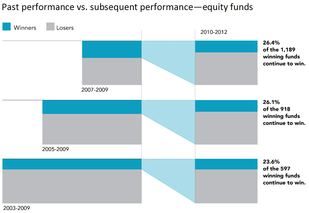
Of course looking forward is more important for you and me than looking back. So we looked at the winners from the 3, 5, and 7 year periods. As you can see in this next slide, about 1/3 of these managers over the three years beat their index average. Then we looked at the next three years and found that only 26% of total funds continued to win in the next period.
From the five years to the ensuing five years it happened again only 26% repeat winners. From the seven year period to the subsequent seven years 23% of the fewer and fewer funds continued to win.
There is no evidence that even if you pick a winner, it will continue to win going forward.
The story is the same in fixed income. Winners are few to begin with, and as you look to the next period from 2007-2009 to 2010-2012 you see the winners splay out and less than half continue to win.
Same for the five year period, less than half continue to win. In the seven year period just over half continue to win going forward.
Theres no evidence that if you keep working at it, youll pick the next winner by looking at the past winner.

*Graph 1: Source: Standard & Poor’s Indices Versus Active Funds Scorecard, year-end 2012. Index used for comparison: US Large Cap—S&P 500 Index; US Mid Cap—S&P MidCap 400 Index; US Small Cap—S&P Small Cap 600 Index; Global Funds—S&P Global 1200 Index; International—S&P 700 Index; International Small—S&P World ex. US Small Cap Index; Emerging Markets—S&P IFCI Composite. Data for the SPIVA study is from the CRSP Survivor-Bias-Free US Mutual Fund Database.
*Graph 2: Source: Standard & Poor’s Indices Versus Active Funds Scorecard, year-end 2012. Index used for comparison: Government Long—Barclays Capital US Long Government Index; Government Intermediate—Barclays Capital US Intermediate Government Index; Government Short—Barclays Capital US 1-3 Year Government Index; Investment Grade Long—Barclays Capital US Long Government/Credit; Investment Grade Intermediate—Barclays Capital US Intermediate Government/Credit; Investment Grade Short—Barclays Capital US 1-3 Year Government/Credit; National Muni—S&P National AMT-Free Municipal Bond Index; CA Muni—S&P California AMT-Free Municipal Bond Index. Data for the SPIVA study is from the CRSP Survivor-Bias-Free US Mutual Fund Database. Barclays Capital data, formerly Lehman Brothers, provided by Barclays Bank PLC.
*Graph 3: The sample includes funds at the beginning of the three-, five-, and seven-year periods, ending in December 2009. The graph shows the proportion of funds that outperform and underperform their respective benchmarks.
Winner funds are reevaluated in the subsequent period from 2010 to 2012, with the graph showing the proportion of outperformance and underperformance among past winners. See Data Appendix for more information.
Data provided by the CRSP Mutual Fund Database. Source: CRSP data provided by the Center for Research in Security Prices, University of Chicago. Past performance is no guarantee of future results.
*Graph 4: The sample includes funds at the beginning of the three-, five-, and seven-year periods, ending in December 2009. The graph shows the proportion of funds that outperform and underperform their respective benchmarks.
Winner funds are reevaluated in the subsequent period from 2010 to 2012, with the graph showing the proportion of outperformance and underperformance among past winners. See Data Appendix for more information.
Data provided by the CRSP Mutual Fund Database. Source: CRSP data provided by the Center for Research in Security Prices, University of Chicago. Past performance is no guarantee of future results.


