WD Gann Market analysis in Excel with XLGann
Post on: 10 Июнь, 2015 No Comment
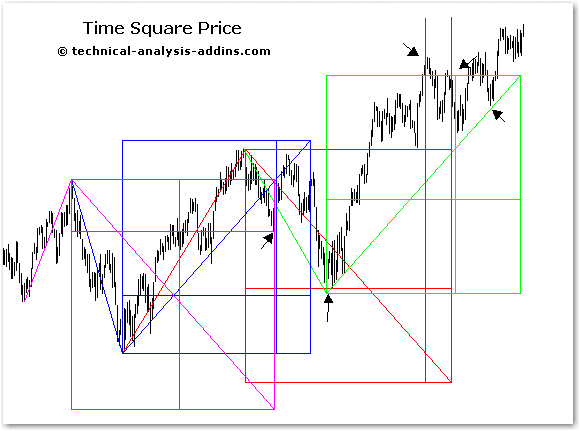
mastercharts, square of nine and more with
XLGann gives you the tools you need to implement WD Gann’s geometric overlay market analysis techniques. Gann was a prolific trader and writer who lived in the first part of the last century. He was also a shriner and a freemason. What he learned in thoselodges he applied to his analysis of the markets.
Take a couple of minutes to watch a demo of XLGann
This add-in makes it easy to put Gann overlays on price charts. There are fivegann grids to choose from that relate price to time in various ways. There is also ahex grid which I developed based on Gann concepts. But that’s not all you get.
You also get a Price-Time Box. Price-time boxes are similar to Don Hall’s Pyrapoint but with modifications suggested by Howard Arlington in the Spring 2001 issue of Trader’s World magazine.
A square of 9 grid overlay tool is also included. You can click on a single price to use in the expansion or you can choose two points and use the price span (and time span) in the expansions. Square of 9 grids are also rotatable, a powerful feature rarely seen in trading software, Of course you can choose the increment in degrees you want displayed.
Lastly you get a square of 9 curve tool. Like the Hex Grid, square of nine curve is my invention. They are only available in the XLGann. You specify the degree increment and shift the curve up or down to match the price action. If the price touches the curve then it has squared on the square of 9. This eliminates the need for those tedious calculations. You know instantly whether that critereon has been met.
XLGann is designed to be used with all XLTrader templates but comes with the update enabled HLC template which event enabled and configured to work seamlessly with the add-in.
You select the tool from the XLGann group on the XLTrader tab and you are asked to specify the point(s). You can change that point later on the form if you wish. Once you’ve chosen a point, you are asked to confirm the selection. When the program has the information it needs, you are taken to the data sheet and asked to specify a column where the overlay values will be placed. The addin then calculates and automatically plots the overlay.
All overlays are defined mathematically. When you rescale the chart the overlay is automatically scaled along with it. This is the ultimate way to do overlays.
Gann Boxes (Grids)
You’ve get five different Gann Box’s (grids) to choose from. There is the standard Gann angles grid most people are familiar with. There is the high-density diagonals grid. There is the square of 144. There are8ths and 3rds divisions. And there is the equitemper orsemi-tone division.
If you want to see more (many more) examples of these tools in action, click here 8. They were all done in Microsoft Excel with XLTrader add-ins.
There is also an automatic gann grid feature. This on decides for you based on a natal date you specify where on the time axis the grid should begin. You can use this feature on either calendar day or trading day charts. XLTrader has a list of past shut downs and future scheduled holidays for the NYSE that it uses to determine the grid location on a trading day chart.
You are asked to specify the size of the grid and the columns on the data page where you want the calculations placed. The add-in automatically draws the grid on the chart where it should be. But if for any reason you want to move the grid, that is easy to do. All you do is click on the appropriate icon Gann group on the XLTrader tab. The shift key is the accelerator key. There are also icons for resizing your grid, in either dimension or both, on the fly.
The chart on the right is an example of a grid that was placed automatically. Notice that the left edge of the grid corresponds exactly to the high in the S&P 500. As you can see, most of the grid is above the price action. We could move it down. Better yet lets just add another grid the same size below the current one. We can do that easily by choosing manual mode and selecting say the lower right corner of our automatic grid.
The chart on the right shows the new grid we placed on the chart inmanual mode. Now we have a roadmap for the future price action. Notice how price made a bottom right on time, at the midpoint of our grid more than once! This example was notcherry-picked. You will learn to anticipate the power of gann grids and how they will tell you what to expect next in the market.
A new featue in XLGann is the Base 10 box. This is similar to Murrey Math. The Base10 grid determines for you the apropriate size of the box on the y axis and defaults to 1/4 of a year for the size on the time axis. The starting location is based on the first day of fall. You can of course easily adjust all parameters once the grid has been drawn.
Hexagon Grids
Over the years I began to notice reoccurring angles on my price charts. One day it dawned on me that was I was seeing is consistent with hexagonal geometry. Depending on what you trade, you may find, like I did that your marketresonates better to hexagonal geometry. If you do, NO PROBLEM! With XLGann you have a hexagonal overly tool.
With the hex tool you’ve got three overlays to choice from. Like the Gann Grids tool, provided you are using the calendar day graph, you can have the program automatically place your hex grid. But if you choose manual mode, you need to specify a point. You can choose any point on the perimeter or the center. As was explained above, you are then prompted to click on a point and confirm your selection.
To the right is an example of an automatically placed hexagon grid. Think that could help you trade? Its not at all unusual and again the example was not cherry picked. It may be hard to notice at that scale, but there are gaps on the chart where weekends and holidays occurred. Again automatic mode only works on the calendar day chart.
The chart on the right is an example of manual mode placement. Its plotted on the trading day chart. (HLC_Chart.xlt has pre-prepared bar graphs for trading days and calendar days). I specified the center point and clicked on the low. Boom seconds later what you see is what you get. This tool is FUN!
Price Time Boxes
Talk to any Gannophile a you might hear him ask: Did you know Price equals time? You say well not really actually price equals time squared!
Gann wasn’t the only technical analyst to dabble in square root techniques. William Dunnigan in his classic: New Blueprints for Gains in Stocks and Grains had a chapter titled: Trend trading with Square Root Methods.
The Square Root Theory offers the best single formula in respect to price levels and movements
William Dunnigan
This tool needs to know only one piece of information: the price of the starting point. Well that’s not exactly true you also need to tell it what size increments in degrees you want. To create the chart below, all I did was click on the high and tell it I wanted 90 increments.
Its that easy! Notice how price follows the roadmap? You can put away your confusing indecisive oscillators away now. No longer needed. The question that’s been bugging me for years is: WHY? Why does any of this stuff work? I don’t have an answer.
Square of 9
OK now we’re talkingmeat and potatos Gann. The square of nine. Anybody that’s ever looked into Gann has heard the story of how he carried a piece of paper into the trading pits and that it was a (what we now call) square of 9. Apparently he considered it to be a very important tool.
To put a square of 9 overlay on our price chart we need two points. The price and time changes between the two selected points are the basis’ to which the program adds or subtracts a user specified degree increment. The choices available are: 90, 180, 360 and 720º.
The chart above is an example of a longer term application using 360 increments based on the two points identified by circles.
The chart on the right was created using 90 increments. Obviously you will get a lot more price time projections the smaller the degree increments used perhaps even too many.
Here we’ve zoomed in on more recent price action. The overlay has 180 increments. Both price and time forecast are pretty good.
In a feature that is unique to XLGann. you can rotate your grid. In this case what you are doing is extrapolating the price-time vector defined by the two points you clicked on. As you can see in the example charts above, price tends to respect the time and price objectives defined by two earlier CITs.
Square of 9 Support & Resistance Curves
Some people believe trend changes occur only when price = time on the square of 9. We can use the square of 9 as a basis for calculating a curve along which price is square time. When we saysquare we usually mean increments of 90. The tool is accessed from the toolbar by clicking on the curve icon or by selecting the menu item from the data sheet.


