The Efficient Frontier Optimal Asset Allocation
Post on: 30 Май, 2015 No Comment
Optimal Asset Allocation
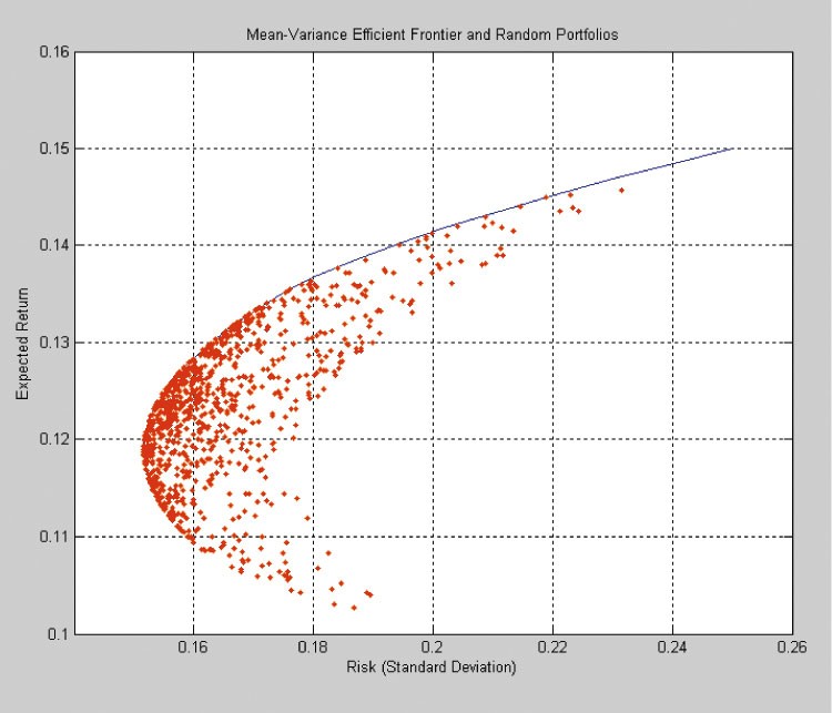
The efficient frontier for the set of assets you choose to be your universe is the set of portfolios that can be assembled from that universe whose expected returns are superior to all other feasible portfolios with equivalent levels of risk. They are efficient on a reward to variability basis, which is the essence of modern portfolio theory, which uses mean-variance (MV) criteria to identify the efficient frontier.
As they say, one picture is worth a thousand words, so I’ll get right to the graphical presentation of the efficient frontier. The following tables and graph were generated from the data for our four-asset portfolio, which I’ve included above the new table along with the correlation and covariance matrixes. The correlation matrix is shown for your reference. The covariance matrix was used to compute the portfolio standard deviations.
In practice, this exercise should be performed with monthly returns. I used annual returns simply because it made it possible to show all the data in one small table that could be viewed on the same screen as the correlation and covariance matrixes.
Note: Portfolio variance is calculated by multiplying each cell of the covariance matrix by its respective weights then taking the sum of all the numbers thus computed: Vp = Sum WiWjCov(i,j). Portfolio standard deviation is simply the square root of the variance.
Click on the chart for a full-screen view. (Opens in new tab/window.)
Before I go any farther, I’d like to say that you don’t necessarily need to learn how to do this. But having a basic understanding of it will really help you understand investing, especially the effects of diversification. Just having a portfolio that is diversified across many asset classes will in itself take you a long way toward efficiency. For instance, look at the evenly weighted portfolio (#34). It’s nearly on the efficient frontier; that was probably just luck, but it worked pretty good. On the other hand, there’s a line of sub optimal portfolios (#26 — #1) that one could easily have picked, as they are all heavily weighted toward the large-cap growth fund. Given the selection, most investors probably would have over-weighted this fund, as it’s close to representing the S&P 500, which is something everyone is familiar with and therefore comfortable with. Anyway, don’t get spooked and run off on me now that you’ve come all this way.
The little table at the top is the same table used in the four-asset portfolio example. The larger table was generated from the smaller table and the covariance matrix. The first column of the larger table is simply a number identifying the portfolios. The next four columns are weights for the components of the 38 portfolios. The four weights for each portfolio sum to 1.00, i.e. 100%. There’s nothing special about the weights, I just varied them in roughly 5% increments down and across, and added the minimum-variance portfolio (#13) and the equally weighted portfolio (#34). The weights were then applied to the returns in the small table to compute weighted average returns for each year and the expected return was then computed as the average of the weighted average annual returns. The next column is the portfolio standard deviation, which was computed using the weights and the covariance matrix as explained in the note below the table. Finally, the Reward to Variability ratio, which is the slope of the Capital Allocation Line (CAL), was computed from the expected return, standard deviation and risk-free rate: Slope = [E(r) — r*]÷s.
A point for each of the 38 portfolios was plotted on the graph with its ID number printed under it, plus I noted the four single-asset portfolios, which are numbers 1 through 4. You should see a fairly well defined ‘C’ shape around the perimeter of the points. The upper part of the ‘C’ is a good approximation of the efficient frontier for this group of assets. The lower half of the ‘C’ is inferior to the upper half. For example, #4 and #25 have the exact same standard deviation, but portfolio #25 has an expected return of 10.4% while #4 has an expected return of only 5.7%.
I could have generated the true efficient frontier by holding the standard deviation constant at 0.5% intervals and solving for the maximum-return portfolio at each interval. But if I had done that, you wouldn’t see any of the inferior portfolios, which I think is instructive. And there are enough points to define the efficient frontier fairly well.
The minimum-variance portfolio (#13) defines the left end of the efficient frontier. From there you can track the efficient frontier by connecting the highest points out to #2. The string is: 13, 17, 21, 25, 30, 27, 23, 19, 15, 10, 6, 2. #2 is special. It is the only single-asset portfolio on the efficient frontier and it is the last portfolio on the efficient frontier, which is not a coincidence. It has to occupy this position because it has the highest expected return of all the assets and is therefore the only option for attaining the highest return without leverage, i.e. buying on margin.
The horizontal green line represents the risk-free rate of 5%. It is the baseline from which all risky assets are measured by their excess returns.
The steeper of the two sloped lines (blue) is the optimum CAL. It passes through #21, which has the highest Reward to Variability ratio, which is the slope of the CAL. CALs with steeper slopes are not feasible with this set of assets. Portfolio #21 is the optimal risky portfolio, as it has the highest Reward to Variability ratio. Investors that prefer less risk than the 4.3% standard deviation of this portfolio can blend the appropriate amount of the risk-free asset with the optimal risky portfolio to attain the desired level of risk, as was explained in the discussion of the CAL .
Investors seeking higher returns at higher levels of risk should invest in portfolios that fall on the efficient frontier between #21 and #27 (they are not limited to the points shown, the efficient frontier is a continuum), beyond #27 they should increase their holdings of portfolio #27 by buying on margin, thus following the shallower-sloped (red) line to the right of #27. Again, the appropriate amount to buy on margin to invest at a given level of risk can be computed as described in the discussion of the CAL .
This example was done using historical data. Although past volatility is usually a pretty good predictor of future volatility, it is always preferable to use expected future returns that were estimated by some means other than averaging historical returns, if you have access to such projections or feel confident in making your own projections. If you must use the past to predict the future, try to find enough data to cover at least one full market cycle for the assets whose future returns you are estimating. For instance, if you estimate the performance of technology stocks from the past ten years (1997-2006) you’ll probably be way off. In this case, you should look for a long period of relatively consistent returns and volatility then decide if it’s reasonable to assume that technology stocks will return to that pattern. Industry analysts’ opinions can be very helpful in these situations. And remember to use the sample standard deviation and covariance if you are using historical data and the population standard deviation and covariance if you are using future returns that were estimated in some manner other than simply projecting historical returns.
I realize that this is a lot to digest and certainly much more than most of you will be inclined to do. But you should at least take the time to understand the basic concepts presented here, as the concepts that explain the efficient frontier and modern portfolio theory provide a good insight to the construction and functioning of real portfolios.
1 2 3 4 5 6 7 8 9 10 11 12 13 14
Section Intro Next Section


