Stock Market Charts Comparison Of Line Bar and Candlestick Charts
Post on: 17 Июль, 2015 No Comment
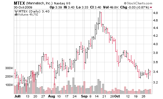
Different types of stock market charts are used in technical analysis. Most widely used are line, bar and candlestick charts.
Stock market charts are an easy-to-read graphical representation of the past price performance. Looking at the chart is one of the first steps in analyzing stocks, to get the very first filling how successfully the company is running its business; in more advanced technical analysis charts are used to identify the stock market trends, trend changes, price variations, institutional trading and many other such critical measures.
While there are many different types of stock market charts available in financial analysis, three of them are most commonly used: the most basic line chart and two more advanced, bar and candlestick chart.
Line Chart
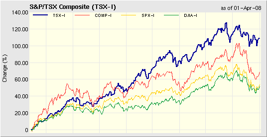
The most basic type of stock market charts is the line chart, which is connecting the stock’s closing price over the timeframe. The most often viewed timeframe for stock charts is daily period. If we are looking at a daily chart, the closing price for each day is plotted and connected by a single line from one day to the next; for weekly charts, the closing price for the week is used, and when looking at monthly charts, the closing price for the month is used.
Line charts are very easy to read and understand. They are usually used over longer time scales to present a stock movement and to help you determine the current trend. Line charts are not used for predicting possible future movement of the stock, since they don’t provide any information about the trading range during each time frame; they only show you one piece of information and that is the closing price of the period.
It is also possible that line chart is connecting the open, high or low prices over the timeframe, but this is rare, since the closing price is considered to be the most important price of stock data. You have probably heard that amateurs are opening the market, while professionals are closing it.
Bar Chart
A more complex type of chart is the bar chart. It expands information of each data point to the open (O), high (H), low (L) and close (C) price in the given period. That is why this type of stock market charts is also called OHLC charts.
A bar is a vertical line for each time frame, presenting the price range between the minimum (low) and maximum (high) price for the time period being displayed. On the left side of vertical line there is a small horizontal dash, which is showing the stock opening price. On the right side of the vertical line there is also a small horizontal dash, but this one is presenting the stock closing price.
Bar charts can be colored to show whether the price rose during the timeframe (green) or fell (red). If the left dash representing the open price is lower than the right dash representing the close price, the bar is colored green, because the stock has gained in its value and vice versa.
Investors and traders use this type of stock market charts for more in depth technical research, since there is a lot more information available in bar than in line charts. You are able to see the trading range of the timeframe and not only the closing price. This additional piece of information can help you determine typical volatility of the stock in given time frame and it clearly tells you who won the battle in that specific period, the bulls or the bears.
Candlestick Chart
Candlestick charts originated as a form of Japanese charting and are similar to bar charts. Each candle consists out of the body and the shadows. The length and position of the candle body determines the open and closing prices of the stock and shadows represents the stock’s high and low values similar to the bar chart. The weekly candlestick for example represents Monday’s open, the weekly high-low price range, and Friday’s closing price.
The body of the candle is usually colored depending on the day’s price action. A candle body is colored with red when the closing price is lower than the opening price. When the closing price is higher than the opening price, it is usually displayed with a green solid body. Other colors and fills are also possible (black and white for example), depending on your charting program — there is unfortunately no standard for use of colors in this area.
While bar and candlestick types of stock market charts are very similar in presenting the same piece of information (open, high, low, close), there is one clear advantage of candlesticks over bars — colored candle bodies are much easier to read, thus letting you feel the market much more quickly.
Which Type of Chart Should You Use and When?
Each type of chart has its own benefits and drawbacks. Learning about each type and their capabilities will enable you to choose the right one based on your trading style. I personally recommend using simple line charts for quick historical review of a stock’s price and when you advance to more detail research, you should move to bar or candlestick charts. Remember, the shorter your investment horizon is, the more important become advanced OHLC charts; I personally prefer candlestick charts over bar charts, since they combine the ability to show complete information for each timeframe with a shape that is much simpler and clearer to read.
Looking at charts can take a lot of your time. On your way to professional investing consider ordering a professional tool for charting; it can save you a lot of time and money.
Recommended Reading — Recommended Reading — Recommended Reading — Recommended Reading


