Stock Charts and Other Line Chart Tricks
Post on: 16 Март, 2015 No Comment
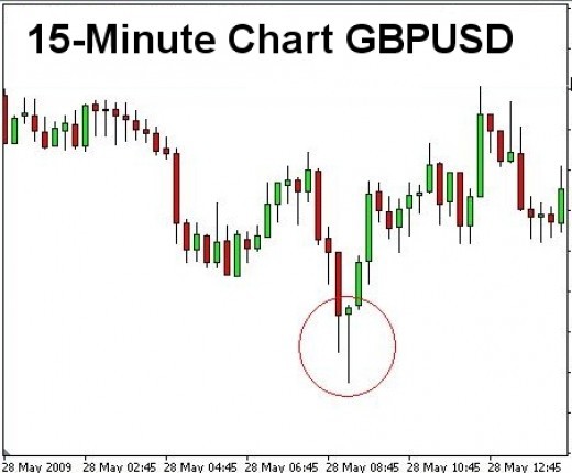
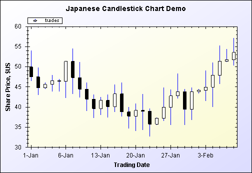
This page explains how to use Excel’s candlestick-style OHLC stock charts, how to make your own using built-in line chart features (high-low lines and up-down bars), and how to combine line chart and XY chart series to produce stock charts with open and close tickmarks, so you can dispense with the candlestick chart’s up-down bars altogether.
OHLC Line Chart
OHLC Line-XY Combo Chart (dual axes)
OHLC Line-XY Combo Chart (shared axis)
OHLC Line-XY Chart with High-Low Lines
Error Bars Make Great Tickmarks
Completed Stock Chart
A Proper Stock Data Table
As with all Excel charts and many other Excel features, it is important to get the data right. Five minutes spent with the data will save five hours down the road. A stitch in time saves nine.
The following table exemplifies good stock chart data. The table does not have to start in cell A1, but wherever it starts, it should contain no blank rows or columns. The first row should contain clear labels. Dates are shown here in the first column, but this could be any type of category data (such as company names), or even absent (not what I would consider a best practice). If the first column does not include data which are obviously dates or text, the label in cell A1 should be deleted. A blank cell in the top left of a chart’s source data range helps Excel to parse the range appropriately, by signifying that the incomplete top row and left column are different from the rest.
The Y values should be in Open-High-Low-Close (OHLC) order. Or in OLHC order. Most important: the Open data should be first and the Close data last, because up-down bars compare the first and last line series at a given category or date. High and Low lines connect the high and low values among all of the line series at a given category or date, so the order of the High and Low columns is less critical as long as they don’t interfere with the Open and Close series. When you add a series such as a market index or a moving average to a stock chart, you should add it as an XY series or on the secondary axis so it doesn’t interfere with the high-low lines or up-down bars; see Stock Charts with Added Series for the protocol.
The Tick data in column F is used in OHLC Chart with Open and Close Ticks below, where it is used as data for the Open and Close tick marks.


