Market’s Bill of Health Long Term Intermediate Term Trends Continue to Improve
Post on: 29 Апрель, 2015 No Comment
Long Term & Intermediate Term Trends Continue to Improve
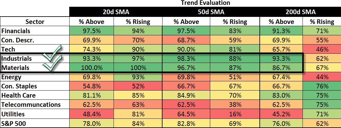
With global QE in effect and stocks rallying in response, our long term and intermediate surveys continued to improve with the long term outlook firmly in the bullish camp (>60%) with 75.2% of the S&P 500 members in long-term bullish patterns, with the intermediate outlook also continuing to improve with 66% of the S&P 500 members in confirmed intermediate uptrends.
* Note: For further explanation of the market surveys and background on analysis, please click here .
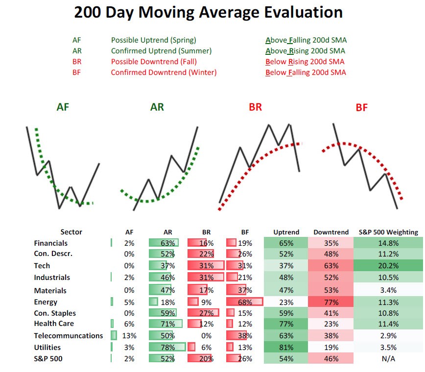
200 Day Moving Average Evaluation – Long Term Trend Determination
As shown in the table below, the net percentage of stocks that are in long term uptrends increased to 75.2% while the percentage of stocks in downtrends decreased to 24.8%. In terms of sectors, the telecom sector lost the top spot to the financial sector which saw the percentage of its members in uptrends increase to 90%. The absolute worst sector is energy as only 64% of its members are above their 200 day moving averages.
Moving Average Trend Analysis (MATA) – Intermediate Term Trend Determination
We saw a further improvement in the MATA survey for the S&P 500 in which the percentage of stocks in uptrends increased from 62% to 66%. The percentage of stocks in intermediate downtrends remained at 16%, with the percentage of stocks with no discernible trend came in at 18%.
52-Week Highs and Lows Data
The data for the S&P 500 for 52-week highs and lows shows broad-based strength with both cyclical and non-cyclical sectors participating. The greatest breadth in terms of new highs is the consumer staples sector leading the pack with 32% new highs in last month, with financials coming in second with 28%. The most important point is that every sector now has new 52-week highs exceeding the percentage of new 52-week lows as market breadth expands to the upside and the overall market health continues to improve.
Source: Bloomberg
Sector & Asset Class Rotation
Below is the relative rotation graph from Bloomberg that shows both the relative momentum and relative performance of assets versus a benchmark. Numbers north of 100 show improving relative momentum while numbers below show weakening relative momentum to the benchmark, and numbers to the right of 100 show outperforming assets and to the left underperforming assets.
Market Cap Rotation
Over the last quarter we have seen a continued rotation from mega cap issues (S&P 100, OEX) and into smallcap (S&P 600, SML) and midcap issues (S&P 400, MID) which reflects the market’s growing risk appetite. The real improvement over the past few weeks has been seen in the midcap space as its relative momentum (vertical movements in rotation chart below) has seen the biggest jump.
Sector Rotation
Over the last few weeks we can see a major shift in relative performance of non-cyclical sectors versus cyclicals sectors (risk off vs risk on) with financials showing the greatest improvement as it has moved from weakening momentum and lagging the S&P 500 (lower left quadrant) to lagging but improving (upper left quadrant). The greatest deterioration has been seen in the non-cyclical sectors like health care, consumer staples, utilities, and telecommunication (yellow lines) as they have moved from being market leaders with improving strength (upper right quadrant) to market leaders and weakening strength (lower right quadrant). Early and late-stage cyclicals have shown improvement as they are following in energy’s footsteps, moving from lagging and weakening (lower left quadrant) to lagging and improving (upper left quadrant).
Fixed Income Rotation
Just as there is a clear rotation to risk assets in market cap performance and sector relative performance, we are seeing the riskier classes within fixed income outperform US Treasuries as high-yield, corporate bonds, preferreds, municipals, and emerging market bond funds are all gaining ground on US Treasuries as investors appetite for risk grows even in the fixed income sector. Over the last quarter the emerging bond market (EMB) is now outperforming the UST market (TLT), with investment grade corporates (LQD), high yield (HYG), and preferreds (PFF) also moving close to outperforming UST’s on a trailing quarterly basis.


