Introduction to Stock Charts
Post on: 11 Июнь, 2015 No Comment
Trade what you see, not what you think you’re going to see.
The basics of stock charts will be covered in this module. You’ll not only learn how to read them, but also become keenly aware of what to look for.
Technical analysis is the formal name for analyzing stock charts .
There are some traders who are pure technical analysis traders.
They use the chart and nothing else.
Maybe you’ll find that’s the trading style that works for you, maybe not.
You have to find what works best for you. No matter what anyone else says, find what works best for your personality and trading style.
If you’re like my wife who thinks a stock chart looks like a hospital heart rate monitor then you’ll be relieved to have this module in the line up. I too wondered what all those squiggly lines meant when I first looked at a chart.
The funny thing is that out of all the courses I paid for, not one of them showed me how to read a stock chart. I kind of just figured it out on my own. Now that I’ve learned it’s time to give back and share what I know.
A stock chart can provide you with a wealth of knowledge as long as you know and understand what you’re looking at.
Basic charting knowledge combined with other stock indicators can immensely improve your trading skills.
How to Read a Stock Chart
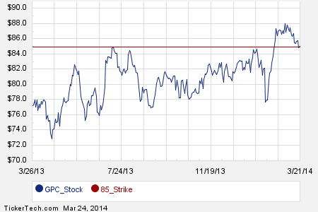
A stock chart is simply a graphical representation of the stocks price over a set period of time.
Let’s pull up a chart and go over the key areas. For our example we will be using the chart of Potash Corporation. When you first look at a chart there are 4 key areas you want to become familiar with:
- Identification Section
- Time Frame
- Volume
- X and Y axis
Identification
- Company Name: Potash Corporation
- Trading Symbol: POT
- Stock Exchange Where Traded: New York Stock Exchange NYSE
- Current Date: 2/23/09
- Days Price Change: opening price: $85.91, day’s price high: $86.65, days price low: $76.19, closing price: $76.24
- Volume: 15.4 million shares of the stock were traded on this day
- Change: this is the days dollar change compared to yesterday’s closing price. So this stock had a -$7.72 (-9.19%) decline in price from yesterdays closing price.
Time Frame: (3 months) according to how the chart is set up we are looking at three months worth of price movement. This can be changed and is highly recommended. Looking at a 3-6 month chart is necessary if you only plan on staying in a trade for a relatively short period of time.
However, expanding the time frame out to 1-5 years will give you a different perspective on the stock. This will be later explained in the Trading Options module.
Volume: Stock volume is a measure of the number of stock shares that have been exchanged or traded within a specific period of time. It’s essentially how much buying and how much selling was going on within that period of time.
Volume is often called the heart of the stock market. It lets you know how much force is behind the price movement of the day. When you see large spikes in volume it means many traders were involved in that movement. So it solidifies or confirms that the move should be taken seriously.
X and Y axis: the X axis is the bottom portion of the graph, running horizontally, and it flows left to right. It’s the portion of the graph that has the time frame that you are looking at. The left side is the past and the right is the present. We use the past as a reference, but we trade from the right side of the chart. We trade what we see now.
The Y axis is the right side of the chart, running vertically, and flows top to bottom. This portion of the graph has the price action. So for our time frame we can see that this stock has been in a price range of $50-95 for the past 3 months. This is a pretty large price range and a highly volatile stock .
Now that you have learned the basic key areas of every stock chart let’s go over the 3 basic types.
3 Basic Types of Charts
Technical analysis (stock charting) is used to look at past price behavior in an attempt to determine where prices are headed in the future. There are three basic types of charts used by traders:
- Bar Charts
- Line Charts
- Candlestick Charts
Depending on your trading style each chart serves its own unique purpose. Bar charts are more commonly used and line charts the least.
Candlestick Charts are in a sense the new kid on the block, even though they have been around for awhile. They are rapidly gaining popularity among traders and have become a favorite of many.
I’m a bit old fashioned, I use bar charts.
Module 4: Stock Charts


