Intermarket Analysis
Post on: 23 Август, 2015 No Comment
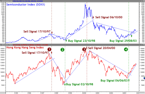
It is generally accepted that there is a relationship, or a measurable correlation between certain markets. There have been many articles, books, and trading approaches based on inter-market relationships. If you turn on the financial news you will usually hear an explanation such as the stock market was down today because crude oil was up, or maybe the stock market was up today because crude oil was up. It can even get more complex. You might hear something such as the stock market was down today because crude oil, being up sharply today, caused the bond market to be down. With the bond market down and interest rates up, the stock market was under pressure and down it went. Etc. Etc.
I find it a good idea to question everything, especially commonly held beliefs. Since a picture is worth a thousand words I will get right to the charts and you can draw your own conclusions.
In the chart above youll see a line of the closing prices of the S&P 500 cash in the upper graph, and under is the Dow Jones Industrial Average. These are line charts of the daily closing prices going back about a year. The indicator in the bottom subgraph is a simple correlation study. It is available on most spreadsheets such as Excel, as well as charting packages such as TradeStation, which is the one I am using. The study tries to find a correlation between two data series. If it finds a positive correlation the dark red line will go as high as + 1.0. That would be a perfect and positive correlation between the two series of prices. If it finds a perfect correlation, but inverse, or negative then it will draw the line at 1.0. The perfect positive and negative correlation reference lines are the bright red lines at the top and bottom, +1.0 and –1.0. The dashed lines are at the +0.7 and –0.7 levels, which would represent a reasonably good correlation, positive or negative respectively, between the two samples. The solid purple line in the middle is the zero line, which would show no discernible correlation between the two samples. So anything above the upper dashed lines would show the two markets to be highly and positively correlated, and anything below the lower dashed lines would also show a highly correlated relationship, but inverse, or a highly negative correlation. And anything in between the dashed lines would show little correlation, especially if the indicator line (in dark red) were to spend much time around the zero line. Also, if the correlation line went from one end to the other frequently, the correlation would be unstable and probably useless for trading.
You can see in the chart that the S&P 500 and Dow Industrials are highly correlated, as one would expect. I show this chart only to show what a highly correlated market should look like. The dark red indicator line spends most of the time above the .70, or 70% level. There was one dip that occurred when large caps started gaining on the rest of the market, but the correlation resumed after a few bars.
In the above chart the S&P 500 is again shown, this time with the Nasdaq 100 QQQQ ETF. It too is highly correlated on most of the chart. There are a few deeper dips in the correlation as the high tech stocks lagged the general market advance a couple of times.
These charts were shown to demonstrate what two generally correlated markets should look like in the indicator. The most widely accepted correlation for as long as I can remember is the inverse correlation between stock prices and interest rates. It is assumed and generally accepted that as interest rate go higher, that stock prices go lower. Lets see.
The chart above shows the same S&P 500 Index on the top. Under the S&P is the 10-Year Treasury Note yield. If this were the 10 Year Note futures prices one would expect the correlation to be positive, but since I’m charting the actual yield and not the note prices, the correlation should be negative, but still highly correlated. You would expect the dark red line to be under the bottom dashed line if this is the case.
You can clearly see that the 10-year yield shows little correlation on a daily basis going back a full year. Maybe on a monthly chart going back 20 years you would see periods of correlation. Since I’m dealing with the current market on a daily basis on this blog I thought it best to present data relevant to what is being discussed here. Maybe 30-year yields are the key. Lets see.
Again, no correlation is evident. With all the talk about yields being the key to the stock market, something should work. Maybe the short term 13-week yield. Lets have a look.
The 13-week yield does approach the 70% level in April, which would be the opposite correlation we were looking for. It touches the -70% level in July for one bar, so it was inversely highly correlated for a brief moment.
Even Gold and Silver in the chart above had many period of non-correlation. The fundamentals can affect each market individually and break the correlation. Ultimately the positive correlation returned in this case. Certainly Gold and Crude Oil must be highly correlated. That should be obvious. Again, lets see.
In the above chart the pit sessions of Gold and Crude Oil show these two markets display little relationship. And why should it? Crude has many fundamentals driving it right now. The only fundamental driving Gold at the moment is the falling dollar. The dollar would be highly correlated, inversely, right now, but if you were to look at these relationships in another year you might find Crude and Gold highly correlated and Gold and the dollar showing no relationship. Relationships change. Just when you think youve found a perfect marriage in the markets, they get divorced.
Nearly every day in the financial news there is worry about high oil prices affecting the stock market. If so then there should be an inverse, but high correlation between the two, much like yields and stock prices. The following chart has the answer over the last year.
Above is the chart of the S&P 500 and the Dow AIG Commodity Crude Oil Index. There was not one instance over the past year where the correlation went to –70%. In fact the correlation oscillated fairly evenly around the zero, or the no correlation line.
What does any of this tell us? Is the much-touted inter-market analysis a waste of time? In a word: yes.
Many trading systems were bought and sold based on inter-market relationships. Every one of them now is most likely worthless. The problem with those systems, and inter-market approaches in general, is they were designed on relatively small samples of data. If they used much larger samples of data they most likely would not find the inter-market relationships they thought existed to be stable and robust. When an inter-market relationship becomes obvious to everyone, its on its way to becoming useless. What everyone knows isnt information that helps make successful trading decisions.
Even if you could find a long lasting, inter-market relationship, how would you use it? I assume the purpose of that analysis would be to find an edge by figuring out which market was leading the other. How can you tell which is leading, if indeed one does lead. You can try to guess at the fundamentals, but that would be a guess about the future. Why not just trade the market you are guessing about and not compound the situation by assuming the guess, if correct, will affect the other market in the way desired. You might be right in your guess, but wrong by assuming the relationship between markets will play out the way you anticipated.
There is even a long held belief that stock market averages influence most of the direction of individual stocks, some say by 70%. This may be true to some extent, which is why I concentrate most of my energy on trading just the indexes rather than trying to be a stock picker. But there are many instances of stocks going down in up markets and stocks going up in down markets. If I were to go long or short a stock I would analysis that stock individually. If my analysis of the overall market were in opposition to my analysis of that individual stock, I would trade that index in the direction of its own signal. I would treat each separately.
My conclusion is that each market should be charted and analyzed individually. Inter-market relationships are fun for discussion, and for financial journalist, but I dont believe they can help in making trading decisions.
ADDED NOVEMBER 10th 2007:
The chart above was just added per request. It is a correlation study of the 13-week Treasurey bills and the 10-year Treasury notes from Nov 2006 to Nov 2007, run on daily data. On most of this chart there is little evidence of correlation, although in mid-August there was evidence of better than 70% correlation briefly. You could see the improving correlation starting in July. In April the correlation almost went negative. A faster parameter would have picked up the changes in correlation a bit faster, but could also have given misleading signals.


