Indicators and Oscillators
Post on: 2 Июль, 2015 No Comment
Indicators are used to show you trends, momentum in stock price movements, and whether money is coming into a stock in the form of buying or out of a stock in the form of selling.
The main issue with indicators is that since they are calculated over time and use data from past time periods, most of them lag actual market performance. For this reason by the time an indicator is telling you something, it might already have become obvious. If it hasn’t, pay attention.
The majority of indicators have number values that are bounded between 0 and 100. Bounded indicators are called oscillators because they oscillate (go back and forth) between 0 and 100. Generally speaking oscillators showing values close to 100 show that the stock is currently overbought and if the value is closer to 0, it shows that the stock is currently oversold .
Unbound indicators provide buy and sell signals (usually lagging) by showing crossovers (similar to moving averages) or divergences (differences between price trends and indicator trends). Since you need to see the actual price and volume movements in order to compare them to what the indicators and oscillators are telling you, they are shown either above or below the price action on the stock chart.
Let’s get into some actual indicators and oscillators:
Moving Average Convergence Divergence
Since you’ve already went over moving averages, we will start with the moving average convergence divergence (MACD) indicator, one of the most commonly used indicators. MACD is calculated by measuring the difference between two EMA’s (exponential moving averages). MACD has a centerline at which the two EMA’s are equal, and compares the two different EMA’s to see how the stock’s long-term momentum compares to its short-term momentum.
When MACD is in positive territory, it shows that the short-term momentum is “up” compared to long-term momentum. When MACD is in negative territory, it shows that the short-term momentum is “down” compared to long-term momentum.
When the short-term momentum component of MACD crosses the long-term component of MACD to the upside, this is the “buy” signal. One the other hand when the short-term component crosses the long-term component on the downside, this is the “sell” signal. The default or most commonly used EMA values of MACD are 12-day for the short-term and 26-day for the long-term. Let’s see it in action:
Bollinger bands
Bollinger bands are another extremely popular indicator used to identify stocks that are either overbought or oversold . Generally speaking Bollinger bands are used to generate sell signals when the stock price touches the upper Bollinger band and buy signals when the stock price touches the lower Bollinger band.
If a stock is trading in a price range, Bollinger bands work quite well for giving valid buy and sell signals. If the stock is trending strongly either up or down, Bollinger bands don’t perform very well because they are calculated as a deviation from the norm (or average) price. A stock that is being bought up heavily can stay at the upper Bollinger band for some time and a stock that is being sold off can stay at the lower Bollinger band for some time.
Let’s look at some examples of Bollinger bands in action in a stock that is trading sideways in a price range that also has a strong uptrend showing false sell signals:
As you can see if you were to buy at each green arrow and sell on each orange arrow, you could have made a lot of money trading Google back and forth over since November / December of 2011 to April of 2012. Starting in mid-March the stock was bought up and was touching the upper Bollinger band for around 10 trading days, resulting in many false sell signals that could have led you to sell early. Sometimes it pays to wait until the stock price has moved in the opposite direction from the Bollinger band before acting on the signal.
Money Movement Indicators
Perhaps some of the most useful indicators let you know whether money is moving into or out of a stock. We will feature some of these types of indicators in this section, starting with the Accumulation / Distribution Line.
Accumulation / Distribution (AD) Line
The AD line is a very popular indicator that is designed to measure whether money is moving in or out of a stock. It does this by comparing the volume of shares traded in a stock to the stock’s high, low and closing prices. For example if on the start of a trading day the opening price of the stock was $600 and it traded lower from there all day, ending at $590, money was flowing out of this stock (a distribution of shares by those who owned it). If the stock price opened at $600 and traded higher from there all day, ending the day at $610, money was flowing into the stock (an accumulation of shares by those who wanted to buy in). Putting these data points on a line shows traders whether the trend in the AD line is up (stock is being bought up) or down (stock is being sold off).
Let’s see an example of the AD line in action:
On-Balance Volume (OBV)
On-balance volume calculates volume flows in a stock and was designed in an attempt to predict when major moves in a stock’s price were about to happen. The thought process behind this is that if volume increases or decreases by a large amount and the stock price doesn’t move much, it’s bound to break out in one direction or the other because eventually there will not be any sellers (or buyers) left at that price. Let’s see how OBV did in this case:
As you can see, changes in the trend of OBV often signal trend changes in stock prices.
Relative Strength Index (RSI)
RSI is another momentum indicator used to determine whether a stock is overbought or oversold . RSI ranges between 0 and 100, with values close to 100 (usually 70 or above) indicating the stock is overbought and due for a correction and values closer to 0 (usually 30 or less) indicating that the stock is oversold and due for a bounce.
The default time period for RSI is 14 days, which can be adjusted to a lesser time period in order to identify changes in short-term trends or increased to a greater time period in order to identify changes in longer-term trends.
Let’s see RSI in action:
As you can see, RSI is all about anticipating reversals. Google only actually entered overbought territory once in early January but each time RSI reached either the top (overbought) or bottom (oversold) line and started to move in the opposite direction, the stock price moved drastically.
Chaikin Money Flow (CMF)
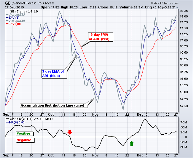
Chaikin Money Flow is a bounded oscillator (between 1 and -1) that measures whether buyers or sellers are moving the stock price. When its value is positive it indicates that buyers are pulling the stock price up and when it is negative it indicates that sellers are pushing the stock price down. The indicator is meant to either confirm trends or call them into doubt. For example if a stock has been in an uptrend and CMF is negative, the strength of the uptrend is questionable. On the other hand if the stock has been in a downtrend and CMF is positive, it may be an early sign of trend reversal.
The indicator can cross the 0 line frequently and often ends up giving false signals. For this reason most people who use CMF as an indicator filter out weak signals by ignoring any bullish (buy) signal of less than 0.05 or even 0.1 and ignoring any bearish (sell) signal until the indicator goes to less than -0.05 or even -0.1.
Another thing to keep in mind with CMF is that it takes the high/low range of a stock into consideration within that trading day, but doesn’t compare that high/low range to previous days. If a stock gaps up or down (opens higher or lower than it ended the previous day by a wide margin), CMF can become disconnected and show you the opposite of what is really going on. An example of CMF is shown below:
Overall CMF is a great tool in certain situations but because of the way it is calculated it can’t be relied upon as a standalone indicator, and is best used in conjunction with other indicators. As you can see in mid-late January the stock gapped down significantly from $640 down to $590 and CMF was slightly positive. The only signal given by CMF here that ended up being correct was when CMF went above 0.1 in February, signaling that money was flowing into the stock. CMF stayed positive right up until the stock price fell off a cliff in mid April sending it down from just under $650 to under $610 over the course of two trading days!
Williams %R
Williams %R was invented by Larry Williams (ireallytrade.com, Larry TV), the man who turned $10,000 into over $1.1 million over the course of a year in a real-money trading competition back in 1987. When a lot of you were still playing with GI Joes (or Barbies) this guy was making real money and inventing indicators so he make even more money.
Williams %R is calculated by comparing the closing price to the high-low range the stock has been trading at during the “look back” period, which is the number of days in the past that Williams %R is set to look at. The number that Williams %R comes up with oscillates between 0 and -100. 0 to -20 indicates that the stock is overbought and -80 to -100 indicates that the stock is oversold .
If a stock is overbought according to the Williams %R indicator, the stock is trading close to the highest point it has been recently. If a stock is oversold according to the indicator, the stock is trading close to the lowest point it has been recently. Just because a stock is overbought or oversold doesn’t mean its going to swing the other way. In a strong uptrend a stock can stay in overbought territory as the stock price continues to move higher. In a strong downtrend a stock can stay in oversold territory as the stock dives lower.
If a stock moves down from overbought and isn’t able to get into overbought territory again, it often signals a downward trend change. If a stock moves up from oversold and isn’t sold down into oversold territory again, it often signals an upward trend change.
Generally speaking, a move above -50 after an overbought reading is a positive sign for the stock price and a move below -50 after an oversold reading is a negative sign for the stock price. An example of Williams %R is shown below:
In this case buying on the first sign of oversold (red shaded area below -80) and selling on the first sign of overbought (green shaded area above -20) would not have steered you wrong. You would have missed out on large portions of the up-swings and down-swings but you wouldn’t have lost anything.
Putting it all together
Now that you’ve seen some different indicators and oscillators, it’s time to talk about what the pros do. The pros don’t just use one at a time. They mix them up and try out different combinations, maybe even using different combinations of indicators for different stocks in different industries. They back-test strategies by looking at what signals the indicators are giving and see how “right” they would have been in the past. Mix them, match them, have a look at a few new ones, and find out what works for you!
Now that you understand the basics of technical analysis its time to moving into Candlestick Patterns


