How To Use ETF Forecasts Of Prices By Market Makers
Post on: 2 Июнь, 2015 No Comment
Summary
- Yes, to get capital appreciation, but also to:
- Balance risk vs. reward prospects.
- Assist asset allocation diversity.
- Further geographic diversification objectives.
- Diversify investment strategies.
Getting market makers to tell you what they think
It’s not easy. How many of them do you know?
Even if you happen to be an investment professional, you may not know that you know some. They habitually hide their true activity because what they do is 1) valuable, 2) influential, 3) timely, 4) sensitive, 5) profitable, 6) delicate, 7) intricate, 8) none of your d*mn business, and 9) they sure as h*ll don’t want you in their way in the markets as they do it.
Their employers’ sales staffs will readily tell you — stories. Stories of what they want you to think, because it came from — the inside. Misinformation can be helpful in (their) getting things done. So can disinformation (outright lies) but that carries the eventual risks of lawyers, fraud charges, and reputational damage. Even so, sometimes it happens.
Just the facts, Ma’am.
Market makers ((MMs)) help big-money investment organizations adjust their portfolios to the changing world as it appears to be evolving. Trouble is (for the portfolio manager running a multi-billion-dollar fund), even moving one percent of the assets often strains the market. A single-trade ticket of $10-50 million puts players in most single-issue crowds of observers — even electronic ones — on heightened alert, and some into actions not likely to favor the fund PM.
So the volume MM is charged with, the opportunity to make a fat fee by matching up buyers and sellers quietly, on the sly. He knows who owns the stock, who has an appetite, and who may be looking to lighten up. They all have price limits on what they are willing to do. But the world is changing and the MM’s job is to find out by how much, and which way, since the time it was done (perhaps by him) at the last trade in size. Done maybe yesterday, maybe just this morning.
Usually the balance between buyers and sellers at the moment and a price, don’t match up to permit a cross where the MM can fill the trade order for the client easily. Instead, he typically may have to put up some of the firm’s capital to temporarily own or be short the stub end of the shares to bring the deal into balance.
That facilitation puts the MM firm at risk. Risk that the market quote will move against the MM firm’s interest before the house can lay off their position gradually enough to not make the risk any bigger.
So before the risk is taken and the deal gets done, the block trade MM queries his firm’s options desk to price the cost of laying off the potential risk through an inter-markets trade in options, futures, swaps, or any other derivative securities that will most efficiently do the job. Those markets are all connected in ways that could make Spidey delirious on their web.
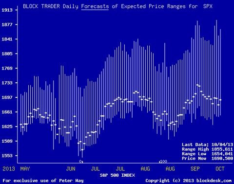
Fortunately, for us, the protective actions needed, for many stocks and ETFs, on a regular basis, leaves telltale footprints in those insurance markets. What the MMs are willing to pay for protections, and the way the deals are structured, tell just how far the MM community believes each security’s price is likely to get pushed — both up and down — in the near future.
O.K. so what do we do with these forecasts?
First, we need to test them out to see how good they have been in the past. Since the forecasts take the form of prospective price ranges, they can be compared with the market quote at the time of the forecast. That lets us split the forecast range into two parts, an upside prospect to the range top, and a downside exposure to the range bottom. The balance between upside and downside turns out to have useful strategy implications.
Here is an illustration of that effect, using ProShares UltraPro Russell 2000 ETF (NYSEARCA:URTY ).
(Used with permission)
To simplify handling this upside/downside business, we have a single figure, comparable between all issues, that we call the Range Index. Its value is the percentage of the whole price range that lies beneath the current market quote. A security whose price is at the middle of the range has a RI of 50, one with 3 times as much upside as downside has a RI of 25. Outliers can go from negative RIs on the under-priced side to over 100 when over-priced (as MMs see them).
Our firm keeps a history of stock and ETF forecasts, implied since the year 2000 from the MMs’ intelligent hedging behaviors on over 2500 actively traded and widely-held equity issues. We subject that population’s forecasts each day to a standard, Time-Efficient Risk-Management Discipline [TERMD] that produces several important measurement results.
I get risk-management okay, but why time-efficient?
Because of the three investment essentials, capital, time, and perspective, time is the most precious. Precious because once it is spent, it can’t be recaptured, recycled, or expanded. Whenever you commit capital to an investment, time is also committed. If a long-term investment of capital fails, so does the time spent fail. The capital may be replaced by more capital, but the time, perhaps years, cannot be.
That causes us to set inflexible price targets to be achieved within time limits of equal inflexibility. If a target is reached before its time limit, the capital is liberated, the gain taken, and both are reinvested in a new mission to compound the next results. If the target is elusive, when the time limit is reached the capital is liberated regardless of gain or loss, and is recommitted promptly into a new investment assignment. No time extensions are permitted, and no interim panic liquidations are permitted.
The result of this discipline is a comparable, policy conditioned set of outcomes, free of interim judgments. Outcomes that can be viewed as interchangeable investment alternatives at their point of initiation. Once a body of capital is partitioned into several parallel threads, each thread can be managed independently of the other threads, but all under the same policy discipline.
Dependent upon specific price achievements of each investment selection’s sell target, a new commitment reinvests the liberated capital promptly in a new issue selection from timely developed forecasts for the population. That means there needs to be a means of comparing alternative reinvestment choices, not just at some calendar-driven month-end, quarter-end, or year-end date, but on whatever day the need arises.
Making comparisons easy and timely
This is done by daily-revised maps that update the results of the continuing time-efficient risk-management discipline for several related alternative investment subjects, in easy to grasp visual terms. They deal with the reward to risk trade-off, the historical odds of a position becoming a winner, and the size of the payoffs that have typically been achieved, even after the losses. Another available map compares the upside vs. downside forecast balances, and in so doing provides comparisons of alternative investment subjects’ uncertainty ranges.
Here are examples of these three types of maps:
The downside price risk measured here is the average worst-case experiences for all prior cases in the last 5 years on a subject-by-subject basis, of TERMD-policy-measured 3-month limit holdings from forecasts with Range Indexes similar to their current forecast. The upside is the promise offered by the current forecast.
These reward to risk comparisons involve ETFs with direct industry involvements like the DirexionShares Daily Real Estate Bull 3x Shares ETF (NYSEARCA:DRN ) and the ProShares Ultra Real Estate ETF (NYSEARCA:URE ) in real estate, the ProShares Ultra Bloomberg Crude Oil ETF (NYSEARCA:UCO ) and the Direxion Daily Natural Gas Related Bullish 3x ETF (NYSEARCA:GASL ) in energy fuel pricing, and the SPDR S&P Oil & Gas Equipment & Services ETF (NYSEARCA:XES ) and the iShares U.S. Oil Equipment & Services ETF (NYSEARCA:IEZ ) in energy equipment and services. Geographic concentrations are involved between iShares MSCI EAFE Value ETF (NYSEARCA:EFV ), iShares Europe ETF (NYSEARCA:IEV ), and Direxion Developed Markets Bull 3X Shares ETF (NYSEARCA:DZK ). Portfolio management strategies are at issue with the ProShares Ultra Semiconductors ETF (NYSEARCA:USD ) and the ProShares Ultra QQQ ETF (NYSEARCA:QLD ) which have had successful sell target achievements despite, or perhaps because of high Range Index valuations, due to upwards price momentum. At the other extreme, Direxion Technology Bull 3X Shares ETF (NYSEARCA:TECL ), iShares Nasdaq Biotechnology ETF (NASDAQ:IBB ), and ProShares Ultra Silver ETF (NYSEARCA:AGQ ) are diverse examples of low Range Index values.
The map thus provides guidance in preferring one issue over another in a variety of motivating considerations. These illustrations are just a few.
The reward
risk tradeoff can play a vital role across a wide diversity of comparison situations. Here AGQ at [8] is the standout with an upside forecast in excess of +15%. It has been accompanied, during holdings following prior similar Range Indexes, by worst case price drawdowns of less than -5, suggesting a reward-to-risk ratio of better than 3 to 1.
The green area of the map covers R
R ratios of 5 to 1 and better. Visual check: Its right hand extreme, with an upside scale of +25, is at the vertical risk scale on the left of -5.
A very different set of considerations is present in the Odds & Payoffs map:
This map requires some mental reorientation, but follows the same general notion of the most desirable subjects being down and to the right, the least desirable up and to the left. Larger payoffs are lower on the vertical scale, while better odds are to the right.
In this illustration, the low Range Index of AGQ [9] accompanies a large upside, which in the past has produced gains from reaching sell targets that were +25% higher than their contemporary market quotes. The AGQ odds indication at 100 (out of 100) says that all past forecasts that have had as favorable an outlook as today’s have all reached their targets.
The closest ETF competitors to AGQ are GASL [7] and the ProShares Short VIX Short-Term Futures ETF (NYSEARCA:SVXY ) [16]. GASL has both less favorable odds and a smaller payoff history, while SVXY has the odds of AGQ, but gives up even more than GASL in the payoff dimension.
Let’s check these three candidates for capital commitment in terms of what is currently being seen for their downside potentials, in comparison to what has been the past experiences shown here. The Volatility map does that.
The same quick visual notions of the other maps prevail here: Better choices are down and right, lesser favored candidates are up and left. This map differs from the Reward
Risk map in that its vertical scale measures current forecasts instead of past experience.
AGQ at [11] is most favored of the examined set of 20 ETFs, and GASL, trades off some higher forecast downside price possibility in exchange for a larger upside prospect. But SVXY at [7] looks to be a non-competitor in this comparison, with larger downside price potentials being seen than its price upside outlook.
Conclusion
We have illustrated how the price expectations of market-makers can influence, and at times dominate, the coming prices of ETFs. The probable extent of their influence can be compared quickly and visually among those ETFs currently regarded (by whatever means) to be of greatest current interest, by the map tools illustrated here.
Those comparisons can serve to reduce a longer investment candidate set to a short list of best choices. But the final decision, if only one is to be selected, needs further due diligence, which also will include closer comparisons offered in our next article.
Disclosure: The author has no positions in any stocks mentioned, and no plans to initiate any positions within the next 72 hours. (More. ) The author wrote this article themselves, and it expresses their own opinions. The author is not receiving compensation for it (other than from Seeking Alpha). The author has no business relationship with any company whose stock is mentioned in this article.


