How to Trade Stocks Using Multiple Time Frames
Post on: 27 Май, 2016 No Comment
Looking at multiple time frames can give you a better idea of what is happening with a stock. For swing trading, we can break this down into 4 time periods: The daily, weekly, 60 minute, and 5 minute time frames.
Looking at a stock through different time frames can be confusing if you are a new trader. Why? Because each time frame looks different! A stock may look great on the daily chart, but look horrible on a 5 minute chart.
I am going to try and simply it on this page but if looking at all these multiple time frames is confusing the heck out of you, then STOP. Just stick with the daily chart and the hourly (60 minute) chart. You’ll do just fine.
The daily time frame
This is where you will spend the majority of your time as a swing trader. When you run your scans. you are running them off of the daily chart. This is where you will seek to find trading opportunities.
Your daily chart should go back 5 to 7 months or longer. You want it to show enough data so that you can find support and resistance points. Remember that each candle represents one day of trading.
Here is an example using QQQQ.
Obviously, your chart will be much bigger than this. Make it fill up your entire screen. The bigger the better.
You still would like to get an idea what the longer term trend looks like. This is where the weekly chart comes in.
The weekly time frame
Think of the weekly chart as the time frame that allows you to step back and get a look at the longer term trend. You can only fit so much data on the daily chart so it is hard to see what is really going on with a stock.
On the weekly chart, you want to see that the stock is in an uptrend and if there are any significant chart patterns. Many investors and institutional traders use this time frame to make buy and sell decisions. So ask yourself, If I were them, would I want to buy the stock now?
Here is an example using the same chart (QQQQ):
We can see from this time frame that QQQQ has formed a double bottom! We couldn’t see that on the daily chart because there wasn’t enough data. But, by looking at the weekly chart, we may be quite a bit more bullish now that we know that it has formed this pattern.
In this time frame, you can go back two or three years (each candle represents one week of trading). There really isn’t any reason to go back further than that for swing trading. And, you don’t need to spend a whole lot of time in this time frame.
After all, you are a swing trader that only holds a stock typically for a few days .
The 60 minute time frame
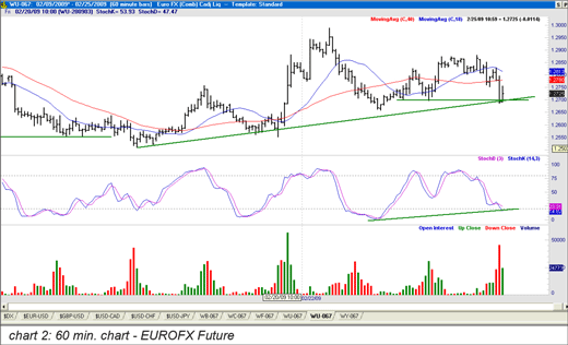
Think of the 60 minute chart (hourly) like you were getting out of pair of binoculars and analyzing what is going on with the individual candles on the daily chart. When you buy pullbacks off the daily with consecutive lower highs (long positions), you will see that the stock is in a downtrend on the 60 minute chart.
You are looking for a break of that trend line in this time frame.
When you say, I’ll buy when the stock trades over the previous high., what you are really doing is buying that trend line break on the 60 minute chart.
Here is an example using QQQQ again:
Your hourly chart should go back 15 to 20 days (each candle represents one hour of trading). You can see that by analyzing this time frame, it is easier to see (and possibly anticipate) a trend line break. And sometimes, you will see a stock bottoming out in this time frame that may not notice on the daily chart. And now it is time for your entry.
The 5 minute time frame
This is where we will get our entry. So far, we have found a great setup on the daily chart. We checked the weekly for chart patterns and to make sure that the stock is in an uptrend. We zoomed in using the 60 minute chart and watched for a break of that trend line.
We have already made our decision that we are going to buy the stock.
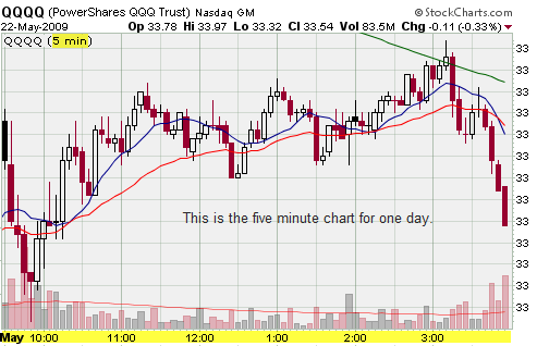
The five minute time frame is used to buy the stock at the best possible price. You really don’t need to spend a whole lot of time analyzing this chart. Just look for the stock pull back to a support area (on the long side) to get your entry price. Simple.
You only need to look at the 5 minute chart with the current days data (each candle represents five minutes of trading).
The 15 minute time frame
There is one other time frame that is useful. That is the 15 minute chart. Why would you look at this time frame? Because sometimes, the day traders will make the 5 minute chart look sloppy! Using the 15 minute chart can smooth out the whipsaws that show up on the 5 minute chart.
You may even decide to use the 15 minute chart instead of the 5 minute chart.
Trading tips
- Each time frame affects the other. A news event affects the intra day (5 minute) chart. This affects the hourly chart, which affects the daily chart, which affects the weekly chart.
- You may be able get a better entry with a tighter stop loss order using the 60 minute chart rather than the daily chart.
- Use the 200 SMA in all time frames — even on intra day charts. You’ll be surprised to see how stocks react when they get close to this moving average!
Analyzing different multiple time frames can improve your success as a swing trader. However, you will rarely find a stock the looks absolutely perfect on the weekly, daily, and intra day charts. Your main goal is to identify support and resistance areas that could affect the stock in that time frame.
The important thing to remember is to pick your main time period then look at a time frame above it and a time frame below it. The lower time frame tells you what is happening now and the higher time frame tells you what could happen in the future.


