Fibonacci and the Use of the Golden Ratio in Trading Markets Traders Laboratory
Post on: 16 Март, 2015 No Comment
When new traders are exposed to the technical chart aspects of the trading markets, one of the earliest terms that is typically confronted is “Fibonacci.” While some of us remember this name from mathematics lessons in elementary school, it can still be confusing to understand why this term is so commonly applied to the analysis of price activity. Even further, there are many chart technicians that would argue Fibonacci has no connection to the market and should not be used when forecasting asset values. In a later article we will look at why some of the skeptics make these arguments. But first, we will outline some of the ways practitioners apply Fibonacci tools, as it is undeniable that these calculations are some of the most commonly used measurements when traders are looking for potential turning points within trends.
Relationships Between the Large and the Small
Fibonacci analysis is based on a unique mathematical ratio that is used both inside and outside the financial markets to describe many of the proportional relationships that are found in elemental aspects of nature. These relationships range from the smallest bodies found in the universe to the largest bodies found in the universe and practitioners of Fibonacci analysis argue that the ubiquity of these relational occurrences is a testament to its validity when looking to forecast price activity.
Assuming this is true, what better analysis could there be than to judge financial markets by the same rules that apply to much larger aspects of the universe? If nature uses proportional relationships to maintain a wider balance, then the financial markets would inevitably be forced to follow these sames rules. Here, we will look at some of the ways Fibonacci measurements are used and briefly explain how the denominations are calculated.
The Math Behind the Fibonacci Sequence
Many are familiar with the Fibonacci sequence, which a succession of numbers discovered in the 12th century, with each term equal to the sum of the previous two terms (1, 1, 2, 3, 5, 8, 13, 21, 34, etc.). The “Golden Ratio” is then derived from this sequence, with the quotient of neighboring terms in the sequence showing what even skeptics consider to be a surprising proportional relationship. This proportion is 1.618 (with 0.618 the inverse proportion going in the opposite direction), and this relationship is sometimes called the Divine Portion, PHI or the Golden Mean.
As we can see from the lofty terminology, it is clear that many practitioners of Fibonacci analysis see deep meanings in these numerical relationships. And many would argue that the consistent presence of this same numerical relationship within nature (for example, in the arc of a nautilus shell or in the sectional lengths of a dolphin’s body) is reason enough to believe this analysis has valid applications for the financial markets as well.
Applications in Technical Chart Analysis
Practitioners of Fibonacci analysis love to give examples of the Golden Ratio in nature. One of the favorites is to measure the length from your shoulder to your fingertips and divide that number by the distance between the elbow and the ends of your fingers, which should equal the Golden Ratio. In price analysis, this mathematical base is used to identify the differences between separate impulsive wave movements. This information is then used to mark potential turning points as price trends reach the end of a cycle. In these ways, traders take natural phenomenon and apply it to the financial markets when making trading forecasts.
Fibonacci Studies as They Appear on Charts
On a chart, Fibonacci ratios are typically visible as three percentages (38.2%, 50% and 61.8%). There are variations here, however, with many traders adding additional percentages (such as 23.6%, 78.6% or 161.8%). These variations can be constructed in many different ways. The four most common Fibonacci studies when used in the financial markets can be found in Retracements, Fans, Arcs, and Time Zones — all of which are derived from Fibonacci calculations.
Fibonacci Retracements
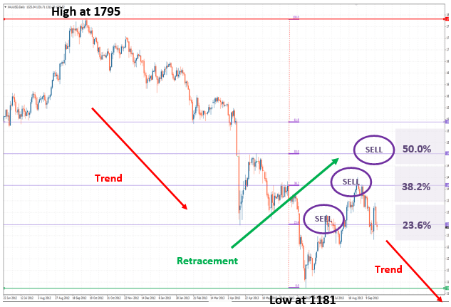
The most common study (and the one used by most new traders) is the Fibonacci retracement, which uses horizontal lines (calculated in conjunction with the previously mentioned percentages) to mark potential turning points within trends (regions of support and resistance). To determine the percentage levels, we take a significant price move (which is clearly defined on a chart). The starting point is marked by the first horizontal line and given the percentage description of 100% (as a price retracement back to this area would be a full retracement).
At this point, we can see many variations but most Fib charts will then show additional horizontal lines at the 61.8%, 50%, 38.2% and 0% (which is the end of the previous impulsive move. In an uptrend, the structure looks like the first attached picture. In a downtrend, the image would be reversed. Price points like those in points C, D, and E would be expected to act as support, pushing prices higher in a turning point after a small corrective downtrend. In a downtrend, these points would expected to act as resistance. As you can see, the “turning point” areas are based on calculations made using the Fibonacci sequence and its accompanying implications.
Fibonacci Arcs

The next commonly used chart tool is the Fibonacci arc, where we again find a major price movement (with a clearly defined high and low). Three circular lines (concentric), using the 38.2%, 50% and 61.8% reference points. In a way similar to Fib Retracements, these circular lines also mark areas of expected support and resistance regions. In some cases, traders use these areas as ways of determining where ranges will develop. This is most easily understood with a visual example. The second attached picture shows how Fibonacci Arcs are used.
Fibonacci Fans
The next chart application is the Fibonacci Fan, which uses diagonal lines. Again, we find a significant price high and low, and an invisible diagonal line is drawn toward the price point on the right (this can be the high or the low). Diagonal lines are then plotted based on the 38.2%, 50% and 61.8% measured calculations. These diagonal lines mark regions of potential support and resistance. The third attached graphic is a visual example of this.
Fibonacci Time Zones
The last (and probably least common) Fibonacci study is the Time Zone, which is plotted using vertical lines. These Time Zones are created to divide charts into vertical segments, which are spaced in intervals that correspond to Fibonacci calculations. Similar to the other studies, these lines mark areas where significant price changes are expected to occur. The fourth chart graphic is a visual example of this.
Conclusion: Basing Market Forecasts on Natural Phenomenon
While there are many technical traders that are skeptical of the validity of Fibonacci studies in forecasting asset price movements, it is undeniable that these studies are a major feature of the markets and one of the most commonly used methods to trading. In some cases traders will even use these studies in conjunction with one another (looking for intersection points in the combined studies). It is rare for traders to use Fibonacci alone when trading but there are many practitioners using these measurements as the foundational basis when opening new positions. Not all market participants are convinced, however, and will instead argue that these price points are arbitrary levels that have nothing to do with future value directions. Some of these disagreements will be address in a later article.


