Chart Analysis is Your Compass in Financial Markets
Post on: 6 Апрель, 2015 No Comment
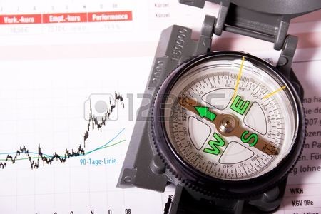
In the jungle of financial markets, one of the compasses to guide us in making better trading decision will be the chart. Chart analysis is the heart of technical analysis and it is getting more popular in these days compared to Time and Sales (T/S) as it provides visual perspective to the financial market action. In this post, we will take a look at various stock price charts and their characteristics. Basically most stock price charts contains the following information such as asset name or company name, date and time of trading transaction, last traded price and volume. Price information can further be divided into opening, high, low and closing prices for the recorded time session. However some charts may not incorporate all the information for their interpretation to filter out financial market noises.
In this introduction series to technical analysis, we briefly talk about these few types of chart.
Bar charts are the most commonly used price chart by technical analyst. Each bar represents the opening, low, high and closing price of the trading time frame. If the bar chart is a daily chart then each vertical bar will represent a single day just as a single vertical bar will represent a 5 minutes interval in a 5-mins intraday chart. We will use a daily chart for the rest of our discussion. Each days closing price will be indicated by the perpendicular bar to the right of the bar just as opening price will be to the left of the bar. However opening price is optional information that can be included in bar chart. I would recommend that all price information to be included in the chart to help us identify the sentiment of the market.
Typical line charts are using closing price to plot the daily price movement and ignoring the market noises such as low and high. Some analyst seems to like the simplicity of the chart and the clear visual appearance of the trend. However due to the lack of vital information, I dont recommend trading using line chart as it does not clearly show us trading setup which is vital for us to execute our entry to either long or short side of the market. However it could be used to point out market movement over a long period of time in a clear manner.
The most striking characteristic of point and figure charts are the absence of time information. Time information will ignored in this type of chart and the analyst will only be interested in the price movement. P&F charts are composed of a number of stacked X and O. A column of X will indicate a series of rising prices while O will indicate a series of falling prices. Each X and O represents a price move of a preset magnitude called the box size. This type of charts will also ignore small fluctuation of prices since only a significant movement of box size will be recorded. P&F charts are useful in identifying the longer term trend since market noises are ignored.
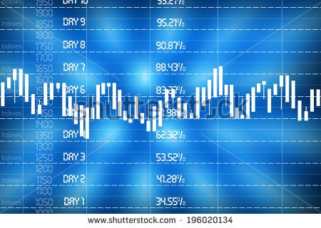
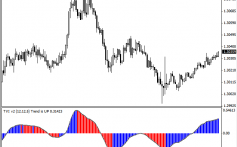
Candlestick charts are similar to bar charts except for its clear visual appearance of the day movement indicated by the body of the candle. A black body will represent a down day while a white body will represent an up day. The top of the candle will represent the high of the day while the bottom of the candle the low of the day. If the top or bottom of the candle is not the same to the opening or closing prices it will shows as a tail on the top or bottom which signify the extreme sentiment of the day. Candlestick charts are my favorite as it shows clearly the battle between the bull and the bear. For some chartist, green color is used to replace the white candle while red for the black candle.
Kagi charts are excellent in showing the underlying demand and supply of the stocks. At first glance, they looked like swing charts but differ slightly in that they use only closing prices and the varying thickness to show increasing demand and supply. Kagi charts consist of a series of vertical lines and ignore time information. They filter out noises by changing directions only by a predefined reversal amount.
This is an introduction to the type of charts used in technical analysis. There are many more types of chart such as swing chart, renko, candlevolume and etc. Each different type of chart uses the information differently and they provide the visual appearance in a different manner. I recommend that you pick one of them as your base charting method and you may use other types of chart to complement your analysis. I will begin a few series on different charts that are useful in chart analysis in future posts.


