Candlestick Charts
Post on: 3 Июль, 2015 No Comment
Candlestick Charts
Click to enlarge the image
Candlestick Charts – Offering Best Information about Forex Trading!
All traders in all financial markets continuously seek for propper tools to analyze the behaviour of the price of the financial assets in order to determine its direction and the right moment to open a position. Well, there are numbers of solution available through which people can get the right option for their market trading. One of the best solutions is the candlestick chart which is a special type of bar-chart through which investors can get more information about the price behaviour of any financial instrument like stocks, currency pairs or derivative for example.
- In this case, this sort of chart is the combination of bar-chart and line chart and each is representing the range of price changes, so it offers the best of both types of charts. For this reason it is commonly used by technical analysts to identify price patterns in the charts.
A major advantage of the candlestick charts is that they are easy to read and interpret. So, these charts can be very useful for beginners traders in any financial market, including Forex. In this case, the trader can get more information about the price change, maximum and minimum prices reached, major and minor trend changes and other important data.
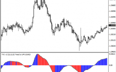
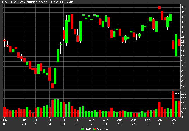
Each candlestick in the chart shows the following information: opening price, closing price, high price and low price over the predetermined period. The time span of each candle can also be adjusted to show any period of time that the trader wants. For example, it can show the longer time periods (long term trends) like weeks, months, and years as well shorter time periods (short term trends), like 4 hours, 1 hour, 30 minutes or even 1 minute.
Traditionally, if the candle is filled or colored, this means that the asset price closed at a lower price that opened. By contrast, if the candle has no color or is filled with a light color (green for example), this means that the asset price closed at a higher price that opened. See the following graphic example:
The advantages of the candlestick charts are the following:
- Easy interpretation
How to read a Japanese candlestick chart?
Thus, how can be used the candlestick charts for improving the trading performance?
Candlestick chart is the great tool to identify the market direction and can be very useful to analyze the price action. Also it can be used to determine the exact moment to enter the market or as importantly, when you need to exit the trades. Precisely the best way to maximize the profits is to enter and exit the market in the right moment. The Candlestick chart is one of the most market analysis method which allows the trader to determine how other traders feel about the market.


