Candlestick Charting
Post on: 23 Апрель, 2015 No Comment
Candlestick Charting — Why is it Different?
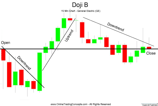
Would you like to learn about a type of commodity trading chart that is more effective than the charts you are probably using now? If so, keep reading. If you are brand new to the art/science of chart reading, don’t worry, we are going to discuss candlestick charting. This stuff is powerful, but it is really quite simple to learn and the results can be impressive!
Technical Analysis…a Brief Explanation
Candlestick Charting Explained
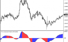
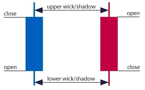
The answer to the question above may not yet seem obvious, but the results are. Basically, candlestick charts are much more visually appealing and informative than a standard two-dimensional bar chart. As with a standard bar chart, candlestick chart patterns have the basics as well; OPEN, HIGH, LOW and CLOSING price for a given time period are included. The body of the candlestick is called the “Real Body” and it represents the range between the open and closing prices. A black, or filled-in, body represents that the commodity or stock closed lower than its open, or in a bearish condition. When the body is open or white, the commodity or stock closed higher than its open, indicating a typically bullish condition. A thin, vertical line that may be found above and/or below the real body is known as the Upper or Lower Shadow, and its presence represents the high or low price extremes for the trading period. Now that you have the basics of the candlestick charting, let’s compare them to bar charts.
Comparing Candlestick Charting and Bar Charts
Lacking the Shadows of a basic candlestick chart, a bar chart cannot reflect the difference between a price extreme and a high or low. For example, a stock that opened high, but traded low for the day would not be accurately depicted in a bar chart. In a basic Candlestick chart, however, the Upper Shadow would show the extreme of the opening price as well as the trading range for the day. In this example, the basic candlestick chart formation more accurately represents the trading of the day. In addition, since the stock closed lower than the open, the Real Body would be black; indicating that the day’s trading was bearish. A typical bar chart is simply unable to provide this level of information. And remember, these are just the basics of a candlestick chart!
In conclusion, even the most basic of candlestick charting methods provides its user with a valuable technical analysis tool. When used with a productive stock investing system, you can successfully analyze stocks and their trends before you invest. Why use a limited bar chart when you can have the power of candlestick charting? Your bottom line will know the difference!
20small.jpg /% Holiday Gift Packages
Website special reflects current newsletter. If you are reading an archived newsletter you will be directed to Current Website Special


