An Introduction To JCharting
Post on: 10 Апрель, 2015 No Comment
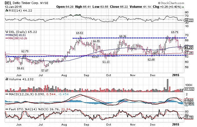
How many North American traders know that one of the most common stock-charting techniques did not originate in the West, but was in fact developed and used in Japan over 300 years ago? Before the United States was even a nation, the Japanese were using candlesticks to predict future price movements in rice trading.
Candlesticks were not first introduced to North America until 1989. when Steve Nison first wrote an article about them in the magazine Technical Analysis of Stocks & Commodities. Candlesticks allowed the trader to see at a glance where the market opened and closed, along with the high and low of the period. But candlesticks were similar to most other techniques (with the exception of point & figure charting): time and price were plotted on the X- and Y-axes, and whether it was one minute or one year, all price action occurring over that time was squeezed into the one frame. Price could then be plotted arithmetically or logarithmically, but either way, time and price were locked together in a set relationship.
But market action was not under the same constraints. In a slow market, there would be very little price movement, while fast moving markets could witness rapid changes in price. Was an arbitrary representation of price per unit of time the best way to forecast future price movement?
Markets as Energetic Systems
Inventor John Chen didn’t think so. After searching for a better way to show price action, Chen decided that markets behaved more like energetic systems than systems confined to the two dimensions of time and price. Current methods were useful for looking at market action in hindsight, but he believed they did little to anticipate future movement. If markets were in effect energetic systems, possessing varying levels of energy, would it not be easier to determine where prices were going with a higher probability of success?
Chen sees markets working as thermodynamic systems. Alternating between periods of equilibrium and chaos, prices seek to find a new balance point after each trend. Think of this behavior as the act of going up or down flights of stairs that are separated by landings. When there is an increase in buying, prices move out of equilibrium and trend higher until a new equilibrium point is reached (the next landing). The whole process is not time driven, but rather price dependent. And the ‘inner force’ is investor behavior, which drives price action in a cause-effect relationship.
According to Chen, price is the only event that really matters. Once a trader understands the process of how price interacts and changes, he or she can exploit it more easily.
How It Works
Chen’s program, called J-Chart, plots price as a five-part Chinese ‘Jeng’ or JE character (). One part of the character plots each time a transaction occurs at a specific price, allowing the user to determine the level of equilibrium at any given time. Depending on user preference, any time period may be set and periods may be combined. Opening prices are plotted in yellow and closing prices for the period are plotted in cyan.
As price plots in a given frame, a triangle begins to form. If it is top heavy, as is the case in Figure 1 below, the part of the plot with indentations (or caves) will generally be filled in subsequent sessions. unless the market is trending strongly in the opposite direction.


