Alpha Stocks Point and Figure Charting Basics (Part II)
Post on: 12 Июль, 2015 No Comment
Monday, March 31, 2008
Point and Figure Charting Basics (Part II)
This is a continuation of the previous post on Point and Figure charting.
Updating a PnF Chart
The basic concept of updating a PnF chart is simple and straightforward: Whichever column the chart is in (Xs or Os), you will remain in that column as long as the stock continues in that direction by one box or more. Lets stop and take a look at what I mean.
Here is the chart of JPM:
Currently, the stock is in a column of Os, meaning supply is in control and price is going down. As long as JPM continues in that direction by one box or more, you will stay in that column. So, in the case of JPM, your first question at the end of the trading day should be, did the stock decline one full box or more on the chart?
You will notice that on Friday 03/28, the price closed at 42.71. It didnt reach 42, so an O is not placed in the box corresponding to 42 (remember, on stocks between 20 and 100, the value of a box is 1 point). The low of the day was 42.65. It is common practice to use the intra-day highs or lows to determine if the column of Xs or Os moves to another box. In the case of JPM, the column of Os stays at 43. If JPM had an intra-day low of 41.75, you would fill in the 42 box with an O, but you wouldnt fill in the 41, since the intra-day price didnt actually reach 41 (or lower). Simple enough.
Keep in mind that all you are doing is recording what the stock does on each trading day. Thats it. Nothing more, nothing less. Easy. You dont have to mess with the chart until the next trading day. Here is the logic you would use for a stock that is falling in a column of Os, as JPM is:
1. What was the daily low? Did it fall from a previous low? (If yes, put an O in the appropriate box(es).
2. If the answer is no, then you have to ask yourself some other questions:
a. Did the stock reverse up (3 boxes) in price on the chart? (If no, stop there. You dont need to record anything!) If the answer is yes:
b. Move one column over and up one box and place Xs in the boxes up to the appropriate place. Then stop there, and move on to another stock you are charting.
Going back to the example of JPM, for you to start a column of Xs tomorrow, the stock would have to hit an intra-day high of 46, which is 3 boxes above 43.
The daily highs and lows for a stock are all you will need to set up PnF charts. Fortunately, you dont need to do these by hand (even though you could if you wanted to). You can easily pull up a PnF chart for most stocks, ETFs, mutual funds and indexes from www.stockcharts.com.
The only record of time in the PnF chart is the replacing of an X or O with the number of the month when a box on the chart reaches the first entry of that month. Placing the month in the chart has no significance other than as a reference point. As the stock moves back and forth in price, it alternates back and forth from one column to the next, X to O, O to X, and so on. At no time will you have Xs and Ox in the same column. As mentioned in the previous post, the month is indicated by its respective number (March = 3, Apr= 4, etc.) with Oct, Nov, Dec indicated by A, B, and C, respectively.
Trend lines are one of the most important guides you will have in PnF charts. It is uncanny how a stock will hold to a trend line, either going up or down. And it is easy to see on a PnF chart, whereas on a bar chart, it takes a little more subjectivity in drawing trend lines.
The two basic trend lines used are the Bullish Support Line and the Bearish Resistance Line. There are two other trend lines we will discuss later: the Bullish Resistance Line and the Bearish Support Line. For now, lets discuss the Bullish Support Line.
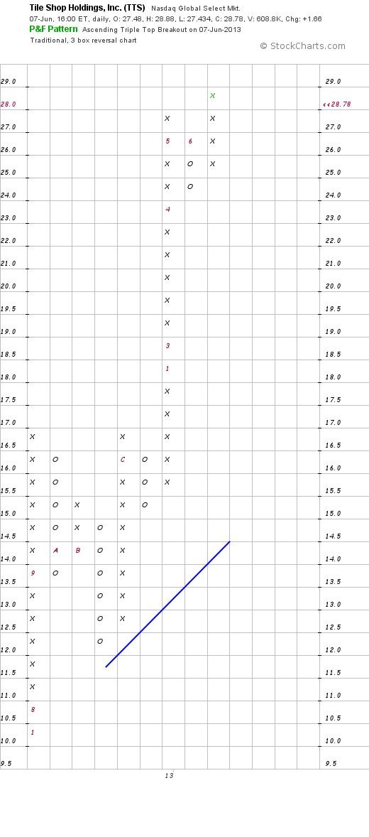
The Bullish Support Line
This is a major component in the stocks chart pattern. It gives us a look at the underlying trend. Think of these lines like brick walls. In general, when using PnF charts to analyze stocks, you would not buy a stock that is not trading above the Bullish Support Line. Drawing the line is very simple.
Lets take a look at JPM again:
Once the stock has formed a base of accumulation below the Bearish Resistance Line (red) and gives the first buy signal off the bottom, we go to the lowest column of Os in the chart pattern and begin drawing a trend line starting with the box directly under that column of Os. Notice the short blue Bullish Support Line just starting at 37, under the column of three Os. You then simply connect each box diagonally upward in a 45-degree angle to draw the trend line.
Unlike bar charts that connect prices, PnF charts never connect prices. The angle for the Bullish Support Line will always be a 45-degree angle, and the angle for the Bearish Resistance Line will be the reciprocal of the 45-degree angle, or 135 degrees.
Consider the longer blue Bullish Support Line started prior to the more recent shorter one. Since JPM traded significantly higher (up to 49) above this trend line and subsequently gave a sell signal (reversal column of Os), followed by another buy signal (column of Xs), the shorter term trend line can be drawn.
The prior trend line is still shown to give you a longer term perspective of support. That will always serve to be the long term trend line and may come into play months or even years later. The new short term trend line will now serve as a visual guide. It is valuable in that it can identify the short term direction of the stock. Traders will often initiate a long trade when a stock has declined near the Bullish Support Line because the stock is close to a stop-loss point.
The most important thing about PnF is its clear guidelines for whether or not a stock is on a buy or a sell signal, and if it is in an uptrend or downtrend. Just remember, this is art, not science.
Next time.The Bearish Resistance Line


