Alpha Stocks Point and Figure Charting Basics (Part I)
Post on: 12 Июль, 2015 No Comment
Thursday, March 27, 2008
Point and Figure Charting Basics (Part I)
Picking up on where we left off on my previous intro to PnF, lets briefly recap:
The PnF chart uses the price action of a stock to measure supply and demand. Its really a study of pure price movement in that time is not taken into consideration while plotting the price action. Since only price changes are recorded, if no price change occurs (as represented by the boxes and their value), then the chart is left untouched. Price changes are shown by a column of boxes that have either Xs or Os. The value per box is important, because it can be assigned accordingly to dampen or increase price sensitivity, depending on how you trade. More on that later.
As stated, PnF charts use rising columns of Xs and descending columns of Os to represent price movements. What you see when you look at a PnF chart is the underlying supply and demand of the security. The columns of Xs illustrate demand exceeding supply (rally), and the columns of Os illustrate supply exceeding demand (sell-off).
If you are looking for a way to filter out all the noise in the market, PnF is a solution to that if all you are interested in is the actual price movement of a stock or index. PnF charts help you observe market activity, and as such, are very helpful in identifying support/resistance lines, buy/sell signals, and trendlines.
By being very flexible, P&F charts can easily be made more or less sensitive to price changes, which can help in determining differences between long term and short term trends. By varying box and reversal sizes, these charts can be adapted to almost any need. There are also many different ways these charts can be used for entry and exit points. As such, all types of traders and investors can benefit from applying and understanding the basic principles of PnF charting.
Lets talk about the chart itself. How is it set up?
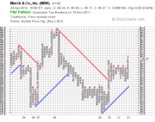
This is a most recent chart of the S&P 500 as of yesterdays close. Price is shown on the vertical axis and time is show on the horizontal axis. Looking at the price increments on the chart, move up from the bottom from 1250 to 1260, 1270, 1280, etc. From this you will notice that each price increment corresponds to a box on the chart grid. Therefore, each box represents a value of 10 points, or a movement of 10.
As I mentioned before, you can assign an arbitrary value to each box, depending on how you trade. If you are a short term trader, you would want to adjust the box values to a smaller number, thus allowing you to move quicker on price changes. If you are an intermediate term trader, you assign a larger value. A long term investor, may want to assign an even larger value to each box. If effect, what you end up accomplishing is filtering out the volatility of a stocks price, which many times just represents normal movement and fluctuation in price action. Reduction of this noise can help prevent you from taking action when you really dont need to.
Assignment of box values
Now, lets get into the mechanics of charting by looking at the values of the boxes used to construct the chart. When I say box sizes, Im not referring to a specific dollar or point value on the chart. The box sizes will change as the stock price moves through certain price levels. Its important to make the distinction between boxes and points. For practical purposes, we will use the conventional 3-box reversal method. It is not a 3-point reversal method. You will understand why a little later.
When looking at and analyzing PnF charts, it is important to think in terms of boxes rather than prices. Between 20 and 100, the box size is 1 point per box. If a stock is trading below 20 or over 100, we want to use different box sizes.
For penny stocks, those under 5, the convention is to assign each box a value of 0.25. Once a stock reaches 5, the box value increases to 0.50. You can see this illustrated with our friends from MVIS:
Here are the conventional or default values that represent the size of each box, based on price:
Under 5.1/4 point per box
5 — 20..1/2 point per box
20 — 100. 1 point per box
100 — 200 2 points per box
200 — 500.4 points per box
500 — 1000..5 points per box
1000 — 2500..10 points per box
2500 +.50 points per box
These values can be used for stocks as well as indices.
The reason why we increase the box size is to adjust for volatility as price or value becomes a greater number. By doing this, we can compress the chart and get a normal picture of the supply — demand relationship of a stock. Stocks like GOOG require 5 points per box, (and now more recently, 4 points per box). while YHOO only 1 point per box.
The key to constructing the chart relates to how the chart switches from one column to the next (moving to the right). When a stock is rising and demand is in control, the furthest column to the right will be in Xs. When a stock is falling and supply is in control, the furthest column to the right will be in Os.
Since we have established that we will use the 3-box reversal method, it requires a three box change (or more) in the opposite direction to be significant enough to warrant a change in the columns from Xs to Os when price begins to fall, or Os to Xs when price begins to rise.
So, for a stock trading between 20 and 100, a reversal would require a move of 3 points, which satisfies the 3 box reversal ( 1 point per box) requirement. In the case of GOOG, currently, it would require a move of 12 points, which is the equivalent of 3 boxes, minimum.
Lets look at the S&P 500 again:
Here we see that the box size is 10 points. That means that a reversal in supply demand would be indicated by a price change of 30 points or more before we would say that is a significant move, or in effect, change in supply — demand for S&P 500 stocks as a whole.
The charts account for time by showing the number of the month of the year in a box. For example, the S&P chart above shows that supply was in control (price moving down in a column of Os) and hit the 1320 level March 2008. The exact day is irrelevant for purposes of guaging supply demand. Since then, you can see from the columns of Xs and Os, that it has been going through a series of reversals, and has recently broken out above bearish resistance (the red line). More on that in a later post. Right now, lets just focus on the chart set up.
Moving back in time, the S&P was at the 1480 level in January (notice the 1) before it started trading down, and subsequently made seven reversals (count the columns of Xs and Os by February (2).
One last point. If you look back in time on the chart, you will notice that there is an A and a B at the 1540 level. A represents the month of October, B November, and C December.
That is all for now. Ive wasted enough time and need to go make money.
Next time.Well go over how easily support and resistance lines are established, price objectives and then get a little bit into how you interpret various chart patterns and what they mean.


