A Quick Top Down Approach to Assessing the Stock Market
Post on: 7 Апрель, 2015 No Comment

What frustrates many a novice do-it-yourself investor is trying to figure out where the markets are heading.
It can be a daunting task sifting through the massive amount of information available on the internet to arrive at a handful of evaluation criteria.
What follows is one such approach that focuses on a low information diet of just the key essential factors that’ll give you a good perspective of where money is flowing in the stock market.
Your focus as a do-it-yourself investor should be on optimizing your returns while creating a time-rich lifestyle for yourself.
This means that you’ll need to develop a disciplined approach to assessing potential opportunities.
In this article I’ll show you how you can:
- Use just a handful of economic indicators to get a sense of where the markets might be heading.
- Get the help of the print media to give you an idea as to where the smart and dumb money is being invested.
- Determine the overall trend of the market using some simple technical analysis.
- Assess which economic sectors offer the greatest current prospects.
My intention is to walk you through a typical top down analysis of the stock market without spending a lot of time analyzing countless reams of data.
The goal is to be able to do this complete assessment given a 1-hour time commitment once you have the initial tools set up.
An hour of your time spent on a monthly basis will give you an edge in the markets that most investors do not have.
Let’s start with what a top down approach entails.
By taking a bird’s eye or 30,000 foot view of the general economy and drilling down to how the overall stock market and the individual economic sectors are doing we can gain a much broader perspective of how the markets might play out in the short term.
Step 1: The State of the Economy
Tool #1 ISM Index
One of the best ways to get a quick snapshot of how the US economy is doing is to check out the ISM report published on the first day of the month by the Institute for Supply Management.
This report is used by well-informed stock investors to measure the business cycle’s growth and contraction .
Since the data comes from corporate America it is viewed as being more authentic than government generated data.
The ISM is expressed as a single number with 50 being the midpoint. An expanding economy shows up as monthly ISM numbers increasing in value above 50.
It is important to note that your focus should be on the rate of change in the data not the raw numbers.
The rate of change gives you a clearer picture as to how quickly the data is changing.
Although somewhat time consuming to first set up, you may wish to create a simple spreadsheet that tracks the rate of change month-to-month for the ISM index.
Once you have created this tool you’ll be able to quickly update the data and keep better track of the rate of expansion of the economy.
Of course, you could also subscribe to a fee-based service that’ll provide this statistic as well as others to help you in your decision-making process.
Tool #2 IWM Exchange Traded Fund
A second helpful tool that’ll give you a snapshot of how the economy is doing is to take a look at the iShares Russell 2000 Index Fund (IWM).
This is an ETF of 2000 small companies.
When the economy shows signs of expansion many hedge fund managers buy IWM and likewise bet on its decline when the economy is shrinking.
Head on over to a stock chart analysis site like StockCharts.com and type in IWM to see a technical chart of how the ETF is doing.
You’ll be able to assess whether the big institutional players are buying the ETF as evidenced by rising prices or not.
This is yet another quick assessment to use in your arsenal of effective stock market analysis tools.
Tool #3 Personal Consumer Expenditures Index
The US Department of Labor produces a monthly report on consumer spending called the PCE.
This particular report is a good indicator of stock market advances and declines.
Author Joseph Ellis has set up a free website at www.aheadofthecurve-thebook.com where you can create and maintain charts that’ll help you track the rates of change in consumer spending.
This is just another suggested resource that’ll make you more efficient and effective over time in your stock analysis.
Step 2: Smart Money vs. Dumb Money
Wall Street generates most of its massive profits from the “dumb money” that is invested in the stock market every day.
Most of this money comes from passive investors who would rather have someone else handle their financial future rather than take it upon themselves to learn how to manage their own affairs.
The financial services industry does a masterful job of systematically reducing your gains through fees and commissions that are paid out whether or not your portfolio has generated a profit.
Unfortunately, this is where most of the dumb money ends up.
To get a quick feel as to how the dumb money is being invested take a look at a couple of popular magazines such as Money Magazine or Smart Money on the magazine rack or online.
Take a moment to leaf through the nature of the investment articles and what appears on the cover of the magazine.
Often this simple insight can give you an idea as to how the masses are enticed to invest whether it be in mutual funds or similar investment products.
Then head on over and check out the cover of Forbes or The Economist. Skim through the contents to gain some insight as to where the smart investors may be investing.
You may be able to get a feel for how the economy is doing and where you might want to consider placing your hard-earned capital.
Step 3: Overall Technical Analysis of the Market
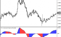
First, go to a stock chart analysis site such as StockCharts.com and type in the symbol for the S&P 500 Large Cap Index ($SPX) which is often used as a broad index for the overall stock market.
Then once in the chart, set the overlays to 50-day Simple Moving Average and 200-day Simple Moving Average (if not already done so) to give you a half year of data points to look at from a graphical or visual perspective.
By looking at the chart pattern and the interaction between the moving day averages you will be able to quickly assess the historical trend over the past several months of where the stock market is and where it might be heading.
Another quick assessment is to look at the most recent 30-day period of trading volume to get a feel as to whether money might be flowing into the stock market or seeking safer havens such as bonds or other fixed income securities.
If you are familiar with some of the other technical indicators you may also want to use the Money Flow Index to get a sense of how the big institutional players have been allocating capital throughout the most recent months.
Should you like to learn more about how to better use technical analysis in your stock investing decision-making process, please check out Michael Sincere’s book: All About Market Indicators.
It’s a simple easy-to-follow insightful resource.
Step 4: Sector Rotations and Money Flow
Your next stop is to drill down deeper into the top 9 economic sectors that make up the stock market as a whole.
Money flows from one sector into another based on how the overall economy is doing as well as the seasonality of the sector’s strength.
These sector rotations are what you want to be aware of as a do-it-yourself investor.
Your goal should be to follow the trend not buck it.
It is a lot easier making money in the stock market when you are following the money flow of the big institutional players.
For example, the technology and consumer discretionary sectors are usually stronger in the fall and weaker in the spring.
This aligns well with the expected increase in consumer spending that occurs from October to January every year.
So how do we go about analyzing each sector?
Here are a couple of simple approaches.
Approach #1
The first is to go to each technical chart of the top 9 sector Exchange Traded Funds (ETF’s) known as Spiders or “SPDR.”
Take a look at the moving day averages to see if they are up, flat or down.
This is a simple way to verify which sectors are currently in favor with Mr. Market thereby increasing your chances of making profitable trades.
You may also wish to drill down deeper into the top 3 holdings in those sectors that tweak your curiosity to see if any buying opportunities may be presenting themselves.
The nine ETF SPDRs that focus on the following sectors along with their biggest holdings are listed below.
Another important analysis to do on a regular basis is that of monitoring the rate of change in each of the sectors month to month.
This can be done by creating a simple spreadsheet and entering the data yourself.
Or you can play with the technical chart and adjust the time period for which you would like the data to be displayed.
Once you have the raw data you can enter the info into a calculator or spreadsheet to see what the rate of change is.
The actual raw data is not that helpful.
The rate of change is what you should be focusing on in all of your investing analysis.
It is the rate of change that is going to tell you how fast the fundamentals are changing.
Approach #2
A helpful inexpensive IOS app to consider using is one called StockTouch .
It uses heat map technology to visually track changes in the stock market whether it be individual stocks within an industry or entire sectors.
Heat maps are a color representation of how a particular stock is trading in relation to past performance and others within its industry.
This visual representation is a quick and easy way to assess trends that are occurring in the market.
This app is worth checking out as it saves you a lot of time researching trends in the market.
You’ll be able to hopefully make better quality buy and sell decisions with it.
In Closing
To gain a much broader perspective of how seasonality might play out for your decision making, check out Yale & Jeffrey Hirsch’s book Stock Traders Almanac 2013 .
Since the early 70’s the Hirsch’s have been compiling statistical data and presenting it in a form that’ll help you make sense of seasonal patterns in the market.
This resource is a great starting point for learning about how you can be more effective in doing your due diligence of the current stock market trends.
There you have it a simple yet comprehensive snap shot analysis of the stock market.
You could of course add other tools to your arsenal.
However this basic framework should point you in the right direction and give you an initial read as to how the stock market is currently behaving.
Read more posts like this in our General Investing Advice Category.


