A Primer on Point and Figure Charting Investment UInstitute for Individual Investors
Post on: 12 Июль, 2015 No Comment
Thursday, March 19, 2009 | Bob De Dea
George writes, These articles use P&F charts on occasion, and I have no idea how they are generated, what they represent, nor how to use them. A tutorial or even a cursory explanation would be helpful. Thanks, George.
Well, George, this is your lucky day. (Or eight days, since this is going to end up as a two-part article.) Not only am I going to explain how Point & Figure charts work, I’m also going to give you an indicator that will help you to see the market in a whole new light. No, it’s not my handy-dandy Market Illuminator Wand — I’ve only got one of those and, besides, when the market gets back to normal, I’m going to sell it on ebay ’cause it’s not been very helpful lately. No, I’m talking about the Bullish Percent Index. But let’s not get ahead of ourselves.
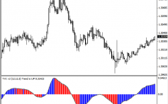
Most investors look at charts like the one below.
There are all kinds of charts: line charts, mountain charts, OHLC charts (Open, High, Low, Close), cloud charts — a whole slew to choose from. The one above is a candlestick chart of DKA, a recent Sector Hunter ETF pick. (Savvy investors can see that it’s on a MACD buy signal.) Notice that this is a relatively new ETF; its date of inception was October 13, 2006. We can see that the ETF hit a peak in May 2008 and shortly thereafter started its decline. From October of last year there was a period of consolidation, where it swung violently between $17 and $23. It recently reached its low of $15.76 on March 3rd of this year.
This is a daily chart. I usually start with a weekly chart (or a monthly chart) over a 2- to 5-year period to see the long-term trend and then zoom in to see how the different indicators change with the different periods, indicating the short- and intermediate-term trends. My objective is to get an accurate historical picture, so I’ll look at bunches of different combinations.
But there’s an easier way to look at both the historical action and the recent price activity. Voila!
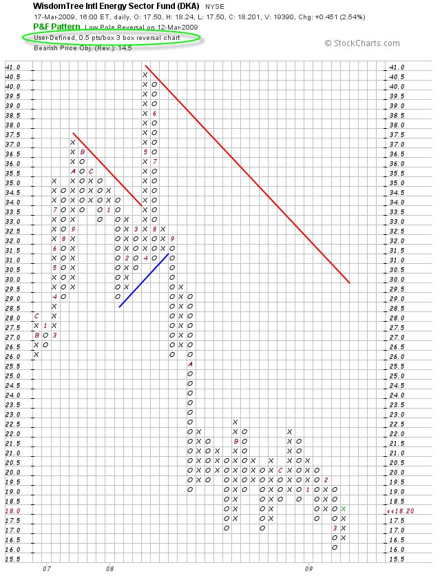
This is a Point and Figure chart for DKA. (Right away you can see that May 2008 peak.) What a P&F chart shows is the ever-struggling relationship between Supply and Demand. When Buyers increase demand for a security to the point where demand overcomes the Supply (i.e. what the Sellers are selling), the price of a security goes up. This is signified on a P&F chart by a column of X’s. On the other hand, when Sellers want to exit their positions but Buyers are reluctant to buy, Supply surpasses demand and the price goes down. This is signified on a P&F chart by a column of O’s. X’s only go up and O’s only go down .
To get this out of the way (I know you’re asking, What do the numbers mean? Why are there letters?), the numbers and letters are the months of the year, to this legend:
Don’t ask me why. It’s just one of those things. Just one of those crazy flings. One of those bells that now and then rings. Just one of those things.
Sorry, got carried away by Ol’ Blue Eyes for a second. Good ol’ Cole Porter.
The unique thing about a Point and Figure chart is that it depicts pure price movement. Notice that the time scale at the bottom is variable — for example, there can be no column change for months (look at the very first column to the left), or there can be several column changes within a month (the columns between B and C in the center of the chart). This means that all the noise of daily fluctuations in the price of a stock is gone, and that time is subservient to price action.
How is this so?
I’ll answer that in just a minute. First, some basics.
1) The scale changes based on the price of the security. In the above chart, you can see each square below the $20 square represents a fifty-cent range. Notice the current price of $18.20, highlighted in red on the scale to the right (y-axis). The last move on this chart is represented by the green X on the bottom right. This box has a range from $18.00 to $18.49. Now look at the box with the B in the middle of the chart. This box was recorded when the price rose above $22, but didn’t go higher than $22.99. From $20 on up, then, the scale changes from fifty cents per square to a dollar a square. Here’s the traditional scale for the box size for reference:
2) Only changes in price are recorded. A P&F chart can use either the high/low or the price at the close. It makes more sense in my opinion to use the close (the DKA chart above is based on the close). If the security doesn’t move at all, the chart is left untouched. In other words, if the price does not rise (when in a column of X’s) or fall (when in a column of O’s) by an amount greater than the box size, nothing is changed. So, theoretically, a stock could stay within a range from, say, $29 and $29.99 for months or longer and the P&F chart would not change a lick. (This will become clearer with item # 3.)
3) A column reversal requires a three-box change in the price. There will always be a column of X’s followed by a column of O’s or vice versa. But in order to change columns — and this is key to the value that P&F provide — prices must change direction by a multiple of three boxes (the three-box reversal). Look at June (the number 6) of 2008. A decline in the ETF’s price began here and continued through September. But some time in September, after hitting a low between $26 and $26.99, the price rose $3 to between $29 and $29.99. This was when the next column of three X’s was drawn. The price could have continued upward one or more squares at a time, as ascending X’s. Or it could have done what it did here. The price dropped by at least $3 to effect another change in direction to a new column of O’s. Well, in October it took a deeper dive to between $19 and $19.50.
So, to answer my earlier question about how a P&F chart eliminates noise, you can begin to appreciate that there is an inherent inertia by design in these charts. It takes a considerable move in the price to effect a change in columns. And this is why I like using the close as a basis for the P&F charts I look at — if you include the daily high/low you still end up with distracting short-term movement — more noise. And unless you’re a day trader, it only gets in the way of determining the history and the trend.
For those of you who might be lost, I’ll give you a brief step-by-step. The rest of you stand and stretch and rub your eyes.
Take another look at that first column of X’s. Notice that this fund had a slow rise from its initial price starting in November of ’06 and continuing through July of ’07. The next column shows us that it dipped in August, then recaptured its footing in August and September, reaching a new high in October of ’07 and staying there until sometime in November, when it again began to decline. In December and January, the ETF continued to drag downward until a reversal in February set the stage for the May all-time high. Etc. etc. etc.
Get the picture?
One more thing before we call it quits for this segment.
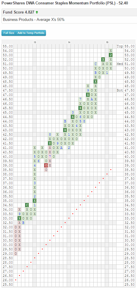
4) History is important. Some stocks are quite volatile and will show many, many column changes as a result. Others are relatively stable and change columns infrequently. To illustrate, compare the two charts below:
Okay. Next week we’ll look at support and resistance, talk a little about variables of P&F charting that we can control to get a different perspective, and examine the Bullish Percent Index. Until then, as my Italian grandmother used to say, May your eyes stay sharp and your ears stay clean.


