Central Banks are Feeding the Next Crisis A Bond Bubble
Post on: 23 Июль, 2015 No Comment
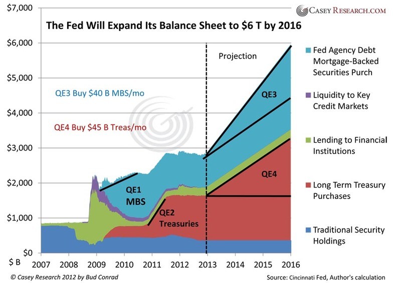
It is often said that every crisis is created in the aftermath of the prior one. The Federal Reserve and other central banks response to the 2007-2009 financial crisis has been to drive interest rates to extremely low levels by engaging in unprecedented balance sheet expansion. The intention of these policies has been to force investors out of cash and back into paper assets. In this narrow regard they have succeeded, spawning a bubble in bonds as investors have been forced to take on more credit risk in search of unobtainable yields in an artificially ultra-low rate environment. But how long can such a dynamic last? History shows that at some point in the not too distant future focus will quickly shift away from return on capital and back to the return of capital. In this article we will analyze further the yield bubble and its impact on the global macro environment.
Central Bank Balance Sheets as percent of GDP
Source: Reuters
The Importance of Capital Flows
It is our belief that any sort of macro analysis ultimately boils down to capital flows and determining what will make these flows shift. George Soros, the great global macro hedge fund manager who recently made headlines for making a billion dollars in profit being short the yen, wrote at length about this concept in his 1987 book The Alchemy of Finance.
The Web of Capital
In the book, Soros essentially described the financial world as an intersecting web of capital. On goings in any part of the web dont occur in a vacuum and thus have impact and repercussions on other parts of the web. Looking at this web of capital today the clear driver of large scale capital flow movements is the Federal Reserve and other central banks reliance on Zero Interest Rate Policy (ZIRP). This policy is effectively distorting the capital markets by coercing investors to take on risk they would normally consider too high versus the prospective return and most importantly with little if any regard for the actual creditworthiness of these investments.
Up the Stairs & Down the Elevator: The Mid-2000s Real Estate Market
A key trait of capital flow is that historically it goes into a market much slower than it goes out. The speed in which capital exits a market and/or a country is ultimately what sparks crisis. The chart below shows the IYR ETF, a proxy for the US real estate market from 2001 to 2007. The Federal Reserve in 2002 implemented aggressive loose money policies in the wake of the 9/11 tragedy and the bursting of the tech stock bubble. Like today, this was done in an effort to entice investors out of cash and in that particular case into physical assets like property and commodities and the chart shows it worked very well with capital steadily concentrating in the space for about 5 years.
IYR: iShares Dow Jones US Real Estate ETF 2001-2007
Source: Bloomberg
But then it stopped abruptly and the chart below of real estate from 2002 to 2010 shows that when capital flees a market it does so quickly and in this particular case it unwound all the gains of the preceding 5 years in about half the time.
IYR: iShares Dow Jones US Real Estate ETF 2001-2007
Source: Bloomberg
Not Learning From the Past
Many of you may recognize that this dynamic is very similar to the infamous market cycle chart created by Dr. Jean-Paul Rodrigue of Hofstra University. In it Dr. Rodrique attempts to describe the various psychological and emotional phases that govern decision making during different stages of a mania. Modern day investors like to believe such emotional driven markets are a relic of a bygone era. However, the repetition of these boom and busts on an almost bi-decennial basis show they remain very much a driver of investment decision making in the modern era.
Stages of a Mania
Source: Dr. Jean-Paul Rodrigue, Hofstra University
Capital Concentration Today
One of the clearest areas of worry for us in the current bailout cycle is in the credit market and specifically high yield. Below we see the HYG ETF, a proxy for the high yield market as a whole. The chart shows that since the Federal Reserve began its campaign of extraordinary policy easing with the launch of the first quantitative easing program in early 2009 there has been a gradual and steady concentration of capital into the space. With QE and ZIRP investors have become fixated on generating yield and obtaining the same levels of return they did in in the past before the broad use of ZIRP. The only way to accomplish this in a world with no yield has been by taking on more risk by going further out on the credit spectrum. More risk equals higher reward and high yield thus has been a primary beneficiary.
HYG: iShares iBoxx $ High Yield Corporate Bond ETF 2008 to Present
Source: Bloomberg
What has Wall Street done during this time just like in every other cycle? It has been busy creating new product and issuing more supply to feed this seemingly insatiable demand. Below is a chart of global high yield issuance over the last 25 years. Over 300 billion dollar of high yield bonds came to market last year alone — A new record!
High Yield: US New-Issue Volume 1988 to 3Q2012
Source: Reuters
Broader measures of high yield show the same thing. This is a chart of both high yield and institutional loan issuance in 2012. It shows more than half a trillion dollars came to the market in 2012 and quite incredibly was able to eclipse the high recorded in 2007. This is no small feat as 2007 was the culmination of one of the largest credit bubbles in history!
What does it all mean?
The point of all this is to show we are now in unprecedented waters and the end game is probably not too far off. As is common in the latter stages of these cycles not much thought is being put into the actual credit worthiness of these investments. Yield for yields sake has begun to trump any sort of actual credit analysis. An occurrence in the bond market from a few months back illustrates well the manic levels attained so far in this cycle.
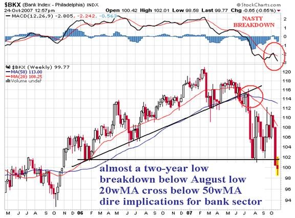
The story above describes how institutional investors became so enamored with high yield at one point in September that they pushed yields on US speculative grade notes to be below those of senior secured loans. This does not make any sense financially. Investors should not be willing to accept less compensation for a similar debt instrument that has no collateral and is a lower tier in the capital structure. The only thing that explains this behavior is the fact that investors have gotten so caught up in the reach for yield that momentum and career risk has trumped common sense. Our big question now is what state Dr. Rodrique would associate such behavior with on his mania chart?
Hunger for Yield is Global
This i nsatiable thirst for yield has not surprisingly seen capital pour into the emerging markets and their high yielding instruments as well. The logic is simple. Why own US debt instruments when one can pick up a few extra basis points in Asia, Eastern Europe and Latin America? Below is a chart of the EMB ETF.
EMB: iShares JPMorgan USD Emerging Markets Bond ETF 2008 to Present
Source: Bloomberg
We use this as a proxy for high yield emerging market debt. It too shows all the same things we are seeing in the US in terms of capital concentration. These capital flows have prompted growth in these countries which have in turn attracted more hot money into these markets. But we may be nearing the proverbial tipping point. In the book This Time is Different by Carmen Reinhart and Kennith Rogoff the authors included various examples throughout history showing that an external debt to GDP over 30% increases the risk of credit crisis for a country. At the moment almost all of Eastern Europe and a lot of Asia and South America are well above these danger levels.
Source: World Bank
The Minksy Moment
We wrote this piece to show that market instruments and movements are not isolated. Global central bank policies are distorting the natural order of the markets and in their quest to stave off the pain of the last crisis they have planted the seeds for the next one. Should investors begin to worry about credit the stage will be set for a traditional balance of payments crisis in the emerging markets as capital flees which will in turn lead to a crisis in confidence in the developed world. Of course with equity markets near all-time highs, volatility at multi-year lows and central banks seemingly in total control it is difficult to envision such a scenario. However, we remind our readers of the great 20 th century economist Hyman Minksy who perhaps said it best Stability begets instability. With central bank policies seemingly beginning to gain traction focus is naturally shifting to determining when policy will revert to normal and rates will begin rise. Throughout economic history this has been a common trigger for debt crisis as the rise in rates whether real or perceived leads to a slump in asset prices which triggers solvency fears in the financial sector which in turn creates a lack of confidence in industry and other parts of the broader economy. In other words, it forces us to look behind the curtain and when we do most times we dont like what we find which prompts a forced liquidation of assets.
Putting it All Together: The Currency Lynchpin
A forced liquidation of assets in the wake of a confidence crisis would obviously have dramatic impact on all the markets we have mentioned in addition to a multitude of others. We have shown that capital concentrations tend to build slowly but unwind swiftly. As such it is not beyond the realm of possibility that all gains seen over past 4 years in the bond and stock markets could be unwound in a very short period of time. Going back to the idea of the web of capital, the lynchpin looks to be the currency markets and specifically the US Dollar. With the Federal Reserve immersed in aggressive balance sheet expansion through the use of quantitative easing the Greenback has become a form of funding especially within the emerging markets through various official and unofficial pegs. At the behest of the Fed through its forward guidance, investors have borrowed these cheap dollar assets to invest in higher yielding non-dollar ones. Looking at the difference between the growth in FX reserves and cumulative current account surpluses we can estimate the rough size of the short USD carry trade. According to the most recent data it is at least around $2 trillion based on this metric! The whole trade, however, is built on the notion that the Fed and other central banks will continue with this policy into perpetuity. For this reason even slightest realistic hint that the Federal Reserve is set to move away from ZIRP has the potential to unravel the whole thing. All those who have borrowed dollar assets will be forced to buy back their dollars forcing the currency higher some 2 trillion USD worth! This de facto policy tightening would have grave and dramatic knock on effects for emerging and developed markets alike. Pay close attention to the dollar. Prolonged strength in the currency could the unexpected tail that prompts the beginning of the end in the latest central bank induced asset bubble.
— Written by Kristian Kerr, Senior Currency Strategist for DailyFX.com
Looking for a way to pinpoint sentiment extremes in the Yen in real time? Try the Speculative Sentiment Index.
To contact Kristian, e-mail kkerr@fxcm.com. Follow me on Twitter @KKerrFX
DailyFX provides forex news and technical analysis on the trends that influence the global currency markets.
Learn forex trading with a free practice account and trading charts from FXCM.


