What is an indexed chart and how to create one using Excel
Post on: 6 Июль, 2015 No Comment
Today, lets talk about indexing, a technique used to compare changes in values over time.
What is indexing?
Lets say you want to compare prices of Gold & Coffee over last few years. Gold price in 2011 (oct) is $1,655 per ounce. And now (sept 2012) it is $1,744. Like wise, Silver price in 2011 is $32.06 and in 2012 it is $33.61. How do we compare such diverse numbers?
Enter indexing.
First we need to calculate price of Gold and Silver in 2012 assuming their starting price is 100. This can be done with simple arithmetic.
We will get this:
Now, we can easily compare the prices. Looking at the indexed prices, we can conclude that both Gold & Silver prices have gone up by similar percentage (
5%).
When to use Indexing?
There are many good reasons to use indexed values. Some of the common reasons are,
- To compare values which are vastly apart ex: price movements of gold, silver & coffee
- To understand growth (or non growth). Subtract 100 from any indexed value to know how much it has grown (or shrunk) compared to base value.
- To understand change with respect to a bench mark ex: performance of a company with respect to stock market index.
For more detailed discussion on indexation & its applications, refer to this article by Paresh .
Indexed Chart Example Commodity prices in last 5 years
Lets say you are a savvy commodity investor and want to understand how the prices of gold, silver, bananas and coffee have changed since 2007. Now, each of them have a different range of values and comparing all of them in same chart can be very confusing .
Let us index the values to 100 and then compare.
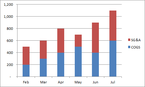
Step 1: Arrange your data.
Lets assume we have our data like this:
Step 2: First indexed value is 100 for all items
Step 3: Calculate next indexed value using simple formula.
See this illustration to understand how to calculate the indexed values.
Step 4: Make a line chart
Select the indexed values and create a line chart. And you are done!
Step 5: Format the chart
This is where you can unleash your creativity. Add labels, legend, format axis etc. Here is a version I came up with.
Download Indexed Chart Example
Click here to download example workbook & play with it. Poke the formulas & chart options to understand this better.
Do you use Indexed charts?
I use indexing technique often to compare various metrics in my own business. I also use these type of charts in various dashboards & client reports.
What about you? Do you use indexation as a technique to compare values? What other techniques you rely on? Please share using comments.
More charting techniques:
Sign-up for our FREE Excel tips newsletter:
Here is a smart way to become awesome in Excel. Just signup for my FREE Excel tips newsletter. Every week you will receive an Excel tip, tutorial, template or example delivered to your inbox. What more, as a joining bonus, I am giving away a 25 page eBook containing 95 Excel tips & tricks. Please sign-up below:


