Using Bollinger Bands to Your Trading Advantage
Post on: 16 Март, 2015 No Comment
As an options buyer and seller, I have a myriad of ways to profit from stock price action. I can trade market scenarios that are bullish, bearish or stagnant. I can trade in very short durations or long time frames. I can add or subtract various instruments within a given trade structure to reflect changes in the trend mid-trade. Basically, my “options” are limitless (pardon the pun!).
I particularly enjoy using my knowledge of various technical indicators to profit from “extreme” swings in the price of an underlying equity. There are times when the momentum of equity price action becomes overdone in the short term for bullish and bearish action alike. My favorite technical indicator for this potential trade setup is use of the Bollinger bands.
Before we get to the particulars of Bollinger bands, we must have a quick review of something we all learned in math class during our educational process – the standard bell curve. The standard bell curve is a statistical analysis of data points. The thought process simplified goes something like this: You plot a set of data points around a mean of 0. The standard bell curve shows mirror symmetry at zero. Half of the curve is to the left of zero and half of the curve is to the right. If the curve were folded along a vertical line at zero, both halves would match up perfectly. When you plot your individual data points, you will find that roughly 68% of these points will fall within 1 standard deviation of your mean of 0. 95% of your data points will be within 2 standard deviations. The standard deviation is the way mathematicians are able to make this bell curve “standard” or applicable to any data set. Take a look at the picture below for a visual representation:
This bell curve can be applied to any data set whether it is measuring school grades, IQ’s or stock prices. The Bollinger bands take this understanding of the bell curve and apply it to stock price movements.
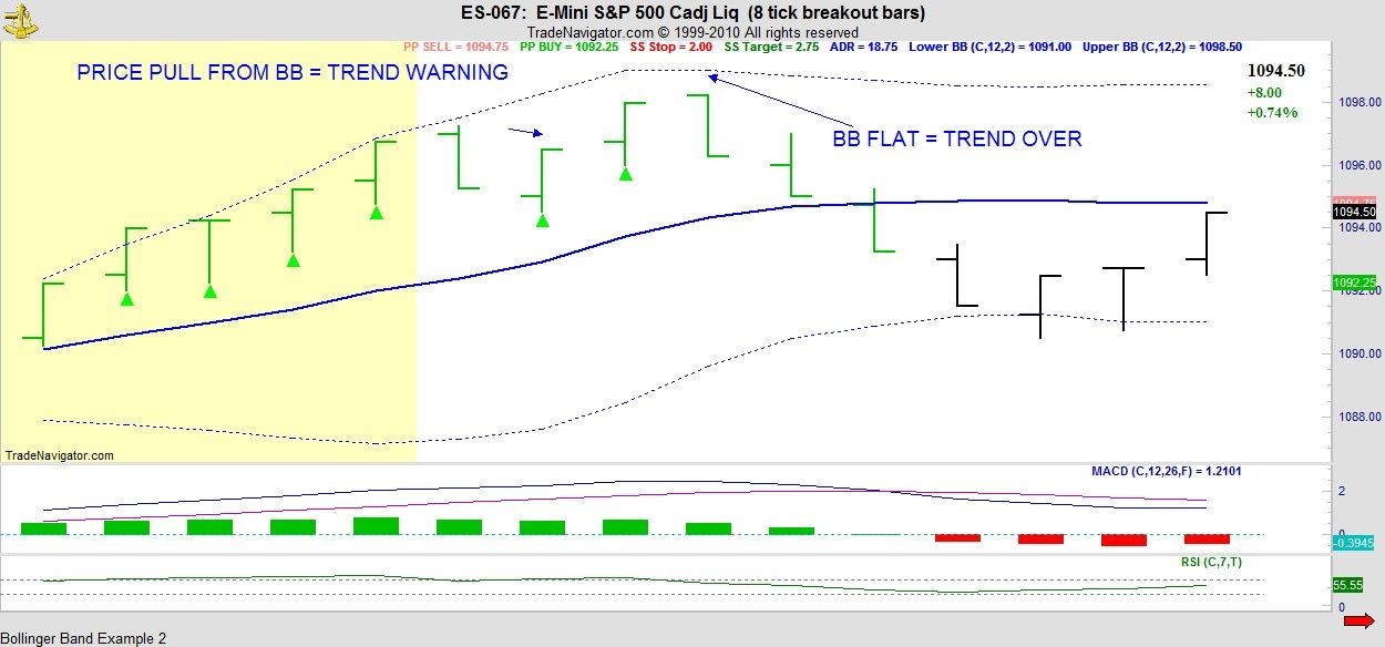
Bollinger bands were created by John Bollinger in the early 1980’s to identify short-term extreme price movements in equities. The indicator is created by plotting the average of a predetermined number of prices along with two trading bands above and below the average. The bands are created by adding or subtracting standard deviation measurements from the average. With stock price action, the standard deviation measurement is an indication of volatility. I like to think of the Bollinger Bands as this standard bell curve “turned on its side”. Both the upper and lower Bollinger bands are 2 standard deviations away from the 20 period exponential moving average in this example (also the “default” setting in most trading platforms). You may notice a few points of interest in this chart. The first is that this equity respects its bands – it has only moved outside the upper band once and only touched the lower band once. Relating this to the standard bell curve, it is within that middle 95% range of data points most of the time. You also notice that during the periods of more volatile price movement, the bands expand to reflect the increase in volatility. The bands likewise contract when the equity is in a channel or lower volatility period of time. Here’s the key: generally speaking, when an equity moves outside the upper band, it may be overbought in the very short term. Likewise, when the equity moves below the lower band, it may be oversold in the very short term. If the equity moves outside the band, it is now above/below that second standard deviation on the bell curve – outside the 95% of all data points. This is often referred to by statisticians as an “outlier” event. In the case of stock movement, the likely outcome is that price action will move back within the band relatively shortly. It does not mean an end to the trend but more likely a pause that brings the price back within the 95% of all price action data points. Notice how this equity popped outside the upper band after a positive earnings event only to succumb to some short term selling/profit taking. It did not reflect an overall top in price action as the equity has traded much higher than that prior price point. It marked a pause for bullish momentum in that shorter term time frame. An active trader can utilize these “opportune moments” to create trades that can profit from the likelihood of such a pause. In this example, a trader might have profited from a very short duration stagnant or slightly bearish options trade as this equity moved back within the band.
I have a watchlist of approximately 30 equities that I trade consistently. By having a watchlist that is easily managed, I am able to spot these types of opportune moments frequently. Not all equities respect their bands equally – some have momentum that moves prices outside the bands for longer periods of time. I have backtested this strategy across my watchlist to find equities that are ideal for this type of short-term trade. Knowing your equities well is the key to success with this strategy. This is one way that I create “alpha” in my overall portfolio management strategy. Perhaps you can do the same!
OptionsANIMAL Instructor


