The CBOEs Volatility Index (VIX)
Post on: 26 Апрель, 2015 No Comment
In my books and seminars I discuss determining market tone before making any investment decisions. One of the main factors I utilize in this evaluation is the VIX.
The VIX is the ticker symbol for the Chicago Board Options Exchange (CBOE) Volatility Index, which is a measure of the implied or expected volatility of S&P 500 options over the next 30 days. This implied volatility is reflected in the premiums paid for the options. It is constructed using the implied volatilities of a wide range of S&P 500 index options. This volatility is meant to be forward looking and is calculated from both calls and puts. The VIX is a widely used measure of market risk and is often referred to as the investor fear gauge.
There are three variations of volatility indexes: the VIX tracks the S&P 500, the VXN tracks the Nasdaq 100 and the VXD tracks the Dow Jones Industrial Average.
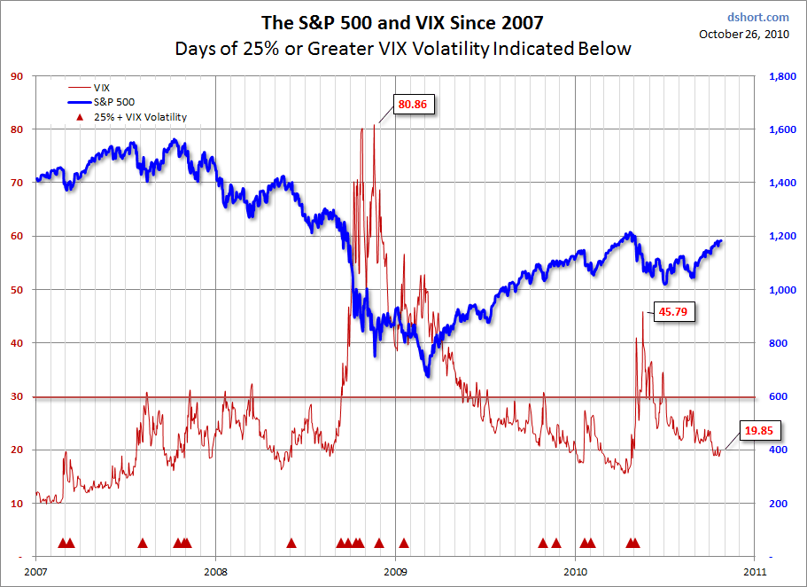
The VIX is a useful indicator for short-term investors including 1-month covered call writers. Generally speaking, as market volatility increases the market values will diminish and vice-versa. The VIX is said to have an inverse relationship with the S&P 500. If we see a declining VIX or one that is remaining stable at a low level (below 30) along with an appreciating S&P 500, we have a favorable environment for selling covered call options. Here is a chart showing the inverse relationship between the VIX and the S&P 500 over a 3 month time frame:
Inverse relationship between the VIX and the S&P 500
The red arrows highlight areas when the VIX was declining and the S&P 500 was appreciating and the blue arrows show just the opposite.
Conclusion :
The inverse relationship between the VIX and the S&P 500 is not 100% accurate but it does add information that will help guide us in our investment decisions like strike selection for example. With a favorable VIX and a positive technical chart for the S&P 500 I am more likely to favor O-T-M strikes. I also may be inclined to roll out and up as opposed to just rolling out as an expiration Friday exit strategy. As with all other technical tools the VIX should be used in conjunction with other fundamental, technical and common sense indicators.
The ETF report has been enhanced (found in the premium site ):
Each week the BCI Team screens exchange-traded funds (with options) from all asset classes and locates the top-performers over the past 3-month period. Of the remaining ETFs, the top 5 (greatest percentage 3-month appreciation) are charted along with the S&P 500. Some weeks we will include more than 5. At the end of this report we now will also screen the S&P 500 Sector ETFs and chart the top 3 performers over the same 3-month time frame.
Select Sector SPDRs are unique ETFs that divide the S&P 500 into nine sector index funds. They have the diversity of a mutual fund, the focus of a sector fund, and the tradability of a stock. Together, the nine Select Sector SPDRs represent the S&P 500 as a whole. However, each Select Sector SPDR can also be bought individually, providing you with exposure to a particular sector or industry group.
These securities all have options and can be used with our covered call strategy. Each week the BCI Team will do a 3-month technical analysis of the linear price chart of each sector and compare it to the performance of the S&P itself. The top 3 funds outperforming the market benchmark will be listed and considered to be among the best candidates for covered call writing in the near-term.
The nine Select Sector funds are:
Here is the most recent chart taken from the premium sites resources/downloads section:
Top 3 Sector ETFs
The BCI team will continue to make every effort to provide our members with the best and highest quality educational tools to achieve our goals of financial independence and becoming CEO of our own money.
This past holiday-shortened weekend produced some positive economic news. The U.S. trade deficit narrowed more than expected in July and the consumer debt decreased by $3.6 billion in July. The Federal Reserve noted continued growth in national economic activity but at a slower pace than hoped for.
A 3-month chart of the S&P 500 shows that the benchmark moved above the 50-d simple moving average in the beginning of September (red circle) and approaching the longer term 200-d simple moving average (green circle):
3-month chart of the S&P 500
The 1-year chart shows that the market has been trending sideways recently and would show a significant positive technical signal if the pattern breaks through resistance on high volume (top green line):


