Technical Analysis_1
Post on: 5 Июнь, 2015 No Comment
Technical Analysis
Tony Pike (WEN Software)
Introduction
Technical analysis is the study of prices and volumes in actively traded free market systems such as the stock exchange. It determines the optimum time to buy and sell stocks as opposed to the intrinsic value of stocks. Timing is the critical success factor in considering an investment in stocks, unit trusts, options, commodities and futures.
The basic philosophy underlying technical analysis is that the stock price reflects all determinants of price including fundamental, economic, political and psychological factors. This does not imply that the market is totally efficient in absorbing all relevant data. There is probably general disagreement concerning the value of a stock because every investor has their own perspective and their own needs and hopes. Therefore, the value of a stock is simply the market value, that is the current market-price.
Should you uncover a stock that you believe to be under its true value, using Fundamental Analysis, you should consider the following: In reality, it is only under its value if the market thinks it is and if the market thinks it is, it will not be for long. Although distortions may exist in the short term, the longer term perspective will ensure that the price of all stocks will eventually tend towards prices established by the markets logical assessment of all relevant factors.
For the above reasons, the technical analysis focus is purely on attempting to understand the implications of price movements that the underlying forces of supply and demand cause. The value of the stock is not its concern.
This has significant advantages. All the analysis requires is a thorough study of price movements and this study invariably extends to an analysis of volume of shares traded.
Compare this to fundamental analysis, an almost unbounded collection and analysis of data that includes (but does not limit itself to) the financial, marketing, managerial and strategic functions of the company. It is easy to see that while financial institutions have the resources to perform such Herculean tasks, it is quite beyond the scope of most private investors.
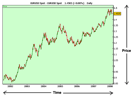
The study of price and volume requires many calculations that computers perform best. Technical analysis software can also meet the needs of beginners and sophisticated technicians. A basic requirement of each package is the graphical display of price charts and technical indicators. Price charts are available in various forms, such as line, bar and point and figure. Each type mentioned has specific applications and interpretations. At the very least, a price chart provides a historical perspective of essential elements such as price range, trends and volatility.
Technical indicators have evolved from observations of price behavior such as the tendency of the price to close near the upper end of the price range for the day, when prices are rising and near the lower end when prices are declining. Some indicators result from statistical techniques. What they all have in common is the general ability to signal conditions which could provide a significant trading advantage.
The technical analyst, like any craftsman, has a number of tools at his disposal. It is essential that the true craftsman uses the appropriate tool. The technician cannot haphazardly accept buy and sell signals from a sophisticated technical analysis package, without understanding the nuances and when it is appropriate to use the signals.
One of the buy signals occurs when the price line crosses a moving average on the upside. However, this is simplistic and will result in many whipshaws (false signals) when the price is moving sideways. It is not true to say that only in trending markets (that is when a definite upward or downward price trend is evident) are moving averages used.
Technical analysis benefits any actively traded market such as stocks, unit trusts, options, commodities and futures. Any investor can use it to great advantage. Say for example, you have not yet ventured into trading stocks but you are investing in unit trusts. Would a good technical analysis package benefit you? Yes is the definite answer.
Unit trust funds will follow the general direction of the stock market. Therefore, you can time your purchase or sale of units for maximum financial advantage. In essence, determine the low and high with the aid of technical analysis and then buy low and sell high.
As your understanding and uses for your Technical Analysis program increases, your needs will become more sophisticated and you will begin to need a comprehensive and flexible technical analysis module and an integrated portfolio management system. Furthermore you may also need a market analyzer and the ability to develop, test and implement profitable and sophisticated trading strategies are absolute necessities in the increasingly complex and sophisticated investment world.
Intelligent and judicious application of technical analysis principles should provide forecasting of price trends and the determination of specific entry and exit points as part of your trading tactics. However, this is not sufficient. Effective money management will increase the probability of success. This encompasses the allocation of funds and risk control.
There are standard guidelines in the industry and for individual needs. For instance, a guideline is that not more than 50% of your total investment capital should be in the market and not more than 5% (for very large portfolios) or 15% (for smaller portfolios) in any one stock.
The important consideration is that diversification and risk control be carefully managed to preserve capital and retain some measure of protection during losing periods.
The Rationale Governing Technical Analysis
Technical Analysis is more than just a fight body of specialized material. It is a combination of several different approaches which makes up the coore of technical theory. And, because technical analysis concerns itself with a subject so dynamic, the need for constant study and review cannot be over emphasized.
It is necessary to define Technical Analysis, as a full appreciation of the technical approach must begin with an understanding of what it really is that technical analysis claims to be able to do. To do this, we have to know the philosophy upon which Technical Analysis bases those claims.
Technical analysis is the study of market action primarily through the use of charts and for the purpose of forecasting future price trends.
Note:
MARKET ACTION = PRICE + VOLUME
1. Market action discounts everything
It is only PRICE + VOLUME that reflects true supply and demand!
Unless this is fully accepted, nothing that follows can make any sense. It is the corner stone of Technical Analysis.
Charts do not cause up and down swings in the price of a share, they simply reflect the reaction of a massively varied body of investors, speculators and traders, to the fundamentals. The chartist knows that there are reasons for price movements, but he does not believe that knowing those reasons is necessary for the charting process.
2. Prices move in trends
Accept that they do, as the whole purpose of charting price action is to indentify the peaks and troughs in a trend for optimum timing of exit and entry into a share!
3. History repeats itself
The only way we can assume anything about the future, is by looking at the past. So, based on the assumption that human nature basically does not change and that it is human sentiment that is reflected in market action, we look at the chart history of a share to extrapolate to the future.
1. Self fullfilling prophecy
- Waves of buying and selling are created by signals generated whthin the charts.
- Chart reading is subjective.
These two critisisms are always lumped together, but really, (ii) entirely negates (i)!
2. The past has nothing to do with the future
All forecasting must be based on the past. There just is no future information available!
3. The Random Walk theory
This theory states that prices fluctuate randomly about their intrinsic value, therefore a buy and hold strategy is the only one worth considering! Trends do not exist and all market action is arbitrary.
Dow Theory
Charles Dow, the editor of the Wall Street Journal, published his first average in 1884. He had noticed that stocks generally moved up or down in tandem.
Even if stocks moved out of synchronization with others in the market, they would sooner or later fall back in line with the averages and join in the cyclical action of the market.
He set forth his principles in a series of editionals in the Wall Street Journal and these were later categorized, organized and published by Hamilton in the 1920’s, when he took over as editor of the Wall Street Journal.
The Rules of the Dow Theory
1. The averages discount everything
This rule still applies to Technical Analysis as a whole today!
2. The market moves in trends
An uptrend exists al long as each successive rally’s high and low are higher than the high and low of the preceding rally.
A downtrend exists al long as each successive correction’s high and low are loweer than the high and low of the previous correction.
Each trend has three categories:
The primary trend last for twelve months and can extend to 2.5 years.
The secondary trend within the primary, consists of corrections or rallies, which last from three weeks to three months, with 33% — 66% retracements of previous price rises or falls. The most usual retracement is one of 50%
3. The primary trend consists of three phases
In and up-trend:
Phase 1: Accumulation by smart money or intuitive investors
Phase 1: Distribution
Phase 3: The public gets out
4. The averages must confirm
Dow used the Industrial and the Rails averages for confirmation.
Both averages have to be showing the same chart to confrim each other and to signal the end/beginning of a Bull/Bear market. this is called the Principle of confirmation.
5. Volume must confirm the trend
This is a Secondary indicator and serve as confirmation on your other rules. What it means is that: in a primary up trend, volume increases when the price is rising and decreases when the price is falling; and in a downtrend, volume increases when the price is falling decreases when the price is rising.
6. A trend is in effect until it changes
How does one tell whether the share is undergoing a normal correction, or whether the chart is indeed singalling a change in trend?
It is for this purpose that chartish have developed a plithora of tools to help in establishing when a change is being signalled. We now attempt to cover some of the major issues.
Trendlines
Trendlines are the most basic and the most valuable to the tehnician. It is to our benefit to establish trendlines as we can then most accurately time our points of entry or exit along that line.
A trendline should not be confused with a moving average. A trendline is determined by drawing a line, which connects the top of the inverted saucer to the follow tops as is shown in the diagram above. Also, it can connect the bottom of the following saucer to the following bottom.
Once this has been done, the following conclusions can be drawn:
- Significance
The greater the number of points touching on a trendline, the greater its significance (i.e. the more the trendline is confirmed)
- Minor penetrations
This compromises the trendline and you should seek other confirming factors, as the graph may be about to break the trend and reverse direction (which may mean you stand to lose investment capital).
- Valid penetrations
A valid penetration is consituted when a share closes above its trendline or you calculate it to be 3% above its trendline.
- Price objectives
Prices usually move a distance beyond the trendline, equal to the vertical distance that prices have achieved on the other side of the line.
- Steepness of the trendline
The most important trendlines are those that are at a slop of around 45 degrees. If a trendline is too steep, it won’t be long before it is violated and it must be adjusted accordingly. In an accellerated trend, 45 degrees may be too flat, but there are other tools to compensate.
The Three Fan Principle
The software draws three lines from one point on a graph containing a graph of historical data up to the present time. The three lines have the same starting point and each touch the base of the preceding trend and the top of the following trend. The thrid fan should therefore touch the base of the last completed trend available.
Should the last available trend also break the third fan, as the prior two have done, this is seen to be a negative sign. This occcurance is usually seen at the end of bull markets leading into a bear market.
Channels
A channel line is a line that runs parallel to the trend line and is often called a return line. It marks off the area in which a share is trading and the more often it is touched, the more valid it is.
- Failure to touch the return line can constitute a warning signal
- Penetration of a return line is a sign that it will move further in the direction of its penetration
- The channel line can be used to adjust the basic trendlines
- Price objective: Once the breakout occurs in the channel, the extent of the breakout is usually equal to the previous width of the preceding channel
- Percentage retracements are between 33% and 66% with the most common one at 50%
Continuation Patterns
Continuation Patterns indicate that sideways price action on the chart is nothing more than a pause in the prevailing trend and that the next move will be in the direction of that previous trend. It should be noted that Continuation Patterns are short- to medium-term by nature.
There are a number of recognisable Continuation Patterns, such as the Triangle Formation, Wedges, Flags and Pennants, to name a few.
Triangles
There are three types of triangles and they all have the same forecasting properties.
1. Symmetrical Triangles
2. Ascending Triangles
3. Descending Triangles
Remember:
- While these triangles usually manifest themselves as Continuation Patterns, they can appear as Reversal Patterns at important market tops and bottoms.
While these Triangles are usually seen as Continuation Patterns, they can act as Reversal Patterns, especially if they take a long time to form and occur at major tops or bottoms.
Symmetrical Triangles
Two converging trendlines meet at the apex of the Triangle and are touched by the price line at least twice each.
The Symmetrical Triangle is usually a continuation Pattern, although it can appear as a Reversal Pattern at important market changes. To know the difference is to look at the length of the time it spends in the forming. The longer it takes to from, the more chance exists that it will reverse the trend.
Also, look at the place it occupies in the cyclical timetable of the market. If it is in the second phase of a bull run, it will almost certainly act as a Continuation Pattern.
The Symmetrical Triangle starts out at the base on high volume, which gradually peters out during its formation, and then increases noticeably on resolution of the pattern and breakout.
Ascending Triangle
A variation of the Symmetrical Triangle, the difference being that instead of an ascending line and a descending line, there is a horizontal line at the top and an ascending line at the bottom. The volume behaviour is identical to that of the Symmetrical Triangle, starting out high, gradually diminishing and then increasing on breakout.
This pattern is invariably bullish in its implications.
The extent of the breakout is determined by the height of the pattern at its base i.e. The height of the base is equal to the minimum price objective on breakout.
Descending Triangle
Here the horizontal line sits at the bottom of the triangle and a descending line comes down from the top and meets with the horizontal line at the apex.
This pattern is usually bearish in its implications.
The broadening formation
This is seen by some technicians as a variation of the triangles. Instead of converging trendlines, it has diverging trendlines. That is, the price action expands.
Remember:
- Volume expands with the wider price swings.
- A broadening formation usually reflects an emotional market that is confused and out of control.
- It usually reflects a large amount of public participation.
- It is usually bearish .
Flags and Pennants
These represent brief pauses in a dynamic market move and occur fairly regularly. They are very reliable as Continuation Patterns and, as they are really breathing spaces in rapidly accelerated moves, the are short-term patterns.
Remember:
- The Flag and the Pennant are always preceded by a sharp move.
- The pattern goes against the trend.
- They usually last no longer than three weeks in an uptrend, and half of that in a downtrend.
- It takes less time to develop in a downtrend.
- They usually appear at the mid-point of the bull or bear cycle.
Wedges
Wedges are very similar to Symmetrical Triangles in shape and the time they take to form, except that both converging trendlines slant against the trend.
As with all triangle patterns, volume starts out high at the beginning of the formation and contracts during its formation, expanding again as the price breaks out of the pattern.
Remember:
- A falling Wedge is bullish.
- A rising Wedge is bearish.
- Unlike the Triangle, the price can run right to the apex and the pattern lose it potency.
Rectangles
Rectangles are easy to spot and represent a pause in the trend during which prices move sideways between two parallel horizontal lines.
Remember:
- Volume is high at the outset, contracts during the formation of the Rectangle, and increases on breakout.
- This is a very useful pattern for the short-term trader.
Reversal Patterns
Head and Shoulders
This is the best known of the reliable reversal patterns and provides the basic blueprint for the majority of all reversal patterns.
They manifest themselves in the shape of three well-defined peaks, where the middle peak is more pronounced that the two outside peaks — creating an image of a head flanked by two shoulders — hence, the name.
Head and Shoulders reversal patterns abound and are varied in shape, length of time to resolve, in price breakout objective and sometimes even in signaling the continuance of the trend prior to the Head and Shoulders as a consolidation pattern (as opposed to a reversal pattern).
The Triple Top formation
The Triple Top or Triple Bottom formations are easily recognisable by the three distinct peaks (when at the top) and the three distinct troughs (when at the bottom) of a major move.
Double Top/Bottom
Next to the H & S, these are the most commonly seen and recognised for the Reversal Patterns. The fairly symmetrical peaks of the Double Top are often called the M-formation and for reasons just as obvious, the troughs forming the Double Bottom are often called the W-formation.
Rounding Tops
Otherwise known as Inverted Saucers, Rounding Tops represent a slow and gradual change in trend.
The pattern starts out on high volume, which diminishes as the price makes a gradual turn, and then increases again as the pattern resolves itself — with the price sliding until there is no more doubt that the upward trend has been reversed.
The chartists should however not get caught by this pattern, as normal Trendline Analysis should have seen him out of the share well before the big losses occur.
Rounding Bottoms
Otherwise known as a Saucer or Bowl, the Rounding Bottom represents a rather dull or slow market bottom. It occurs more frequently than its topping counterpart and manifests itself with slight variations.
The saucer always starts out on heavy volume, which peters out as the price flattens and then increases as the sideways price movement gradually turns up. Often the Saucer will exhibit a sudden spurt of activity at the bottom, shown in increased volume and the price almost spiking.
Sometimes a rectangle forms at the culmination of the Bowl. Volume behaviour within the rectangle starts out high at the base, peters out and then increases markedly on breakout and it is only at this point that the pattern is resolved.
Spikes are not patterns of any kind, as they happen too quickly to be classed as consolidation of any kind. However, they do occur frequently enough to warrant a mention.
Spikes or V-formations are very easy to spot (in hindsight), but they are near impossible to trade as they are over just too quickly.
Patterns are pauses, or breathing spaces that occur in price advances or declines. They occur gradually. The Spike is a radical departure from this tendency of markets to gradually change trend.
Spikes occur at important tops and bottoms and are usually representative of a last extra gasp of an highly overbought situation, or conversely, a swift correction from a severely oversold situation.
Relative strength
This is the price of one entity divided by another. That is, simply a ratio which is the measure of strength relative to a base entity.
It is often said that a share or group of shares is outperforming them market. This is simply another way of saying that it has moved up faster in relation to the market. Or, put another way, the Relative Strength of that share or group of shares has improved.
We also know that generally speaking most stocks move up or down in tandem. So, what Relative Strength tells us, is which share or group of shares is moving up or down faster than the average is, and are therefore out- or under-performing the market.
Top-down approach
This is the most useful approach. Here, the chartist starts out by comparing, on a relative strength basis:
- All the sectors of the market with the overall market, thus determining which sector is the strongest, and
- Individual shares of a sector with each other, to pull out the strongest.
On a Relative Strength basis, compare:
- Individual markets with the overall market
- Sectors with individual markets and the overall market
- Shares within the sectors with their own sector, and with individual markets and the overall market
- The industrial market with the Dow Jones industrial average
- The Gold price with gold shares
- The Dollar with the Gold price
Once you have done this, you should have a fairly good idea where the best performances are being put in. You may land up, with a list that is still too long to handle successfully. So, plot the share against each other! Should you be considering a purchase, buy the stronger share, should you be considering a sale, sell the weaker share.
As can be appreciated from the foregoing, the Relative Strength philosophy derives from the thinking that strength begets strength and weakness begets weakness. In other words, if a share or group of shares is strong relative to the commodity that influences its fortunes, then that strength is likely to continue. And the converse applies in cases of weakness.
Obviously, no share or index can lead the market indefinitely and other tools have to be used, to determine when the leader is about to change to a laggard.
This is where trendline analysis once again is of the utmost importance. As with price graphs, Relative Strength graph are ideally suited to trendline analysis. The violation of a trendline heralds a breakout in the same direction in which the breakout occurred.
Also equally useful, is the use of moving averages on the Relative Strength Line. Moving Averages are very useful in pointing out possible changes in up- and down-cycles, the trick is to use the correct Moving Average duration.
Experience has shown that for short-term changes, the optimum Moving Average is the 21-day Moving Average. The medium terms is best analyzed using the 15-week Moving Average and the long term, a 45-week Moving Average seems to work best.
Remember:
- When the Relative Strength Line moves above the 21-day MA, short term buy is generated
- When that line continues up through the 15-week MA, a medium term sell signal is in effect
- When the line moves above the 45-week MA, a long-term buy signal is generated.
Note:
- Crossovers in the MA are as vital in Relative Strength analysis as they are in price graph analysis!
- Sell signals are given when the line crosses through the MAs on the downside.
Relative Strength is a very powerful indicator, but in our opinion, it must not be forgotten that everything in Technical Analysis is subordinate to Trendline Analysis of the price graph and Relative Strength must be used primarily as a confirming factor.


