Point Figure Charting
Post on: 16 Март, 2015 No Comment
Point & Figure Charting
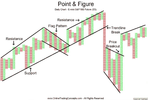
Point & Figure Charting, also referred to as P&F Charting, has been around since the 1800’s. According to resources, Charles Dow was the first individual to record stock price movements and created a method of analysis called Figuring. Figuring eventually became to be known as Point & Figure Charting.
P&F Charting is an easy, yet powerful form of technical analysis that tries to gauge supply and demand for a stock. P&F charts also try to simplify charting by eliminating most of the nominal fluctuations of a stock’s share price, allowing investors who utilize these charts to focus more on the larger trend at hand.
P&F charts provide a different perspective than candlestick charts or bar charts since they use a series of X’s and O’s to indicate the changing share price for a stock. X’s indicate that the share price is increasing while O’s indicate that the share price is decreasing. P&F charts can also be customized for different styles of traders (short-term, long-term) by manually changing a setting on the chart called the Box Size.
Let’s take a look at an example of a P&F Chart courtesy of StockCharts.com — I use StockCharts.com for all my P&F Charting needs. The below chart is a P&F Chart for Apple (AAPL). Here is a quick explanation of how to read the chart for those that are not familiar with the P&F Charting methodology.
- In the upper left-hand corner of the P&F Chart heading you will notice the stock’s, name, ticker symbol and a snapshot of the date when P&F chart was created.
- Next, the chart lists any recognizable patterns that are forming on the P&F chart (there is no new P&F pattern for Apple). After the P&F Pattern, the chart displays the chart settings that were used to display the current chart. Until you become more familiar with P&F Charting, I would recommend staying with the default settings, which should read Traditional, 3 box reversal chart.
- The last item in the chart heading is the price objective for the stock. For Apple on the chart below, the P&F Chart suggests a bullish price objective of $649.
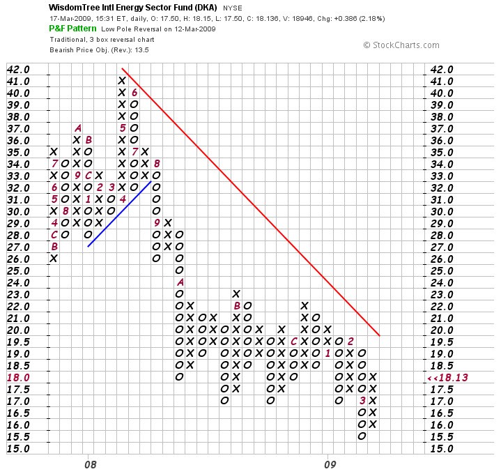
Apple (AAPL) P&F Chart
What a P&F chart is not able to provide is an approximate timeframe of when the price objective will be met. That is the weakness inherent with P&F Charting techniques. However even without any timeframe guidance, P&F charts have excellent predictive powers when calculating target areas for a stock’s share price.
The X’s and O’s that make up P&F Charts sometimes form into recognizable patterns. Just like any other type of chart patterns, P&F Chart Patterns can be used to predict future price movements and calculate price objectives.
Does P&F Charting sound intriguing? Then consider joining Trendy Stock Charts where P&F Charting is just one of the types of technical analysis that is discussed in the Members Area .
So what are you waiting for? Click here to start the subscription process and become a Trendy Stock Charts member today!


