Point and Figure Charts
Post on: 8 Июль, 2015 No Comment
20for%20point%20and%20figure%20charts.jpg /%Charting the price action by Point and Figure charts (P&F charts) is a very effective method to know the true picture of the market trend by avoiding the market noises or insignificant moves. In fact these insignificant moves can be considerably big but very temporary in nature and hence are considered as ignorable market noises.
In todays world the information availability is very easy. Be it the fundamental factors which affect the financial market or the actual ongoing price data at every moment. Getting hold of the information is not an issue, what is important is how do we organize the various bits and pieces and process those to analyze the same in a meaningful way.
In speculative trading markets the prices change every moment but every move of the price is not important. here is a lot of movement and insignificant spike in the price-action which can be ignored simply ignored as meaningless. Point & Figure charting helps us in doing that in a very effective way. After reading this guide, you may also use the real-time online Point and Figure charts for analysis for your trading.
Point & Figure Versus Other Charting methods
Charts represent the statistical data in a visual form to make the interpretation easy. The initial charting methods like Line charts do this representation literally. Financial charts then evolved to bar charts and candlestick charts to put the pricing information in a more meaningful way. Point and Figure charting is another big jump in that direction.
While other charts e.g. bar charts and candlestick charts record every move of the market on a time scale, the soul of the P&F chart is pure price action and nothing else. Point & Figure charting does not take the time factor, volumes, highs and lows etc into consideration. It is only about the pure price action and that too by avoiding market noises.
In order to avoid to ignore the insignificant price-action, the first step to draw a P&F chart is to decide the moves which can be considered as significant or worth considering.
Construction of Forex Point and Figure charts
The very first step in drawing the P&F Chart is to decide about the amount of move in the price action which we should consider as significant and hence worth recording. There are two types of significant moves we need to consider, one in the direction of the recent trend and other as reversal. For this purpose first of all we decide about the following components:
Box Size
Box size is the amount of movement of the price which is worth considering in the direction of the recent trend. In this tutorial we will consider a box size as 10 pips. What it would mean is that if the prices are falling then we will consider a drop of 10 pips or more as a fall but any drop less than 10 pips will be ignored. Similarly if the prices are moving up then any upward move less than 10 pips will be ignored.
In this article we shall consider the box size as 10 Pips.
Reversal size
Reversal size is the amount of move in the price which we decide as worth recording as a reversal. Please note that reversal does not mean a reversal in the overall trend. Reversal here only means the reversal of the recent price-action direction.
The most commonly used reversal size is equal to three boxes. Hence is we our Box Size is 10 pips for a particular currency pair then the Reversal Size would be 30 pips.
In this tutorial we shall consider the reversal size as 30 pips (3 boxes).
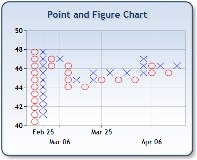
Point & Figure charts are alternate columns of Xs and Os. X represents an upward move and O represents a downward move. Any one column on the chart will have either Xs or Os i.e. no single column can have both Xs and Os.
Step to Step Guide for constructing a Forex Point & Figure Chart
Time frame
The very first step before drawing P&F chart is to decide the time frame of the chart. In this tutorial we will be using daily chart.
Price point
The second step is to decide which price points we would be using. There are three important price points for every period, closing price, High and low. Opening price is always the previous period’s closing price. Considering this there are two options about the price point and these are as follows:
1) Closing price:
We can just record the closing price of the day as we are going to use daily charts. This is the simple and effective way for constructing the point and figure charts.
2) High and Low method:
In this method we record either the high or the low points of the day’s price-action. The rules for High-Low method are as follows:
When the prices are moving down and we are drawing the column with O’s
When the prices are moving up and we are drawing the column with X’s
- Record the high if it is equal to or more than the Box Size than the previously recorded price and ignore the low of the current day.
- Record the low when high is not having the required Box Size difference with the previously recorded price but the low has the required Reversal size (3-box sizes) difference.
- Ignore both when neither the high has the required Box Size difference nor the low has the required Reversal size difference
In this tutorial we will be using the daily closing prices for the explanation.
For our exercise to construct the P&F chart, let’s consider that the closing prices of the currency pair in question have been as in the left side of the following:
Example of Constructing a Forex Point and Figure Chart
20of%20point%20and%20figure%20chart%20-%202.png /%
The Point & Figure chart on the right hand side is drawn based on the daily closing prices indicated on the left hand side.
Step by Step Explanation
- Please note that on the left hand side of the P&F chart we have used price range of 10 pips e.g. 124.01 to 124 and so on. Each of this range represents a box size of 10 pips.
- We observe that during the first day the price has been falling and hence in the first column we enter the first O for the falling prices in the row 125.41 to 125.50. This entry points to the closing price of the first day i.e. 125.50.
- The closing prices of Day 2 and Day 3 did not meet the requirement of the box size of 10 pips and hence we ignored those prices and no entries were made.
- Day 4 had a closing 12 pips below the previous day and was more than the Box size. But what we are interested in is the difference with the previous entry i.e. 125.50. The difference was 11 pips. We enter another O for the fall below the previous O.
- Days 5, 6 and 7 resulted in the subsequent O’s just one box below the previous ones.
- Now please note that the Day 8 had a difference of 26 pips which was more than 2 box sizes. The previous O was in the row representing 125.01 to 125.10. The O for the day 8 would be in the row of 124.71 to 124.80. What it would mean that we have two blank cells in the previous two rows of 124.81 to 124.90 and 124.91 to 125.00. The point to be noted here is that these two cells would also be marked with O’s. This is because the price as covered those ranges during the fall.
- The closing price of day 9 was 56 pips more than the day 8. This reversal was more than the required reversal size of 30 pips and hence it requires an X to be market in the next column. This X would be entered in the row representing 125.31 to 125.40 as the closing price was 125.35.
- The important point to be noted is that all the cells below the mentioned cell in point number 8 are also to be marked with X as the price action has covered all those prices during the upward move. Another point to be noted is about the lowest cell highlighted by yellow color. This cell is left blank. If you observe the subsequent columns, you will note that the column of X starts from one cell above the bottom of O column and the column of O starts from one cell below the top of the previous X column. This is because the subsequent column are representing a reversal and entering an X where the O ended or vice versa is not required as that price range has already been taken care of.
How to decide Box Size And Reversal size
For any Point & Figure chart for Forex we need to consider the following criteria to decide on the box and reversal sizes:
1) Volatility
Some currency pairs tend to have more volatility than others. For such highly volatile currency pairs we may need to have a bigger box size. For example GBP/JPY would generally have quite high volatility than many other currency pairs.
2) Time frame
If our P&F chart is based on a larger time frame than the box size may also need to be large. The box sizes for a daily P&F chart and a 4-hourly chart will be different. The reason is simple that the total price movement in during a day may be much larger that it would be in any 4-hourly period.
Using Point & Figure charts
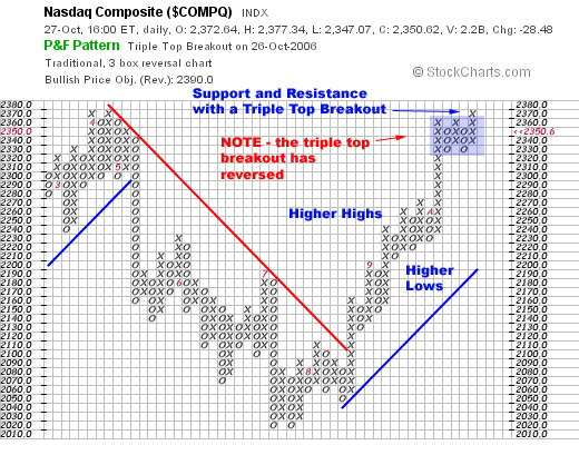
Reading and analyzing Point & Figure charts and taking trading decision are same as any other chart. We use the trend lines and various common chart patterns for our trading decisions. Most of the trading positions depend on either the breakouts of the chart patterns. The difference is that on other charts the chart patterns represent the price actions directly while in P&F charts the chart patterns eliminate the insignificant price actions or market noises.
Please have a look on the following charts which are self explanatory:
Example 1 — Break of resistance trend line
20and%20figure%20chart-%20resistance%20trend%20line.png /%
The above chart represents the breakout of the resistance trend line. The price continued to rise after the breakout.
Example 2 — Break of support trend line
20and%20figure%20chart-%20support%20trend%20line%20trend%20line.png /%
Example 3 — Ascending Triangle Breakout
20and%20figure%20chart%20-%20ascending%20triangle.png /%
The above example #3 again shows a bullish breakout from an ascending triangle. Please note that the ascending triangles are bullish patterns.
Example 4 — Break of Descending Triangle
20and%20figure%20chart%20-%20descending%20triangle.png /%
In the above chart a breakout of descending triangle has taken place. Descending triangles are a bearish configuration. The price action continued to drop after this breakout.
Example 5 — Double Top Formation
20and%20figure%20chart%20-%20double%20top.png /%
The above chart in example #5 shows a double top formation on Point & Figure chart. This works in the same way as with the normal price action charts.
Example 6 — P&F Chart and Double Bottom Formation
20and%20figure%20chart%20-%20double%20bottom.png /%
The above chart in example #5 shows a double bottom formation on Point & Figure chart. Just like the double top, the double bottom formation also works as with the normal price action charts.
Example 7 — Bullish Breakup from Symmetrical Triangle
20and%20figure%20chart%20-%20symmetrical%20triangle%20bullish%20break.png /%
In above point and figure chart the trend lines were forming a symmetrical triangle but then the price break out of the upper trend line and continued moving upward.
Example 8 — Point and Figure Chart’s Bearish Breakup from Symmetrical Triangle
20and%20figure%20chart%20-%20symmetrical%20triangle%20bearish%20break.png /%
In the above point and figure chart the trend lines were forming a symmetrical triangle but then the price break out of the lower trend line and continued moving downward.
Point and Figure charting can be an important and powerful trading tool if you can invest some time to work on the same.
You may also check Important Chart patterns and candlestick charts


