Japanese Candlestick Charts
Post on: 20 Апрель, 2015 No Comment
Japanese Candlestick Patterns – What are the patterns telling us?
Origins
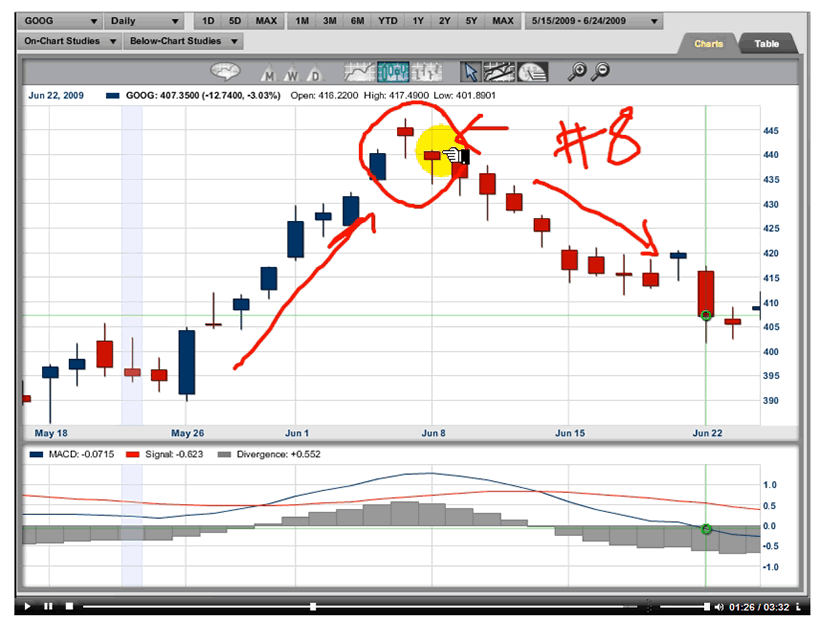
A candlestick chart is a form of hybrid bar/line graph primarily used to show equity price movements over time. This chart form was originally devised by a legendary Japanese rice trader named Homma Munehisa in the early 18th century. Homma used his charts to develop insights into market psychology, which in turn allowed him to amass a considerable fortune in the rice market and eventually rise to the rank of Samurai. Today candlestick charts are used extensively by currency, equity, and options traders engaged in technical analysis.
The Basics
A candlestick line consists of a body, which is a black or white rectangle, and optional upper and lower shadow lines, called the wick. The body indicates the opening and closing prices of a stock. If the opening price was lower than the closing price (the stock went up), the body is white. If the stock went down, the body is black. The wick indicates the highest and lowest prices during the day’s trading (the intra-day high and low).
A candlestick chart thus conveys five pieces of information for each day’s trading and is considerably more informative than a simple line or bar graph of closing prices. Candlesticks do not necessarily have both a body and a wick. If prices were completely flat for the day, the candlestick will have neither and appear simply as a horizontal line.
Basic Patterns
The shape of individual candlesticks is considered by proponents of technical analysis to convey insights into the market trends. There are over a dozen named individual candlestick shapes, each of which has different implications for the next day’s trading. For example, a Marubozu White candlestick, a white body with no wick indicating that the opening and closing prices were also the day’s low and high, implies a strong bullish trend. More ominously, a Gravestone Doji candlestick, a long wick with a horizontal line at the bottom indicating that the price opened and closed at the day’s low, is the harbinger of a market top, suggesting that it is time to sell.
Complex Patterns
More complex patterns can be observed by comparing the candlesticks for two or more adjacent trading days. For example, a Bullish Engulfing Pattern consists of a short black bodied candlestick (indicating a moderate decline) followed by a taller white candlestick, where the body starts below and ends above that of the black candlestick. In financial terms, prices on the second day open lower than the first day’s close and end higher than the first days open. As the name suggests, a Bullish Engulfing Pattern is a strongly bullish signal which suggests that it is time to buy.
Does It Work?
Colorful nomenclature such as ‘Gravestone Doji’ and ‘Bullish Engulfing Pattern’ might lead us to consider that Japanese Candlestick Analysis is more superstition than science. Believers in the Efficient Market Hypothesis would certainly dismiss candlesticks of all nationalities and in fact all other forms of technical analysis. However, this would be a mistake. Advances in Behavioral Economics have created renewed interest technical analysis techniques, such as candlestick analysis.


