Japanese Candlestick Chart Make Stock Charts Using MS Excel
Post on: 20 Апрель, 2015 No Comment
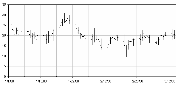
Japanese Candlestick Chart or Candlestick Chart as they are popularly known are one of the most commonly used stock charts.
According to Wikipedia. a Japanese Candle Stick Chart is,
Candlesticks are usually composed of the body (black or white), an upper and a lower shadow (wick). The wick illustrates the highest and lowest traded prices of a stock during the time interval represented. The body illustrates the opening and closing trades. If the stock closed higher than it opened, the body is white, with the opening price at the bottom of the body and the closing price at the top. If the stock closed lower than it opened, the body is black, with the opening price at the top and the closing price at the bottom. A candlestick need not have either a body or a wick.
Today we will learn how to make a candlestick chart in Microsoft Excel in 4 simple steps. For our purpose, we will plot candlestick chart for Apple stock prices between Jan 26 and May 02.
1. First get the stock price data
You can get stock price details open, high, low, close prices for the stock chart from anywhere. I have used google finance (here )
The data should be in this format for us to make the chart:
2. Insert stock chart
Select your data and launch insert chart dialog and select stock chart as type and Open High Low Close Chart as sub-type.
This will insert a chart like the one shown below.
However there is a problem with this chart: excel leaves blanks when stock market is on leave (for eg. weekends) so,
3. We change the axis type from time-scale to category
Right click the chart and select chart options and in the axes tab change the category axis type from automatic to category. This ensures that excel treats dates as categories instead of times and thus removes the blanks.
But when we do this, excel reverse the dates, thus your new chart would read from 02 march to 26 jan instead of the otherway around. To fix this, select the category axis, and check the categories in reverse order and value axis crosses at maximum category options. This sets the date order correctly.
4. We are almost done, now format the chart
Adjust axis scaling options, grid lines etc and you have a Japanese candlestick stock chart ready.


