Interpreting A Strategy Performance Report
Post on: 16 Март, 2015 No Comment
Today’s market analysis platforms allow traders to quickly review a trading system’s performance and evaluate its efficiency and potential profitability. These performance metrics are typically displayed in a strategy performance report, a compilation of data based on different mathematical aspects of a system’s performance. Whether looking at hypothetical results or actual trading data, there are hundreds of performance metrics that can be used to evaluate a trading system.
Traders often develop a preference for the metrics that are most useful to their trading style. While traders may naturally gravitate towards one number — total net profit, for example — it is important to understand and review many of the performance metrics before making any decisions regarding the potential profitability of the system. Knowing what to look for in a strategy performance report can help traders objectively analyze a system’s strengths and weaknesses. (For a background, see our Trading Systems Tutorial .)
Figure 1 shows an example of a performance summary from a strategy performance report that includes a variety of performance metrics. The metrics are listed on the left side of the report; the corresponding calculations are found on the right side, separated into columns by all trades, long trades and short trades.
Figure 1 — The front page of a strategy performance report is the performance summary. The key metrics identified in this article appear underlined.
In addition to the performance summary seen in Figure 1, strategy performance reports may also include trade lists, periodical returns and performance graphs. The trade list provides an account of each trade that was taken, including information such as the type of trade (long or short ), the date and time, price, net profit, cumulative profit and percent profit. The trade list allows traders to see exactly what happened during each trade.
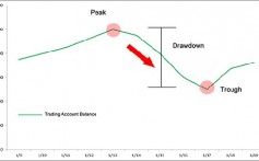
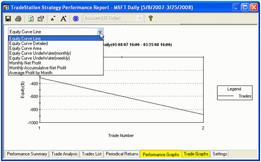
One of the quickest methods of analyzing strategy performance report is the performance graph. This shows the trade data in a variety of ways; from a bar graph showing monthly net profit, to an equity curve. Either way, the performance graph provides a visual representation of all the trades in the period, allowing traders to quickly ascertain whether or not a system is performing up to standards. Figure 2 shows two performance graphs: one as a bar chart of monthly net profit; the other as an equity curve. (To learn more, check out Charting Your Way To Better Returns .)


