Identifying Trend Reversals Binary Options Leader
Post on: 17 Июнь, 2015 No Comment
The trend is your friend is an oft-repeated maxim of trading, and a lot of binary options trading strategies hinge around identifying a trend and trading with it. Of course every market is volatile, and every trend comes to an end. So, what do you do when trend ends?
Knowing when to get into the market is an essential skill, but getting out at the right time is just as important. With binary options, it’s a little easier to know when to get out, because they expire at a fixed time. But, if you are following a trend, how do you know if it’s going to last until the option expires, and how do you know whether it’s a good idea to get into another option right after, taking advantage of the continuing trend?
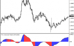
Let’s take the following chart:
It shows a clearly defined rising trend. However, it didn’t just go up and up, but came across different pauses along the way when it went down for a brief bit. These are corrections, and they happen in every market. The trouble is identifying when a change in direction is just a correction, or it’s an outright reversal as we see at the end of the chart. This is even more important in binary options, because if you’ve identified the upwards trend, you don’t want to get caught in one of those corrections.
Of course there is no way of predicting the future, but there are a host of tools that investors can use to identify patterns that give an indication of when a reversal is imminent. A lot of them use sophisticated indicators like Bollinger bands. Commodity Channel and Relative Strength indices, and the more exotic Ichimoku clouds.

But you can get a leg up by just looking at the graph.
The movements on the graph can give you an idea of how strong a movement is, and often an indication of when a trend is starting to get exhausted. One of the more common indicators that an asset is in the process of reversing is that its downward movements become stronger than its upward movements.
This is a pattern called “engulfing”; either a “bullish engulfing” meaning the equity is about to start to go up, or a “bearish engulfing” meaning it will go down. They are the easiest to identify with candle or bar graphs, although you can spot them in a line graph with a very keen eye. Let’s go back to the graph: Notice at each time the asset started a correction, the downward candle (bear candle) was shorter than the upward candle that preceded it (in other words, it went down less than it went up in identical time periods).
But later, when the trend reverses, the downward candle is longer than the preceding one, indicating that the downward movement is stronger. It’s important to remember that this doesn’t happen every time, but it can give you an edge in predicting when the market will turn around. This will allow you to prevent getting in on the wrong side of the trend, or be able to catch on to the new trend quickly.


