How to Read the Stock Charts Using Technical Analysis
Post on: 22 Май, 2015 No Comment
Stock charts are a graphical representation of the movements of the stock market. Being able to read the stock market charts and infer what they signify is also called Technical Analysis. It involves predicting where the market will move next based on its past fluctuations. While technical analysis is merely one’s most educated prediction, it is usually not perfectly precise. With this in mind, it is still an incredibly useful way to target possible trades that pose a high profit with little liability.
Understand the Chart
A stock market chart is essentially like many other standard visual charts. The horizontal axis typically lists the time period. Based on the chart, the time period could be measured in minutes, hours, days, weeks, months or years. The vertical axis lists the price levels that the stocks reach. Stock charts can be read linearly with the oldest information in the chart on the left side leading up to the most recent updates generated on the right. A stock chart can display information about stocks, foreign currencies, futures and more.
Decide on a Time Frame
Since there are so many time periods that can be chosen to display data, it can be a little confusing at first when deciding which one is most useful. It mostly depends on the type of stock trading that is being done. For example, traders involved in short term trades would typically choose an hourly or daily chart. An hourly chart allows them to make small but quick trades. Keep in mind though that short time scales can give a somewhat distorted impression of the stock’s movement trends. For example, on an hourly scale, we might see that the stock is moving upwards, but when the chart is zoomed out to a weekly scale, it might show that overall the stock is on a downwards trend. When picking a time frame, it always helps to open another chart of the same stock but to choose a different time period to help keep the trends in perspective. Since all traders have their own ways of analyzing stock movements, it is wise to initially experiment a little with different time frames to see which ones are most preferable.
Ways to Show Prices in Stock Charts
In a stock chart, there are several different ways to visually display the stock price data. The three most commonly used styles are the line chart, bar chart and candlestick chart. Again, picking a price display method generally boils down to a trader’s preference. Each of these styles is read slightly differently and provides data in different ways. The sections below explain each of these in further detail.
Line Charts
Of all the available chart types, the line chart is the simplest one. It is plotted by obtaining the opening and closing price of the stock for each segment of the time frame. The closing price is especially important to many traders who use line charts since it helps to keep out the distractions of minor fluctuations that occurred during the time segment. Line charts are also used when there is not enough data provided for a certain stock. This lack of data can also make it difficult for traders to predict the stock’s future movements.
Bar Charts
Unlike line charts, bar charts plot price data by using a series of vertical bars with a horizontal line intersecting each one on the graph. Each vertical bar corresponds to the price changes during the chosen time period. For example, on a daily scale, the top of each bar would indicate the highest price the stock attained during the day while the bottom would show the stock’s lowest price within the same time period. The horizontal line bisecting the bar indicates the closing price of the stock. This style of displaying data offers a little more information to traders than line charts, which can be far more helpful when predicting future trends.
Candlestick Charts
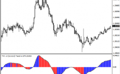
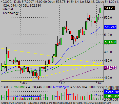
Although candlestick charts were created in Japan at least a few hundred years earlier, originally to measure the value of rice, they are still used today in modern trading. More significantly, candlesticks are fairly easy to read with a little practice and offer a wealth of information in a chart. Each plot point on a candlestick chart consists of a rectangular shaped body (think of it as the candle) with a vertical line (the wick) extending from both the top and bottom parts. Candlesticks are colored and typically a dark candle indicates a downward movement while a light one shows that the stock moved upwards. Each candlestick can be read to learn about the stock’s highest and lowest prices as well as its opening and closing prices.
To Sum Up, A Variety of Stock Charts can be Used for Different Trading Methods
As shown here, there are various types of options when choosing which chart to use, from the time frame to the pricing representation. When starting out, the best way is to become familiar with all of these options and practice a little with each one. Eventually traders realize that one type of chart works best for them. After coming to this realization, try to use that type of chart regularly while trading since each chart requires differing trading methods.


