Candlestick Charts How To Read A Candle Stick Chart
Post on: 20 Апрель, 2015 No Comment
Candlestick charts create a perfect mix between a line chart and a bar graph, depicting more information than is typically available with either on their own. Overall these charts signal to investors whether bulls (the buyers) or bears (the sellers) dominate the market. In trading binary options, it is important to know how these charts can be useful in predicting the best points to buy and sell.
What are Candlestick Charts? How Do I Read One?
The Basic Candlestick Chart
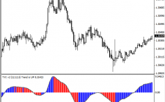
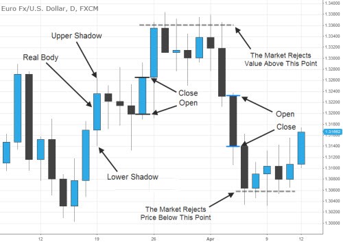
Candlestick charts get their name from the thin bars that they are composed of that display the opening and closing stock price as well as its high/low range which resemble the wick of a candle.
Candles are arranged along a chart, in a pattern similar to a simple line graph, however they contain more information than a simple line graph can give.
The Bars Each candle is formed by a hollow or filled in rectangle that indicates whether the stock closed above or below its initial selling price, respectively. A longer body represents either increased buying or selling pressure due to the behavior of investors during the time period. Most candlestick bars are red and green. Red bars mean the assets price closed lower than it opened for that time period. Green bars mean the asset closed higher than it opened for that period. The size of the bar represents the price movement of the asset from open to close.
The wicks – better known as shadows – on the top and bottom of each candle is a line. This line shows the highest and lowest points reached by the asset during that particular time period. Long wicks tend to show a shift in behavior. Either buyers drove prices up and then later, trading slowed as investors refused to pay the high prices, or vice versa. The top of the wick is the high price the asset traded for during that candle. The low wick is the lowest price the asset traded for during that time period.
How Can I Use Candlestick Charts to Trade Binary Options?
Over time, investors have begun to notice that recurring market trends are typically a reliable predictor of events to come. By looking for these indicators on a candlestick chart, it will help you to decide whether it is the right time to purchase or sell your binary option. The strategy is called price action trading and it is the predominate way the seasoned traders advocate learning and trading binaries successfully.
Common Chart Patterns and Terms
As you become more familiar with binary trading you will see more and more of these patterns. There are a wide variety more candle types over at stockcharts.com which has a pretty comprehensive library. We will not rehash all of them here, however these are some of the ones we find most common below. We also created a page where we are updating and adding more and more common candlestick chart patterns.
Engulfing
This occurs when a candle with a very small body is followed by a candle with a body that is larger at both ends; the second candle therefore completely engulfs the first candle. It tends to signal a bullish market when found at the top of an upward trend or a bearish market when found at the bottom of a downward trend.
Shooting Star is the opposite, a short body candle, containing a long shadow occurs above a longer bodied candle at the top of an upward trend. This is signaling that the market is about to become a bear market.


