Steps to Building a More Profitable Online Checkout
Post on: 16 Март, 2015 No Comment
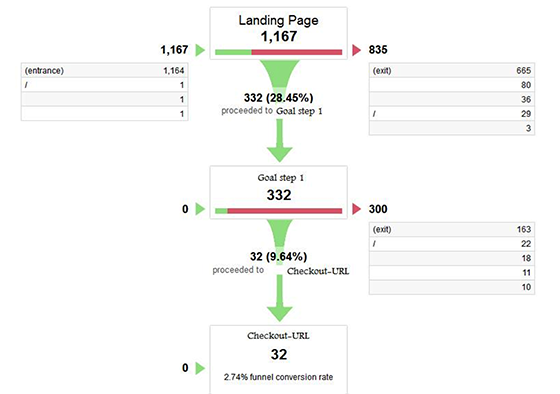
The core business of eCommerce sites is to sell. But despite all the effort and optimization built into your websites home page and product pages, the main determinant of conversion and the place where the real selling takes place, is the checkout .
Here are 4 steps to creating a better online checkout process. These are based on customer experience insights that our consulting group has gleaned from enterprises around the world.
Step 1: Be Smart about Registration
The first step of the checkout process generally offers visitors the opportunity to log in or register. I would like to emphasize here ‘offer the opportunity’ since it should not be the only way to enter the checkout process.
1st step Sign In / Register
Why? Because research shows that 30% of visitors drop off when presented with a forced registration. Of course it’s great to be able to have their personal information, so offer them an option to register at the end of the checkout funnel and ask them to provide only a username and a password, et voilà!
At this stage visitors would be more likely to register than continue as a guest, since they don’t have to invest any extra work.
They benefit, since the next time they visit your site they won’t have to fill in all their address details again. And your organization benefits from adding a new lead who you can continue to nurture with new deals and product updates in your own time.
Step 2: With Online Forms Less is More
A heatmap showing vistors dropping out after the first part of the long form
The next step is the form. This is the part where visitors tend to get overwhelmed, annoyed, frustrated and leave. Yes, the form is more important than you think because it can harm conversion.
How? Well, to start, let’s assume the visitor wanted to buy something, and now the visitor gets a form to asking him to provide every contact detail; address, email AND telephone (and yes, maybe even a separate daytime and evening phone number). Also, the visitor is asked to fill in the email address twice (you know, just to confirm ).
Is it any wonder visitors get frustrated and drop off?
In order to achieve the best form conversion ask as few questions as possible. Consider using an address locator so that the visitor only has to fill the postal code and house number. Don’t ask the visitor to repeat the email address, which will only hasten their drop out!
In general, every extra field added to your form costs your organization money. So think hard about how important each form field is to the checkout process – and you’ll notice your conversion improve from removing just one!
Form Analytics shows which field cause most visitors drop out
Step 3: Safety Builds Trust
After visitors provide their personal information, now they have arrived at the payment step. Visitors want to buy your product so make it as easy as possible!
Use security seals on the top of the page and next to the call-to-action buttons.
Visitors need to trust you with their credit card details so illustrate that trust. Use security seals (e.g. Norton or MacAfee) and place them on the top of the page, next to the call-to-action buttons.
Also, provide the visitors with all information necessary so they won’t make any mistakes. Provide an example of the security code, show which credit cards you accept and offer a drop-down for the expiration date of the credit card.
Step 4: Don’t Lose Customers at Confirmation!
The last page is the confirmation page. The visitor will probably notice the confirmation number, but will most likely not write it down. So send a confirmation e-mail (and use this e-mail address for future communication).
Also, the confirmation page is where the visitor is sent back out into the world. So this is the time to engage your visitor! The visitor will leave your website if you do not guide him back in somehow. Many times I see visitors confused on this last page of the checkout process, scrolling up and down, looking for the purpose of the page. If you don’t give them that purpose, they will leave your website.
Click heatmap showing confused visitors clicking on the confirmation number
This is the place to provide clear call-to-action buttons that guide the visitor back to your homepage or any other relevant page on your website. Try to keep them engaged with additional special offers or products related to their latest purchase.
By keeping customers engaged with your website, and providing a good customer experience, they’re much more likely to come back and purchase again.


