Relative Strength Index Momentum and Accumulation
Post on: 16 Март, 2015 No Comment
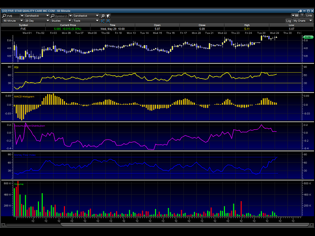
The three I use sometimes are:
- RSI = Relative Strength Index
- Momentum
- Accumulation / Distribution
Relative Strength Index
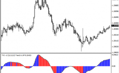
RSI is one of two Momentum indicators, no prizes for guessing what the other one is. What momentum indicators show us is the speed with which the chart is either rising, or falling. This so called speed, as we will call it, starts at 1 and peaks at 100. This speed or strength can be read as follow:
Below 30 = Over sold market suggesting market may rise
Above 70 = Over bought market suggesting market may fall
Around 50+/- = Signal Line. Possible consolidation
I say may, as these are possible from using just the RSI. Like I have said before, these tools should be used in conjunction with other methods and not as THE single method to spot trends or reversals.
Personally I set the RSI with the following settings:
20 day RSI
I think a metaphor would work here for RSI. Think of RSI as a car moving anywhere between 30 to 70 mph. Now when we press the breaks we slow down, but it takes a while, likewise when we press the accelerator, we go faster but it may take a while. Now the faster we go, the harder we have to press the break and the slower we go the more we have to press the accelerator. The lower speed limit is 30 miles an hour, so when were heading below that we could expect to accelerate again and see markets rise, likewise if we go past the top speed limit of 70 the breaks are applied to slow down and we can expect the price to fall.
However and thankfully no analogy this time, always look back on the RSI over a year on the chart that you’re looking at. Some charts, especially those that are highly volatile tend to trade at unusual limits within the RSI. For instance, it isn’t uncommon to see a stock appear to be overbought (above 70) and not retrace (fall). The reason behind this is that the stock may naturally trade high within the RSI. Therefore, always check back and look at the RSI on the chart over the year and see where the stock has retraced on the RSI alone. Chances are, if the RSI is high and remaining that way, the point at which the stock has retraced (fallen) within the RSI is in fact higher than 70.
Momentum
This is not so surprisingly the other Momentum indicator that I use, how did you guess! Now the momentum indicator is an indicator Newton would be proud of. Think of momentum as a ball being thrown up in the air; the acceleration is quick initially and then reduces, until it runs out of momentum, gravity takes over and the balls slows, falling back down.
Now within Momentum with have a line called the zero line, also known as the Signal Line. Sometimes represented as 100 or simply just 0. The Zero line can be seen when the ball is in neither up nor down. When the line is above the zero line we can expect the markets to rise. When the line is below the zero line we can expect the markets to be falling on that chart.
The severity of the increase dictates to some degree the strength of that momentum behind the forming trend. So a steep rise above the zero line would suggest that the price/ market might rise much quicker, or fall much quicker, if below the zero line.
Remember, momentum indicators are like weak signals that we try and interpret into the movement of trends. Using our other tools and those momentum indicators combined, gives us a broader picture of what could happen in the very near future.
I use the following settings on Momentum indicators:
20 day setting
There is no exponential setting for Momentum indicator, so all the past 20 days are taken as the same weight.
The final indicator that I use comes under the banner of OHLCV indicators. Sounds all very technical and can be read to mean the following; OHLCV gives the opening, closing, highest and lowest prices for each share each day, plus the total number of shares traded the volume.
It does sound complicated. That’s what happens when Institutions get their money stained hands on something really quite simple. When you read how it’s really used rather than its overly technical name suggests, you will realise more of the technical guff that’s used to make something seem more complex than it really is so us mere mortals will think twice about using it. Oh and God forbid we might actually understand it too and make money!
Accumulation / Distribution
I dont use this one as much now. It does give some good signals. Sometimes I use a combination of RSI, Momentum or RSI and AD.
Now what this indicator not so surprisingly signals is the relationship between the share price and the volume (quantity of shares traded).
This can be simply read as follows:
An upward trend in the Accumulation & Distribution suggests that there are more investors buying then there are selling. As the volume is associated more with buying than selling, this would therefore suggest that the market trend would be going up.
When the trend in the Accumulation & Distribution is in a downward trend, then the reverse is true. The volume is greater in terms of sales then buys, so the share will eventually go down.
This can be read in comparison to the charts as when the above is going up or down, the market will usually follow eventually. Therefore, we can use the Accumulation & Distribution as an added tool in our belt to spot price movements.
There are no settings for Accumulation & Distribution.
This entry is filed under academy. You can follow any responses to this entry through the RSS 2.0 feed. You can leave a response. or trackback from your own site.


