Renko and Kagi
Post on: 16 Март, 2015 No Comment
Renko
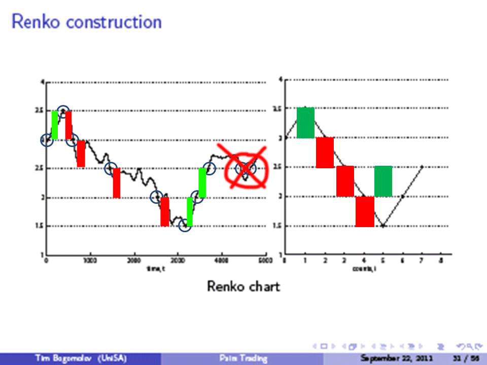
The Renko chart is similar to the three line break in that you only plot when the price movements demand it, so again the date line is variable. And once again you only look at closing prices. The difference is that in Renko you plot standard lengths of line, so unless the increase or decrease in the price is sufficient to allow another line to be drawn, then there is no action. Heres a typical chart: –
Once again the purpose of the chart is to spot strong trends and filter out minor fluctuations. You have a choice of the amount that you use for the standard length of line, and in the above chart it is set at 4%. If this is too small, then the chart will track the stock price too closely and you would buy whenever the price went up and sell when the price fell. While this method is trend following, it would result in a lot of trading. On the other hand, if the value is too large then you would be later discovering and trading on a trend, and therefore leaving some profits behind.
Kagi
Another variation on the trend spotting charting techniques introduced above, kagi is drawn as a series of lines, sometimes of two different thicknesses or of two different colours in order to distinguish them. Here is a chart so that you can follow how it is constructed: –
Again, we only use the closing prices, and there is a minimum amount that the price must change before the next line is drawn, making the price scale erratic. The chart above is drawn with a minimum 4% move, the same as the renko, and the same considerations apply when deciding how much or how little to make this number. By the way, if you dont plot it in colour, with black for the up-trend and red for the down-trend as shown above, the convention is that the up-trend lines are thicker.
To explain the way the chart is drawn, lets assume we are in an up-trend. The vertical line would be drawn up to the value, but no higher, and it would stop at the increment – so with 4% as the increment, if it went up 6% you would still only draw it up to 4%. You would only draw it longer if it went up 8% or higher.
If it keeps going up, you wait until it hits 8%, then 12%, etc. and extend the line up. But if it goes down, you draw a horizontal connector and draw the line down, as you can see above. As long as it doesnt go below the previous low, you are still in an up-trend, and the line is black and/or thick.
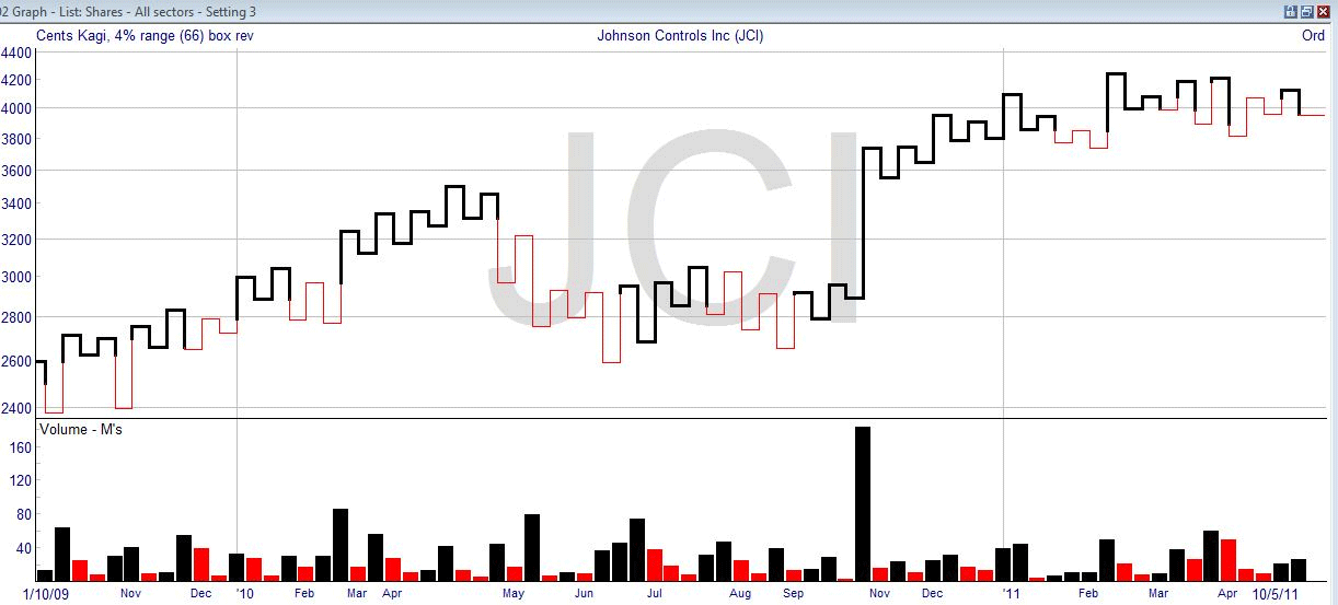
The reversal in trend is when you see a low that is lower than a previous low, which idea should be familiar to you now. Then you change over the line to red or thin, and do exactly the same idea, but going downwards now. You only extend the line down when it hits another increment, you can have price moves up, by moving sideways and drawing up, provided it is below the previous high (or else the trend would have reversed again). And so on.
If you look in detail at the chart above, it becomes obvious that the method only works when you have a good trend. Looking at the middle, where the stock is trading sideways, you would have lost each time you entered the market on the basis of a renko reversal. This is why you would tune up the response by selecting the percentage. If the percentage change required was greater, then you may not get so many erroneous signals. The downside is that it takes longer and more of the trend has happened before you get in the game. If the percentage was smaller, you would be switching all the time, and be very lucky not to lose your shirt.
Of course, no matter how you look at it, no trend following system is going to make money if there is no trend to follow – so in the case above, you would not make a profit with any of the sideways movement. And you also need to remember that you really cant tune the system to never lose, thats just not real, so you need to stop at some time and get on with testing the ups-and-downs.
You might find it useful to look at the Kagi chart to see when the market is in a good trend, and then time your spread bet by looking at other indicators, such as candlestick patterns.
Steve Nison, the candlestick charting trader, is also credited with introducing the other charting methods above, Three Line, Renko and Kagi, to the Western trading community. The next alternative charting method was around before all that happened. Some say that it was called the “Book Method” in 1880 or 1890, and Charles Dow certainly knew about it and used it. Around the 1930s it was named what it is called today, the point and figure chart. As with all the other charting methods, all you are doing is taking historical data and applying it in certain ways so that you get a better idea of where the price is likely to go and can place a trade or a bet accordingly.


