Investment Banking Jobs Trades & Tombstones
Post on: 5 Май, 2015 No Comment

The First Half of the 21st Century-the Debt Era?
Fifty years from now, when economists debate the major themes of the first half of the 21st century, could the first half be known as the debt era?
Heres a map of the global debt to GDP landscape. Perhaps completely unsurprising to seasoned professionals in the investment banking world, the map shows the dominance of debt in European countries.
European countries are, of course, not alone. Some other high debt load countries include Japan, the United States, Indonesia, China, and a few others. Of this group, probably the only really surprising member is China.
Also interesting when looking at the geography behind the debt picture is the lack of large debt burdens in Russia and many South American countries. One likely explanation for this is the concern bond markets have for the stability of the given countries financial systems.
Detailed Views
Heres a detailed view of Europe. As mentioned, European countries are loaded with debt. The highest on the debt list is Ireland at 390%. Irelands profligacy is followed by Portugal, Belgium, Netherlands, and Greece.
Other European countries with debt burdens above the 200% watermark are Spain, Denmark, Sweden, France, Italy, United Kingdom, Norway, Finland, Austria, and Hungary. Interestingly, the strongest members of the EU Germany has a relatively low debt burden at 188%. Guess it pays to be efficient and prudent.
South America
The debt picture is somewhat different in South America. The country with the highest debt load is Brazil at 162%.
The debt picture in Asia is somewhat surprising. Of the interesting numbers is the lack of profligate spending in Russia, with a debt to GDP burden of only 65%. On the other end, some of the worlds most highly indebted countries call East Asia home, including Japan at 400% and Singapore at 382%. Also interesting is the 217% debt burden in China.
North America
In North America, the U.S. has the highest burdened citizens at 233%, followed by Canada at 221%. The other end includes Mexico at a mere 73%.
The Table
Heres a table view of the debt to GDP picture.
What Has Debt Done Since 2007?
Certainly, some of the massive debt expansion has the global financial crisis of 2007 to 2008 to blame. Heres a look at how the debt picture has changed since 2007 to 2014 Q2.
The column on the farthest left is debt to GDP. The second column is total debt growth since 2007. The third column is corporate debt growth since 2007. The fourth column is household debt expansion since 2007. The right column is the debt change in the financial sector since 2007. A couple of things stand out.
First, government debt has exploded much quicker than household or corporate debt.
Second, its hard to tell which sector expanded quicker overall corporations or households indicating that the two have a closer view of the usefulness of debt than governments do.
Conclusion
Overall, debt picture is part surprising, part alarming, and part amusing. Theres lot of ways the debt world could deal with the massive debt loads in various areas of the world, but one thing is certain. It will have to be dealt with sooner rather than later, regardless of what current Greek politicians think.
Employment and GDP Growth by US President
Unless you willingly prefer to ignore reality, you likely know that politics is intricately connected with the investment banking world. Lets take a look at employment growth by U.S. president since 1948. Unsurprisingly, employment growth expanded the strongest during the Clinton and Reagan administrations.
Employment Growth
During the Clinton administration, employment grew by a little over 20 percent. The Reagan administration places second at about 17 percent. Fast-forwarding to the two most recent administrations, things do not look nearly as bright.
During the George W. Bush’s administration (Bush II), the employment picture expanded by a couple of percentage points. The Bush II administration was hindered by two recessions – the bursting of the technology bubble and the global financial crisis.
Following the George W. Bush’s administration, the Obama administration’s experience has been just as weak (weaker if you solve for trend growth). President Obama came into office about in the middle of the 2008/2009 recession. Since bottoming out early in his second year of office, the U.S. economy has slowly added jobs, only recently gaining a little bit stronger pace after four years of anemic growth. Overall, if the current administration is lucky, it could see employment growth a little bit better than the Eisenhower administration (thanks to the weakness in the last year of the Eisenhower administration).
GDP Growth
Switching to GDP, here is a look at GDP growth by U.S. president. Unsurprisingly given the performance of employment during their presidencies, GDP expanded the strongest during the Clinton and Reagan administrations. During the Clinton Administration, GDP grew by about 35 percent. During the Reagan Administration, GDP expanded by about 30 percent.
Fast forward to the two most recent administrations and again, things look relatively poor. At this point in his presidency (6 years), GDP was up about 16 percent during the George W. Bush’s Administration. Through the 6 years of the Obama Administration, GDP is up about 13 percent.
Where did the growth go in the past 15 years?
Conclusion
Overall, the investment banking universe is intricately connected with the political world. Always has been, and likely always will be. In looking at the performance of the economy – as measured by jobs – by U.S. President, it does not look very good for the most recent administrations. If the economy is able to survive another two years without a hiccup in the overall employment picture (probably unlikely), the Obama administration might make it to third worst since 1948 (for 2 full-term serving presidents).
A third worst performance would put the Obama administration far behind the employment growth experienced during the Clinton and Reagan years and about in line with what happened during the Bush II years if one excludes the global financial crisis.
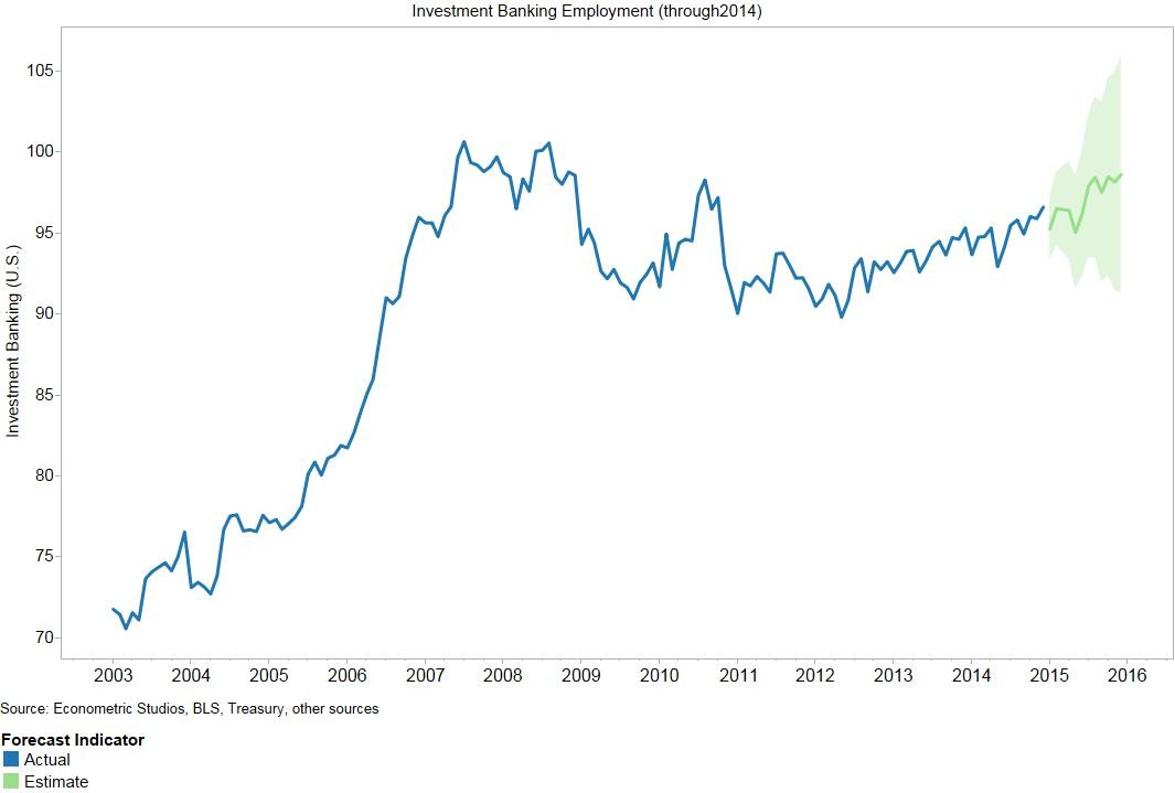
When switching from the employment picture to the GDP picture, not a whole lot changes. The Reagan and Clinton years were the best, and the two most recent administrations saw uncharacteristically slow GDP growth.
Which Economic Units Inflation Rate Moves the Price of Gold the Most?
Its not uncommon to see investment bankers check the state of the gold market at least a few times a day. Of all the markets in the world, its one of the few that everyone finds fascinating.
Movements in the gold market can signal pending inflation, slowing economic growth, unwise budgetary decisions, and other interesting indicators. The gold market also has a much broader reach than any other market, in that traders, politicians, and many others care about what the price of gold is doing. Given the interest from the investment banking world in general, we thought it might be interesting to see which economic units inflation rate has the greatest impact on the price of gold.
Here is a look at the relationship between the price of gold and four selected economic units inflation rates over the past 15 years. You might be surprised by which one moves the price of gold the most.
U.S. Inflation and the Price of Gold
First, lets review the relationship between the inflation rate in the U.S. and the price of gold. Perhaps surprisingly, the two are not as closely related as some might think. At times, the inflation rate in the U.S. moves fairly closely with the price of gold, such as in 2008 and 2009. This conventional wisdom finding breaks down a number of times, though, such as the divergence seen in the most recent years (2013 and 2014).
Europes Inflation and the Price of Gold
The next graphic is a look at the inflation rate in Europe and the price of gold. Interestingly, the two look even less closely related than the inflation rate in the U.S and the price of gold. As with the experience in the U.S. there are times when the two generally moved together (2008/2009 and 2012/2013). Theres also been some divergences, such as the 2005/2006 and 2014 periods.
Russias Inflation and the Price of Gold
The third graphic is a look at the price of gold and the inflation rate in Russia. Perhaps less surprising, the two look as though they generally dont move together, with the exception of, for example, the most recent movements in both.
Chinas Inflation and the Price of Gold
The following graphic is a look at the inflation rate in China as related to the price of gold. Interestingly, this looks as though the two move generally together, with fewer exceptions than the U.S. and Europe.
Which One Wins?
With the four economic units inflation rates shown, which one is most correlated with gold price movements? The answer, surprisingly, is Russia on the downside and China on the upside (see the following correlation matrix).
Interestingly, the inflation rate in Russia (and the U.S. and Europe) is negatively related with gold price movements. This means that, contrary to popular belief, an increase in the inflation rate in Russia (and, again, the U.S. and Europe) is correlated with a decrease in the price of gold (that is, without doing any sophisticated econometrics).
In contrast, the inflation rate in China is positively related with gold price movements. This means that when the inflation rate in China rises, so does the price of gold (in general).
If you were asked which economic units inflation rate moves the price of gold the most, you probably would have said the U.S. Now you can see that the gold market appears to care more about what is going on in China and Russia than inflation conditions in the U.S. at least when looking at the correlation of these economic units inflation rates with the price of gold.


