Common Candlestick Patterns What They Mean Trading Binary Options
Post on: 15 Апрель, 2015 No Comment

Candlestick charts are used to track price movements. Traders use them to help predict the direction in which an assets price will move. The patterns displayed on the charts indicate whether the market for any given asset (gold, oil, corn, shares of IBM, etc.) is, on average, bullish or bearish. Bullish sentiment signals a pending price rise; bearish sentiment indicates a pending price decline. For binary options trading, candlestick chart patterns are an invaluable tool.
The patterns are not difficult to read, even if they first appear so. Understanding them is just a matter of knowing what to look for. This page will give you a brief, but thorough, guide to reading the charts and recognizing valuable information from the patterns you see. Youll learn how to quickly identify the most common candlestick chart patterns, and how to use them to make more profitable binary options trades.
Candlestick Chart Patterns And What They Mean
There are dozens of candlestick chart patterns, and each signifies something different. Its not necessary to memorize all of them at once. Some are less common than others. Some are also less useful than others. The following are among the most important patterns to recognize.
Doji This pattern appears when the closing price of an asset is the same or nearly the same as its opening price. The bar displays as a horizontal line. The candles wick, which runs vertically, creates a cross upright or inverted or plus sign with the bar. A doji pattern indicates uncertainty and indecision on the part of the market.
Hammer A hammer pattern can emerge when the price of an asset has been declining. The assets price drops after opening, which indicates strong selling pressure. By the close of the trading session, however, the price rallies and buying pressure builds to the point that the assets price is pushed above its opening price. This activity forms a candle that looks like a hammer with the wick extending downward from the bottom of the bar. A hammer pattern suggests that investors and traders are becoming bullish.
Morning Star This pattern surfaces after three days. On the first day, a long red (or filled) bar is created as the assets price closes far below its opening price. On the second day, a much smaller red/filled bar is created as the price closes below the previous days closing price. On the third day, a long green/unfilled bar emerges as the assets price rises after opening, and closes above the middle of the first days bar. A lot of traders take this to mean the bearish sentiment behind an asset is reversing.
Shooting Star A shooting star pattern develops the day following a strong rise in an assets price. The price opens above the previous days close, and continues to rise. However, it falls during intraday trading and eventually closes near the opening price. This causes the days candle to appear like an inverted hammer.
Engulfing This pattern can surface in two ways, one indicating bullish sentiment and the other indicating bearish sentiment. Both involve a small bar followed by a long bar, where the range of the latter extends beyond that of the former on both ends. A bullish engulfing pattern develops when the first day results in a price decline (red bar) and the second day results in a price rise (green bar). A bearish engulfing pattern develops when the opposite occurs: the first day produces a price rise and the second day produces a price decline.
Piercing A piercing line pattern develops over two days. On the first day, selling pressure pushes the assets closing price far below its opening price. On the second day, the price rallies as buying pressure pushes it upward, past the middle of the previous days open-close range. This is a bullish indicator.
Spinning Top This pattern is created when intraday trading causes the price of the asset to drop far below, and rise far above, the days open-close range. The candle appears similar to a top, with a short bar and a long wick that extends from both ends. Like a doji pattern, the spinning top is a sign of market indecision.
Harami A harami pattern emerges over a two-day period. In appearance, it is the opposite of an engulfing pattern. That is, the second days open-close range is eclipsed by the previous days open-close range. This pattern can be either bullish or bearish, depending on the activity that occurs over a three-day period. Two days of downward price movement followed by a price rise on the third day is a bullish sign. One or two days of upward price momentum followed by a price decline is a bearish indicator.
The ability to recognize common candlestick chart patterns when trading binary options will help you to choose more profitable trades. We recommend starting with the eight patterns described above. Then, with those under your belt, learn to identify the less common ones. Youll find they can be surprisingly accurate in predicting future price movements in the assets you trade.
Candlestick Charts 101: How To Read The Charts
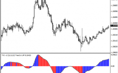
A basic CandleStick Chart FreeStockCharts.com
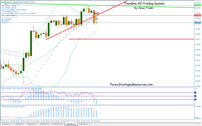
In order to recognize patterns in candlestick charts, you first need to know what the individual markers, or candles, indicate. Lets cover the basics.
Every candlestick chart is composed of a series of candles. Each candle represents a trading session, and illustrates the assets opening price, closing price, and lowest or highest trading price.
Each candle has a bar and a wick (or shadow). The bar depicts the range between the assets opening and closing prices for the trading session. On most charts, the bars are either green or red. Alternatively, they might display as hollow or filled. A green (or hollow) bar means the assets closing price was higher than its opening price. This is generally considered to be a bullish indicator. A red (or filled) bar means the assets closing price was lower than its opening price, a bearish indicator.
The wick of a candle is a vertical line that extends from the top or bottom of the bar (and sometimes both). It represents the highest and/or lowest prices of the asset during the trading session.
Are Candlestick Charts Effective As A Binary Options Trading Tool?
Candlestick charts are commonly used in technical analysis. The guiding principle for using them is that asset prices can be predicted with reasonable accuracy based on past market activity. For example, if a particular pattern emerges that signals a bullish sentiment in the market, many traders respond to it by purchasing the asset in question. Conversely, if a candlestick chart pattern indicates growing bearish sentiment, many traders will respond by selling the asset in question.
Note that this type of analysis is driven largely by market psychology. That is, an assets price rises as more people buy it. This in turn signals to others that they too should buy it, driving the assets price even higher. The opposite occurs when an assets price is falling. More people sell it, causing the price to decline further.
As a tool for predictive modeling for trading binary options, candlestick charts are very reliable. But as we noted earlier, leveraging them requires being able to identify certain patterns.
More Candlestick Chart Resources


