The Complete Tick Chart Guide
Post on: 21 Июнь, 2015 No Comment

Heres a different way of looking at technical chart analysis
Most traders look at time based charts, however there is another (better) option (in my opinion), the tick chart. In this post I will share how I use tick charts for gaining an edge over the competition.
Tick Chart Overview
So let’s start with the basics, what is a tick chart ?
A tick chart is made up of bars which are based off a number of market transactions (as opposed to elapsed time).
Most charting packages will default to the standard time based chart where each bar forms after a specified amount of time has passed (1-min, 5-min, 15-min etc.). The tick chart allows us to break down the bar into number of transactions (144, 233, 512, etc.).
These numbers are a little more ambiguous than your typical time based charts, but tick charts have some distinct advantages. The most relevant is the ability to view price charts in a variable other than time, but time does play an important role.
Interpreting Volume
Since tick charts are made up of bars which form after X # of transactions the amount of time it takes for each bar to close (or series of bars to form) tells us a lot about the volume of the markets.
Periods when bars are forming faster indicates more volume moving the markets. When bars are slower to form this is indication of lower volume.
The chart below is an example of how to interpret volume within tick charts:
While the size of each individual transaction is unknown, larger positions are commonly broken up into smaller orders.
Thus, a larger order of 10,000 contracts might be filled over the course of 5-10 smaller orders. In order for the market to absorb this order many smaller orders will be filled to match the other side of this trade.
Other Data-Based Intraday Chart Types
In addition to the tick chart, there are two other types of data-based chart types, range, and volume charts. Range charts print bars which close at the end of a specified data interval (ex: after a 1.0 pt range is traded).
Volume charts. are similar to tick charts, except their bars close once a certain number of contracts have been traded. These charts are all unique in their own way and put a nice spin on the standard time based chart.
Adding the Heikin Ashi Candlestick Study to Better Identify the Trend
The Heikin Ashi Candlestick is a great indicator to be familiar with and have in your toolbox. Below youll notice a distinct difference between a traditional candlestick and the Heikin Ashi, the main difference being the color coating of the bars. Heres an article I wrote for Active Trader Magazine which outlines the basics of understanding and applying Heikin Ashi Candlesticks .
Below I compare the traditional candlestick study with the Heikin Ashi chart study:
Of all the bar chart types out there I prefer the combination of the tick chart with the Heikin Ashi Candlestick. This combination is a crucial part of my chart setup for day trading the Euro 6E futures.
The video below provides more detail on how I use Heikin Ashi Charts in my trading.
Trading Setups on the 512 Tick Chart
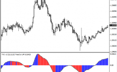
When you combine the tick chart with the Heikin Ashi candle stick study you get a nice clear picture of the current market condition.
Trending markets are easy to identify with clean bars of the same color forming one after another.
Range bound markets will appear choppy, with bars changing color more frequently.
Youll notice in the images below periods of trending followed by consolidation sideways chop.
For a detailed look at my trading setups for the ES & 6E you can checkout My Trading Rule s. a comprehensive guide I put together that acts as the framework for my trading.
If you found this post helpful please share or retweet it below. Thank You!


