Technical Analysis An Introduction to Chart Reading
Post on: 16 Март, 2015 No Comment
Join Andrei Knight’s Live Trading Room, we have a discount for you!
The markets represent the struggle between two opposing forces… the bulls, who want to push the price higher, and the bears, who wish to push it lower. As each side tries to overpower the other, they leave footprints behind.
Technical analysis is the art and science of reading a price chart in order to determine who is stronger, and who is winning the struggle at any given moment.
Chart Types
There are three types of charts commonly used in technical analysis:
The line chart is the simplest form of charting. For any given time period, it shows you what the closing price was. It does not, however, tell you very much about at which price the time period opened, or how big the struggle itself was.
For this, we turn to the bar chart. Here the vertical bar shows us the extremes, the highest and lowest price reached during that particular period, while the short ticks on the sides show us where that period opened and closed. The bigger the bar, the wider the range of the struggle, and the smaller it is the more agreement and consensus there was on the price. You can also see if the open and the close of the period in question occurred closer to the lowest price, the highest, or somewhere closer to the middle.
Candlestick charts were first used in Japan in the 12th century, in an attempt to predict rice prices, and yielded remarkable accuracy. Like a bar chart, they show you the open, the close, the high, and the low of any given period. Besides just answering the question “who is winning?”, at a glance they can also tell you “who is stronger?” This is due to some easily recognizable characteristics such as the size of their bodies, the length of their wicks, and their overall coloring.
Candlesticks on charts have wicks at both ends. The wick shows us the extremes, the highest and lowest prices seen during that period. The candle body shows us where the opening and closing prices were. Additionally, the color of the candle shows you who ultimately won. Green candles represent a higher close than open, while red candles represent a decline in the closing price from the open.
In the example on the right, you can see that the most recent candle opened at 1.4830, then dropped as low as 1.4820, went on to rise as high as 1.4860, before finally settling at the present closing price of 1.4850; 20 pips above where it started its journey.
In this manner, each candlestick tells us a complete story of what happened in the power struggle between bulls and bears during that particular period of time, and gives us clues as to who is growing stronger and who is weakening.
There is also a special kind of candle called a “doji”– this is a candle where the open and closing price were the same, leaving the candle without a body at all. These candles look like a “+” and represent a moment of consensus – an agreement between buyers and sellers in the market, but also moment of indecision as to the next direction.
In the chart to the left, you can see the bulls gradually losing strength as the rally comes to an end at the top, as evidenced by the shrinking candle body. Then a doji prints and we begin to see the bears slowly overpower the bulls as price begins to move back downward.
Timeframes
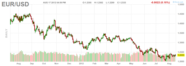
Each candle or bar on a chart represents a specific period of time. This can be a minute, 5 minutes, 15 minutes, 30 minutes, an hour, 4 hours, even a day, week, or an entire month. The timeframe refers to the amount of time it takes to print one candlestick on your chart.
Both of the charts on the right show the same period of time, and the same price move from 1.4710 up 1.4840
The first chart is a longer timeframe, where each candle takes 1 hour to form. The second chart is a lower timeframe, which shows the same move but in 5- minute increments.
The timeframe you choose to use depends on what sort of trade you are looking for. A longterm trend follower is likely to use a longer timeframe, a swing trader something in the middle, and a day trader or scalper might choose one of the lower timeframes.
Trading with Multiple Timeframes
One strategy for trading might be to use multiple timeframes. First, identify the best chart to use for your particular style of trading. This will be your lower time frame. Now pick another to be the higher one — the goal is to pick two that are far enough apart (a factor of 5 or as close to that as possible).
A long-term trader who uses a daily chart as the lower timeframe, for example, may occasionally glance up at a weekly chart as the higher one (since there are 5 days in 1 week). A day trader who uses a 5-minute chart as the lower timeframe would most likely use a 30-minute chart for the higher one (since a 15- minute chart is only a factor of 3, and may not provide a different enough perspective).
On the higher timeframe, you can decide if you wish to be a bull or a bear in regards to that particular currency pair (or you can also decide to stand aside and look for another pair if the market is sideways and showing no clear direction). Then you can switch to the lower timeframe and take entry signals as normal, but only in the direction you decided upon in the higher timeframe. A bull would be looking for long signals in order to buy, while disregarding any short signals, while a bear would be looking to sell short and would disregard any long signals.
Trends do change direction eventually, but generally they tend to do so gradually. You are allowed to change your mind and choose a different direction, but only on the higher timeframe, not on the lower one. The idea behind multiple timeframe analysis is to reduce the number of false trades, and to avoid the temptation to trade randomly in both directions at once.


