Swing Trading with the MACD
Post on: 24 Июль, 2015 No Comment
by Dennis Cajigas
Moving Average Convergence/Divergence. otherwise known as MACD, is a useful tool to have in your technical toolbox. I think it’s particularly useful for swing trading, which can be defined as trades of an intermediate time frame (typically more than a day, but less than a month). I’ll take a look at what the MACD is, and how to apply the concepts to current markets.
Gerald Appel created the MACD in the 1960s as a way to analyze market momentum and strength. The later addition of a histogram provided a way to anticipate crossovers in the MACD. The histogram added another method of analysis that gave the MACD a renewed sense of relevance. Traders often use the histogram as a tool to anticipate trend and momentum shifts.
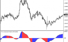
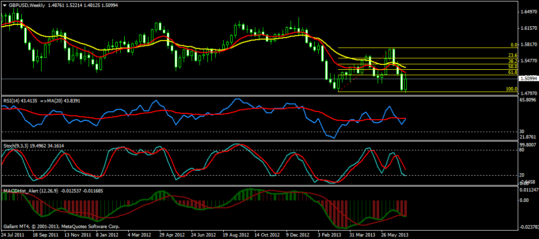
The MACD oscillates above and below zero. When above zero, the market has positive momentum which can often means an upward trend. When below zero, the market is described to have bearish momentum and can be assumed to be in a downward trend. When the MACD crosses zero, it does not necessarily indicate a specific entry point to buy or sell. It merely signals which way the market momentum is leaning. The MACD represents the difference between two (fast and slow) weighted moving averages of closing prices. The 12-day moving average is commonly used to represent the fast, while the 26-day moving average is often used to represent the slow. In the chart below, the blue and red lines indicate these two moving averages.
A trigger line, or signal line, is created by smoothing the result with another weighted moving average. This is the histogram, which you can see in the pink waves in the charts below. Most commonly, the 9-day is used. This creates a centered momentum oscillator, which visually indicates shifts in trend or changes in momentum.
What you are looking at is the relative difference between two moving averages. Is the fast gaining on the slow or vice versa? The histogram is the visual representation of this change. The MACD can be useful for either intraday or swing trading, but in a shorter time frame, it becomes more sensitive to changes. Thus, I highly recommend that you pair the MACD with other indicators. Volume and open interest can be good confirming indicators to help more completely describe the story.
Common Pitfalls
The MACD is a powerful and useful indicator, but it is a lagging indicator. Often there may be a delay between a signal in the MACD and price movement. The MACD may be used in all market condition types, but it is most useful in volatile markets when trend changes more frequently. So, the bigger the market swings, the more powerful this tool is to gauge strength of momentum.
Traders should be careful not to mix signals when forming their trade strategies. For example, when entering a swing or momentum-based trade, make sure your exit strategy is also based on a momentum indicator rather than a price, time or profit target. This is unique from risk management, which might incorporate these factors.
Types of Signals
Moving Average Crossover. This occurs when the two moving averages (fast and slow) cross. It indicates a potential shift in trend; essentially more buying (or selling) is coming into the market. It is the most common type of signal, but should be reinforced with another type of signal or indicator as it can occur fairly often. You can look on the MACD histogram for a three-bar confirmation of the price action, or look to another indicator entirely.
In the chart examples that follow, you’ll see two red and blue lines at the bottom, representing the two moving average time periods (fast and slow). The histogram in the middle has a line running through the center, which creates a trigger or signal line. This is an older chart of the U.S. Dollar Index futures, for the purposes of example only.
The histogram visually shows the difference between the moving averages. It also smoothes out fluctuations. I’m using a candlestick chart, with down days designated by red candles and up days by green. The tan ovals represent crossovers to the positive of the center line. You see how the red and blue lines cross, reflecting weakness that is mirrored in the price chart. The blue oval shows the fast moving average crossing the slow, suggestive of another trend change.
Centerline Crossover. This occurs when the MACD moves past the zero line and in the opposite territory; either negative to positive or positive to negative. It can also be combined with other types of indicators to confirm the signal. You’ll see a centerline crossover as the histogram increases. Traders will often monitor the slope of the histogram as well to reveal the strength or weakness of the market momentum. Again we can see the tan circle indicating bullish action, while the blue circle indicates bearish price action with a sharp slope.
Positive/Negative Divergence. This occurs when the strength or weakness of the MACD differs from the relative price action of the market. It is the least common of all the MACD signals, but some analysts regard it as the most reliable of the MACD signals, indicating a major trend shift.
Look at the two orange lines on the histogram and price chart below. At the beginning of the orange line there is a higher bar on the histogram that corresponds with a high on the price chart. But then we see weakening momentum on a lower high and a divergence on the price action. There is more buying coming in, but it’s happening on weaker strength, so it’s a bearish signal.
Crude Oil Momentum Shifts
Let’s look at some current examples to put these concepts into practice. First is a daily chart of crude oil. There is a moving average and centerline crossover in early August, where you can see the bearish action on the price chart. Notice the slope and how steep it shifts downward. The market is moving from positive to negative, and shows a downward angle near 70 degrees. As you look at momentum, you see a shift as the histogram begins to weaken and as the market begins to strengthen.
We see a divergence also within the same time frame (see the orange line). We have strengthening momentum but weak price action, but then weakening momentum and stronger price action. This shows negative divergences and suggests the beginning of a bearish swing trade.
Gold Momentum Shifts
Looking at gold, we also see a divergence in the histogram. Price action is diverging from the momentum indicator, suggestive of a shift. One more strong day and then a trend change. We don’t know if this will be a major or minor shift, but we do see a shift taking place.
This is just a brief introduction to MACD, and I encourage you to do further research and to contact me with questions on how you might apply these techniques to your market analysis. Please feel free to contact me for more specific trade strategies based on your unique goals and risk tolerance.
Dennis G. Cajigas is a Senior Market Strategist at MF Global’s individual futures trading division. He can be reached at (866) 631-6216 or by email at dcajigas@mfglobal.com
Futures trading involves the substantial risk of loss and is not suitable for all investors. Past performance is not necessarily indicative of future trading results. Trading advice is based on information taken from trade and statistical services and other sources which MF Global believes are reliable. We do not guarantee that such information is accurate or complete and it should not be relied upon as such. Trading advice reflects our good faith judgment at a specific time and is subject to change without notice. There is no guarantee that the advice we give will result in profitable trades. All trading decisions will be made by the account holder.
(c) MF Global Holdings Ltd. All Rights Reserved. 141 W. Jackson Blvd. Suite 1400-A, Chicago, IL 60604.


