Market Profile Charts
Post on: 25 Май, 2015 No Comment
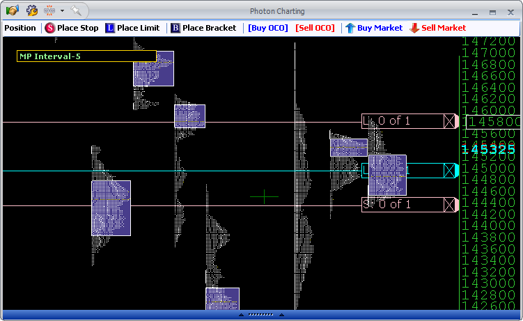
Market profile charts are a chart type that can be used by short term and long term traders alike. Market profile charts are based upon price and volume information, and combine them in a way that displays price, volume, and time frame, on a single chart. Market profile charts use standard market data, so they do not require level 2 market data or any additional market information (such as separate time and sales, etc.). Market profile charts are sometimes known by other names, such as Sierra Chart’s TPO and Volume Profile Chart.
Reading a Market Profile Chart
Market profile charts display the price on a vertical scale (as with most graphical charts), the volume on a horizontal scale, and the time frame using a combination of letter and / or colors. Understanding the price is quite straightforward, but the volume and time frame are slightly more complicated. The example chart (view full size chart )shows one day of the YM futures market (the Dow Jones futures), using colors to display the time frame information (rather than letters).
Price
Market profile charts display the price in the same manner as any other day trading chart, with the price scale being displayed on the right hand side of the chart.
Volume
The volume on a market profile chart is displayed as a horizontal histogram, with the longest horizontal lines showing the greatest amount of volume. This means that the price that has the longest horizontal line is the price where most of the volume has been traded. This price is also known as the point of control, as it is the price that had control of the market most of the time. On the example chart, the price that has the longest line and therefore the highest volume is 12541 (as shown by the annotation Point of Control and the yellow arrow).
Time Frame
The time frame on a market profile chart is shown using letter and / or colors. When letters are used, each letter represents one unit of the time frame (e.g. 5 minutes, 1 hour, etc.), and when colors are used, each color represents one unit of the time frame. The example chart is a 15 minute chart, and is using colors to show the time frame, so each colored square represents 15 minutes of trading. By knowing which color is the most recent, a trader can easily see which prices have been traded most recently.
Trading Using a market Profile Chart
Market profile charts can be used as a complete trading system, or as part of a larger trading system that also uses other charts. Either way, market profile charts are usually traded based upon support and resistance, and how the price interacts with the point of control (the most traded price). For example, a day trader might trade bounces off of the most recent point of control, while a swing trader might trade breakouts of yesterday’s point of control.


