How to Use Stock Market Charts Understand Market Trends
Post on: 16 Март, 2015 No Comment
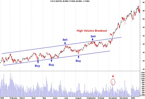
As an investor and practitioner of technical analysis, you must be able to read stock charts to understand how stock market trends are fluctuating. Whether you use line, bar or candlestick charts, you need to understand how stock prices, trading volume and momentum are moving to assess the opportunities and make the appropriate stock picks. By analyzing historical trading volume, opening and closing prices of a stock, Investors use charts to forecast future direction of the stock’s price. Knowing how to read charts assists investors in identifying stock market trends and helps them make more educated trading decisions.
Line Chart
The line chart is the most commonly used chart and considered to be the most basic and easiest to understand. The lines within the chart connect the points where the stock rose and fell over a period of time. It begins with the opening price of the determined time and ends with the closing price. Traditionally they are used over long periods of time and help to understand the large scale stock market trends. Line charts are not used to determine future of stock market trends but are used as a way to measure the current and past movements of investments. This is because line charts only show one piece of information, the price, while other charts provide information about the trading range.
Bar Chart
More complex than the line chart, the bar chart expands information of each data point to the open, high, low and close price in a given period. For this reason, it is commonly called an OHLC chart. On the chart, a bar is a vertical line representing a time frame and the minimum and maximum price during that time. On the left side of each bar there is a small horizontal dash representing the opening stock price. There is a similar line on the right side of the bar, presenting the closing price of the stock. The bars are color coded to show gains (green) and losses (red).
Investors and traders track stock market trends with this type of chart because it shows more technical depth research. The added information gives investors the tools to determine the stability of the stock.
Candlestick Chart
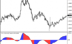
Candlestick charts originated from a form of Japanese charting system, but are similar to bar charts. Each candle consists of a body and shadows. The length and position of the candle are important pieces to understand in a candlestick chart and show the open and closing prices of the stock. The shadows represent the stock’s high and low values. Similar to the bar chart, the body of the candle is colored to show whether a gain (green) or a loss (red) took place. The extra information provided by the shadows can lead to better estimations of stock market trends.


